Mac Musings
iCab & SmoothType: Odd Couple?
Daniel Knight - 2001.12.17I first wrote about iCab in A Promising New Browser on March 2, 1999. I didn't note the version number, but I was already favorably impressed with the fledgling browser - which is still in beta nearly two years later.
Although Internet Explorer 5 remains my default browser - mostly because it's compatible with WebChecker and iCab is not - I am using iCab daily. iCab is getting better all the time, is much faster than either IE or Netscape, and is being developed for pre-PowerPC Macs as well as OS X. It'll be interesting to compare iCab with OmniWeb when I finally make the move to OS X sometime next year.
iCab doesn't display pages in exactly the same way as it does in Internet Explorer. That makes using iCab feel a bit odd at first, but different needn't be better or worse - just different. Here's an example:
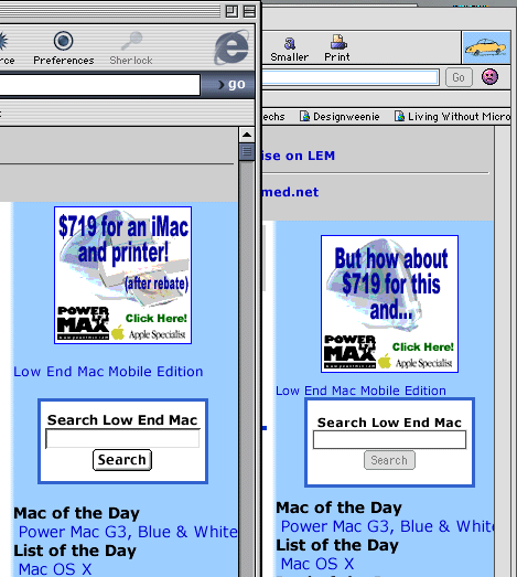
The browser on the left is familiar IE 5. The gray bar at the top of the displayed page is much smaller then on iCab (on the right), and the PowerMax ad is much closer to the top of the navigation bar than in iCab. Interestingly, the search box is much closer to the text above it in iCab. And although I've matched the size of the main type in both browsers, the smaller text for the Low End Mac Mobile Edition and the text in the gray bar at the top of the page is about a point smaller in iCab than in IE 5.
That's not better or worse, does fall within the vagaries of the HTML specification, is definitely different, and argues against trying to make a page display identically in multiple browsers.
For the most part, the differences between iCab, IE 5, Netscape, and Opera are minor, but I've had a real problem with Van's Hardware when using iCab. (Don't even try to view the page with Opera - all the white text displays black against a black background!) Most part of the page render just fine, but sometimes boxed text looks like this:
 vs.
vs. 
The blotchy text is pretty much unreadable, while the IE 5 sample to the right is perfect. But is iCab at fault, or should we look for another culprit? This kind of artifacting sometimes shows up when viewing text on a very busy background, and it's due to the way SmoothType, a shareware alternative to Apple's font smoothing, displays text. SmoothType generally does a better job of displaying fonts than Apple's font smoothing technology - but it has problems in cases like this.
So I did a comparison by turning font smoothing off and then using Apple's font smoothing. Here are the examples:

Comparing the amber and red text in all four samples, I think you'll understand why I've been using SmoothType for years. It does a marvelous job rendering type. But what turns everything so messy when font smoothing (above left) has no trouble at all? I don't know.
By turning off smoothing, the answer become obvious - the text is running right up against the vertical white line on the left. That doesn't happen in IE 5, so SmoothType has no trouble rendering the type beautifully with Internet Explorer. But iCab doesn't provide that extra space around the text, so SmoothType is trying to smooth the fonts with both the black background and that white line that abuts the text. Messy.
The problem isn't with iCab or SmoothType individually, but the interaction of the two in this particular situation. Apple's font smoothing works here, but so does SmoothType when viewing the page with Internet Explorer. Something needs to be tweaked.
As soon as I upload this article, I'll send the URL to the iCab development team, Greg Landweber (the author of SmoothType), and Van Smith, the publisher of Van's Hardware. It's possible SmoothType could be tweaked to address this situation, but the better solution would be for iCab to disallow text running into the surrounding border as IE 5 does.
Or it could be the way the page is coded. It uses several commands I'm not at all familiar with. Then again, I've seen the problem elsewhere; it is not unique to Van's site.
Here's the source code for this text:
<p class="MsoNormal" align="center" style="mso-margin-top-alt: auto; mso-margin-bottom-alt: auto; mso-border-alt: solid yellow .5pt; mso-padding-alt: 1.0pt 4.0pt 1.0pt 4.0pt; border: medium none; margin-top: 0; margin-bottom: 0; padding: 0in">
<i><b>
<font face="Arial" color="#FF0000">Featured Article</font></b></i></p>
<p class="MsoNormal" style="margin-top: 0; margin-bottom: 0"><b>
<font face="Arial" color="#FFFF00"><span style="text-decoration: none">
<a style="text-decoration: none" href="articles/2001/december/011209_AS_Interview/011209_AS_Interview.htm" target="_top">
An Interview with Arctic Silver</a></span></font></b></p>
<p class="MsoNormal" style="margin-top: 0; margin-bottom: 0">
<font face="Arial" size="2">Joel talks with Nevin House, owner of Arctic
Silver, and uncovers many thought provoking facts regarding CPU cooling.</font></p>
It will be interesting to see where things go from here. I love SmoothType, am growing to appreciate iCab more and more, and find Van's Hardware to be one of the better PC-oriented sites on the Web. (PC users deserve good sites, too.) It'll be marvelous to have all three work well together.
We'll post comments as we receive them.
From Van's Harware
Dan discusses a rendering problem when this combination is used to view boxed text on VHJ. It appears the issue occurs because iCab, a beta German browser for the Macintosh, places text directly against the border, confusing SmoothType. SmoothType is font anti-aliasing software for the Mac and is similar to Microsoft's ClearType used on PocketPCs, Microsoft XP, and in Microsoft Reader. I hate to admit it, but out of expediency we produce this site in Microsoft FrontPage 2002. As time permits, we will be developing our own tools and cleaning up the "Microsofted" versions of HTML coughed out by FrontPage like disease-ridden phlegm.