Mac Musings
A Refreshed Look at Low End Mac for 2006
Daniel Knight - 2006.01.02
Welcome to 2006. We've enjoyed our week off, and we've updated our graphics.
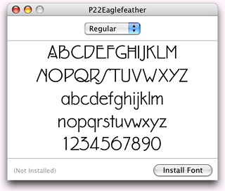
Myriad, the font Apple uses for almost everything these days, is so 2003, as is running words together with alternating colors or boldregular text. With the new year, we're introducing a new typeface for our logo and other headers: Eaglefeather.
Eaglefeather is based on an alphabet designed by Frank Lloyd Wright for the Eaglerock project in 1922. Although the project was never built, P22 adapted Wright's lettering to create the Eaglefeather font, which is available through Type Foundry.
I'd never seen this font before, but I noticed a box marked Frank Lloyd Wright on a shelf in my brother's den. I was helping him with some Photoshop work for his new business and just had to check out the typeface. It was still factory sealed - and I understood why when I saw the Mac OS label on top of the box.
He's a Windows user.
From Floppy Disk to OS X Mac
And we're not just looking at a Macintosh font, but one on a floppy disk. That was a challenge in and of itself. None of my modern Macs have floppy drives, and I don't own a USB floppy drive.
Fortunately, I recently acquired a pair of PowerBook 1400s - more on them later this week - and a pair of floppy drives for them. These nice old 'Books don't support OS X, don't have CD burners, don't come with built-in ethernet.
 I
finally figured out how to move the fonts to my OS X Macs. One
of the two floppy drives could read the floppy disk, so I copied
the files from the disk to a Compact Flash card in a PCMCIA adapter
in the 1400. Then I plugged the CF card into the USB card reader on
my eMac and Power Mac.
I
finally figured out how to move the fonts to my OS X Macs. One
of the two floppy drives could read the floppy disk, so I copied
the files from the disk to a Compact Flash card in a PCMCIA adapter
in the 1400. Then I plugged the CF card into the USB card reader on
my eMac and Power Mac.
This was the first time I'd tried to install fonts on OS X, and I wondered just how difficult it would be. I double-clicked on the font suitcase to see what Eaglefeather looked like, and Font Book offered an Install Font button (right).
Very nice! You can't get any easier than that.
Photoshop 5 and Later
If you work with type and images, Adobe introduced one of the most useful features ever with Photoshop 5.0 - editable text. That's why I bought a previously owned copy of Photoshop 5.5 a couple years ago, and I've used it to make the headers for our computer profiles and columns (such as Mac Musings at the top of this page).
![]() I started with our site logo,
which has a very simplified representation of a compact Mac and our
name in Myriad Bold and two shades of blue (right). We've used this
graphic, font, and color scheme since our 8th birthday last April,
and I wondered how Eaglefeather would work with our graphic.
I started with our site logo,
which has a very simplified representation of a compact Mac and our
name in Myriad Bold and two shades of blue (right). We've used this
graphic, font, and color scheme since our 8th birthday last April,
and I wondered how Eaglefeather would work with our graphic.
![]() Eaglefeather is a much lighter
typeface - even the bold version. As I experimented with type size
and color, I concluded that our old graphic was too heavy for the
new font. In the end, I blew up the graphic by 50% so I could use
Eaglefeather at a large size, and then I made the lines in the logo
thinner.
Eaglefeather is a much lighter
typeface - even the bold version. As I experimented with type size
and color, I concluded that our old graphic was too heavy for the
new font. In the end, I blew up the graphic by 50% so I could use
Eaglefeather at a large size, and then I made the lines in the logo
thinner.
- Logo tip: When working with a logo with strong graphical
elements and solid colors, convert your image mode from RGB Color
to Indexed Color before you resize it. When you resize it,
Photoshop (or any other graphics program) will only use colors in
your original graphic instead of introducing additional shades and
making your simple graphic fuzzy.
I really like the new look. It's lighter, brighter, and friendlier than our old logo and font. Because most of our header graphics had already been created in Photoshop 5.5, it was fairly easy to change the font from Myriad Bold to Eaglefeather Bold (usually 60 pt or 66 pt) and resize the image to fit the new typeface using either Photoshop 5.5 (one of my holdout classic Mac apps) or Photoshop Elements 3.0.
Design Evolution
We've been through a lot of design changes over the years, and last year's big change was moving from a table-based design to one that uses Cascading Style Sheets, at the same time switching from a 3-column layout to 2 columns and eliminating the gray behind the column on the left.
Another change came later in the year, and it was one I'd resisted for a long time. I really liked the idea of a fluid design that would adjust to the size of your browser window, but to really make ouor new design work across platforms (read: to accommodated IE 6 on Windows), we ended up with a fixed width design. Our pages are now 730 pixels wide with a 140 pixel column on the left side of the page.
In some ways, that simplifies a lot of things for us. We can now have graphics up to about 590 pixels wide, something we didn't allow before, since we wanted to work with a wide variety of window sizes. The factors that determined our size:
- Banner ads up to 720 pixels wide.
- A design that works on an 800 x 600 display.
- The main body narrow enough (590 pixels) so visitors with a 640 x 480 display can see the whole width of the text.
We are Low End Mac, after all, and even though only 6% of our visitors have 800 x 600 displays and less than 1% 640 x 480, we want to accommodate them. I even verified that our design is usable in Cyberdog recently, thanks to the PB 1400.
Content Is King
I may get a bit excited about graphics and fonts. I used to work as a book designer, after all. But for most of you, the question is, "What's in it for me?"
Content is king at Low End Mac, and our design takes a back seat to clear presentation of information, whether that's a computer profile or speculation about Macintel hardware. But design never really take a back seat - it enhances presentation. The best design is one you never notice. It's just there and feels natural.
That's something I've always tried to do, and that won't change in 2006. Neither will our commitment to helping you get the most out of your Mac, new or old.