My history with the Mac OS is considerably shorter than my time with Windows, but it is no less interesting. Since I began to use the Apple Macintosh, there have two distinct releases: Mac OS X 10.3 Panther and 10.4 Tiger.
Since its first release in 2001 (with a public beta released the previous year), Mac OS X has had four updates.* These occurred on a roughly 18 month release cycle, with the latest version being Mac OS X 10.4 Tiger, the edition I will use as the basis for my usability study.
I have personally used two versions of Mac OS X, 10.3 and 10.4, and I will describe my experiences with both here.
Panther: Mac OS X 10.3
When I purchased my first Mac in early 2005, Mac OS X 10.3 Panther was preinstalled on its hard drive. Prior to receiving my new Mac and its operating system, I read up on the Mac OS to get an idea of what to expect. Frequently I would hear claims that the software was easier to use than Windows, required less maintenance, and was inherently more secure. These were the things I was looking for in an operating system, and Panther seemed to fit the bill perfectly.
Upon finally receiving my iBook G4 and booting it for the first time, I instantly knew that I was in the presence of something much more advanced than I was used to on the PC. The thing that struck me initially about the Mac OS was its presentation: Aesthetically it was leagues ahead of Windows XP, with a modern brushed metal appearance for windows, vector-based icons that could scale indefinitely, and eye catching graphical effects, such as transparency and zooming, not to mention the stylish system fonts used throughout the OS.
I was impressed by all of these things, but I knew that all this would count for nothing if Panther was lacking in the usability stakes. Thankfully it was this area that would impress me further. In total, I believe it took around 45 minutes to develop a complete mental model of how the Mac operating system worked.
There were several quirks about the way it did things that had me confused. This was not because they were difficult or obscure, but simply because they were different to the Windows way I was used to. For instance, navigation, with all windows having the up and down control buttons located together at the lower portion of the navigation bar. Windows has them at opposite ends, corresponding to up and down.
Exposé
Switching between open applications is also different, not to mention ingenious. Instead of using a task-bar at the bottom of the screen a la Windows, Mac OS X uses a navigation scheme called Exposé [since OS X 10.7 Lion, it is called Mission Control]. By hitting F10 on the keyboard, all of the open windows in all active applications zoom out simultaneously so the user can see them.
To select one, you simply move the mouse cursor over it and click, at which point all of the open windows zoom back to normal size, leaving the selected one in front of them all at normal size – much better than the minimized bar technique employed by Windows, which can be slower due to the time it takes to get the mouse cursor to the bottom of the screen. You also know exactly what is contained in each window, because you can see it, much more useful than the text-based summary you are offered in the minimized task bar button.
Exposé can manipulate open windows in different ways that are accessed with other function keys. You can be shown only the windows related to the application you are currently in, or you can have all of the windows pushed away to get you to the desktop. In essence, there is no minimizing in Mac OS X; indeed, the Windows-trained mind has a distinct need to minimize windows you’re not using, and this was how I felt initially. But with Exposé I realize that there is no point in minimizing: If I can’t see a window behind the active one, how does reducing it to a small bar at the bottom of the screen help me?
The Dock
Another handy feature I discovered early on in my Mac OS X induction was the Dock. Praised and maligned in almost equal amounts by some sections of the Mac community, the Dock sits at the bottom (or side, if you so choose) of the screen and mainly serves as a place to keep all of the your favourite applications. When you click on the icon of the app you want to run in the Dock, it bounces up and down, indicating that it’s loading. You can switch between running applications in the Dock by clicking on them, and the selected application takes over the screen accordingly.
The Dock is a program launcher and application switcher.
The Dock basically saves you having to navigate through the OS folder hierarchy to find your application. In Windows terms, it’s like having the applications sections of the Start bar constantly open at the bottom of the screen. I found the Dock to be very useful, and subsequently I placed all of my favourite apps in there for quick access – this resulted in a very large Dock.
To be honest, I’ve had usability issues with the Dock, the main one being accidentally clicking on something in it – and therefore launching that program. This can be annoying, as slips of the hand are common while operating a trackpad. However, this can be avoided by adjusting the settings in the System Preferences menu, where you can limit or maximize the usage of the Dock.
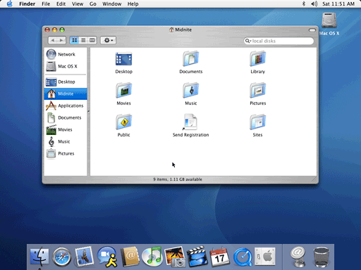
The Finder
One thing that has been a stable with every release of the Mac OS since 1984 is the system’s file browser, called the Finder. The Finder has evolved through each Mac OS version, and by 10.3 it had become a highly customizable and versatile feature. The Finder was probably the first Mac OS feature I had to use, as I need it to access anything that is on the Mac’s hard drive. At first, its differences with the Windows equivalent (Windows Explorer) meant that a little practice was needed before I was able to use it to its maximum.
In the Windows world, people don’t really appreciate Windows Explorer as a separate entity to the operating system itself. Windows Explorer is rarely referred to by name – far less than the Finder – and when I used it, I probably used perhaps five or six of its features. The features were only there to help me find what I want more quickly, and the three options I probably used the most were the delete file, list view, and new folder commands.
The Finder, on the other hand, is far more powerful. Instead of being a mere window that pops up and displays the folders and files within, you have a permanently running window with shortcuts to your favourite locations, built in search mode, scalable icons, and various view types. It’s kind of like a combination of the Start menu, Windows Explorer, and a web browser, with the intention of letting you surf through the contents of your hard drive easily.
The Finder, the Mac’s file browser, is one of its oldest applications.
It was perhaps the additional features that initially staggered me upon my introduction to the Finder. I was never presented with so many options in a file browser, but now I appreciate having them.
It’s the customizability of the Finder that I like. From my point of view, it’s great to be able to add buttons for my most often used functions to the tool bar. Or to add the most frequently accessed files to a separate column down the left hand side. Even burning a few files to a CD can be done directly from the Finder with a couple of mouse clicks, much more convenient than having to be taken through a wizard.
Also, being a person who likes to keep things tidy in my life (including my computer), I don’t need to clutter the desktop with dozens of my favourite folders and files; the Finder and the Dock keep them all in one place. Sure, I could add all of this functionality into Windows XP, but I would need to download additional software or wade through several control panel screens to do it. The Macintosh has all of this by default.
Tiger: Mac OS X 10.4
A few months after I purchased my first Mac, Apple released another iteration of Mac OS X. This was version 10.4 Tiger. Claiming to have over 200 new features over the previous version, I was able to upgrade immediately upon release due to an Apple Promotion that meant Macs purchased in early 2005 were eligible for a free upgrade to Tiger. Obtaining the Tiger install DVD and subsequently upgrading my OS, I was able to explore the new features and see which ones worked for me. I was already aware of most of the new technology included in Tiger, as I had read all of the press surrounding it in various Mac-centric magazine, and I was looking forward to actually using them.
The Dashboard
In the end, there were a handful of the new features that I actually ended up using regularly. One of these features is Dashboard. Dashboard is a mini application layer that is used to host mini-applications or “widgets”. With the press of a function key, the Dashboard fades over the top of everything else on the screen, and on it are displayed small dedicated applications, each one designed for a specific function.
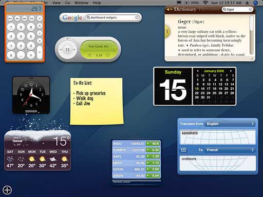
The Dashboard in Mac OS X 10.4 Tiger
On my Dashboard I have a dictionary, a currency converter, a TV guide, a weather report, and several other widgets. For what at first seemed like quite an unassuming extra in Tiger, its usefulness grows with the addition of each widget, providing you with any piece of information you require at the click of a button. Although it is possible to access any of the data offered by Dashboard widgets through a web browser, it is far quicker and more convenient to use Dashboard to access such data. It is probably my favourite feature of OS X Tiger, and its standing as an impressive attribute of the OS is further enhanced with the nice little graphical effects that occur when widgets are moved and manipulated on the dashboard.
Spotlight
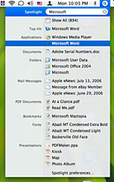 Another feature that I use often is Spotlight. Spotlight is accessed by clicking on the magnifying glass in the top right hand corner of the screen in the menu bar. It is used to find any kind of file or folder on your Mac hard drive. A much more primitive search is used in Windows XP and previous versions of the Mac OS, but these are slow and not very accurate.
After Spotlight has fully indexed a Mac’s hard drive – a process it undertakes in the background upon a fresh install of Tiger – you can type in any kind of text, number, or symbol, and Spotlight will search your hard drive for any files or folders matching the input either in name or content.
It works so fast that the initial results are presented while you are still typing the keyword. It is incredibly useful, as I often find myself looking for files that were saved without remembering where the save was created. Its functionality can be increased by using combinations of symbols with keywords to perform specific searches, such as those within Word documents or in the metadata of an MP3 file. With a tool like Spotlight, it’s impossible to lose a file on your hard drive. As long as it exists, Spotlight will find it seconds.
These are the two main new features that I have used in Mac OS X Tiger; others include a web browser called Safari 2, the ability to create smart folders that dynamically update according to a set of attributes, the Apple Mail email client, and the new version of QuickTime, version 7.
Viva La Difference
My overall experience with the Mac OS is one of enlightenment: I was already completely converted upon using OS X Panther, and with the addition of the extra features I regularly use in the latest version, I am now a complete Mac evangelist. For me, the advantages of the Mac OS over Windows are too compelling to ignore, and on the rare occasions that I’m forced to return to the Windows environment, I miss the functionality of Tiger.
For the most part, the big features I have mentioned in Mac OS X do not have equivalents in the Windows world, and where they do, I find them to be unwieldy copies.
No Mac OS X Viruses
Of course, I have not mentioned one of the biggest advantages of the Macintosh – the almost total lack of computer viruses. [Editor’s note: A few “proof of concept” OS X viruses exist in labs, but none have successfully spread in the wild. As noted on the ClamXav.com (a free anti-virus program for OS X) home page, “Today, the number of viruses actively attacking OS X users is . . . NONE!” dk]
I have one virus scanner program for OS X, and I use it to weed out the Windows-centric viruses that sometimes get downloaded to my Internet cache. They are harmless to my Macintosh, but should I inadvertently pass them on to a Windows using friend, it would be very irresponsible of me, hence the virus scanner. I even have a folder on my desktop containing the viruses that have been found. I find it amusing to keep a collection of malicious files that are harmless to the Mac OS X but would easily be able to disable a Windows PC.
System Maintenance
The other massive advantage is maintenance. On a PC, I was forced to periodically scan the hard drive for errors, sometimes in addition to a time consuming defragmentation procedure. More time would also be spent scanning the computer for viruses and malware, a process that required running two or three applications to cover every threat. On the Mac, you don’t need to perform any of these tasks. Every time I install a new program, OS X automatically optimizes the space on the hard drive, as well as performing automated maintenance tasks that are transparent to the user.
The only kind of computer “spring clean” I need to partake in is to “repair disk permissions”. If I feel the Mac is becoming sluggish for seemingly no reason, all I do is repair the permissions using a handy tool called Disk Utility (built into OS X). This only takes a minute of my time and can be performed in the background. Sure, I do have a virus scanner that I do run a scan with fairly regularly, but I do this out of choice on my Mac; on a PC it’s a necessity.
Usability
Finally, there are few little usability quirks that I love about OS X. They make the whole experience of computer use far more pleasant.
Installing an application is a simple case of obtaining the application, opening the device it’s on in a Finder window (be it a CD or DVD), and dragging and dropping its icon into the Finder’s Applications folder. All of the necessary files are copied accordingly, and voilà, the application is installed. No lengthy wizard or cryptic install procedure common to PCs.
To delete the application, all I need to do is drag and drop the offending program’s icon into the Trash.
This is true of most programs, but some of the larger ones (such as those made by Adobe and Microsoft), sometimes requires you to go through a Windows-like wizard procedure. This is most likely due to complexity of the applications themselves, with lots user input needed to hone the installation to the users taste. Still there is never a need for the OS to restart once installation is complete.
This describes the experiences I have had with both Windows and Mac OS X. In general, it is usability issues that determine my OS of choice. In this case, the Mac OS caters to my usability needs better than Windows.
All in all, they’re both very close in terms of functionality, but it is the extras that the Mac OS provides that gives it the edge for me, as well as the millions of other Macintosh users.
What About Leopard?
Mac OS X 10.5 Leopard could potentially throw a spanner in the works. I’ve begun using it, but I’ll save that for another article.
* This article was originally written before the release of Leopard.
Trevor Wale originally wrote this as part of a project at school. We’ve adapted it for use on Low End Mac and broken it down into a series of articles encompassing Trevor’s years with Windows and his switch to the Macintosh. dk
Keywords: #macosx #osxpanther #osxtiger #expose #finder #spotlight #dashboard
Short link: https://goo.gl/8Mqyzl