If you know anything at all about the history of keyboards, you probably know that the QWERTY design – so named after the first six alphabetical keys – was deliberately designed to avoid jamming typewriters. Ideal or not, it’s been the standard keyboard layout in the English-speaking world for 130 years.
The only alternative layout that has made even a little bit of headway against the QWERTY layout has been one designed by August Dvorak, which was intended to improve typing efficiency. Despite the “improved” design, neither side of the QWERTY-Dvorak debate has been able to conclusively demonstrate any superiority over the other layout.
That’s because the QWERTY layout was never intended to slow down typists – a common accusation from Dvorak supporters – but to allow them to type quickly without jamming the keys in their typewriters. In other words, QWERTY was designed to be efficient, too.
Of course, computer users don’t have to worry about keys jamming, but there was no reason to change something everyone was used to, so computers adopted the same key layout as typewriters. (This varies around the world. QWERTY was designed for English, and other layouts work better for other languages. Still, computer keyboards follow the dominant typewriter layout for a given language, adding whatever additional keys are deemed important to computer users.)
Perhaps someday we’ll have a universal keyboard for languages that use the Western European character set, complete with accents, umlauts, cedillas, and a variety of currency symbols, but I don’t expect that to happen any time soon.
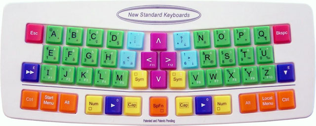
Or maybe it will. The “New Standard Keyboard” addresses the issue of key layout by subsuming ergonomics and typing efficiency for the sake of the hunt-and-peck typist. The New Standard Keyboard puts the text keys in alphabetical order, frustrating QWERTY and Dvorak users alike.
If you think the concept of an alphabetical keyboard is lame, just check out the actual product. It looks like it was designed for preschoolers:

Despite the garish color scheme and the bizarre decision to put keys in alphabetical order, the New Standard Keyboard is innovative. It rethinks almost every aspect of the keyboard – other than the square shape of the keys.
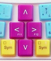
This is a compact keyboard, because there are no function keys, navigation keys, number keys, or even a traditionally wide space bar. There’s not even a standard numeric keypad. All 26 letters are there, along with punctuation, Shift and other modifier keys, and a centrally located set of arrow keys.
It’s obvious that a lot of time, thought, and research went into this project. The keyboard has an ergonomic design without the odd humps and weird shapes seen in too many ergonomic designs. The keys are aligned to match the natural movements of fingers. And each of the modifier keys appears on both sides of the keyboard.
 My favorite feature is the location of the arrow keys between the right and left hands – no more need to move your right hand to use them. Clever, and both more intuitive and space-efficient than the inverted T found on most extended keyboards.
Still, it’s not going to fly – simply because it’s too different and over-designed. Typists might accept one or two changes in their keyboards, adding others over time, but a completely new key layout, the lack of number and function keys, no Home or End keys, and the childish color scheme are too much. (Update: New Standard Keyboards has since introduced a “professional” model with black keys.)
There’s no way the New Standard Keyboard is going to become the standard anywhere. QWERTY isn’t going away any time soon, and if people are going to accept the other improvements this keyboard may offer, they won’t consider it worth the time required to learn and entirely new layout.
The keyboard has to function in the real world, where people use numbers, function keys, navigation keys, and even dedicated sleep, email, volume, and other keys. The New Standard Keyboard flies against the wind of more functions on the keyboard.
That said, perhaps others can learn from it. Many long for smaller keyboards, gladly dispensing with numeric keypads and a full complement of navigation keys to keep the mouse closer at hand.
The slightly angled keys make for a more ergonomic design than most of us have, and with the minimal curvature it might even be practical to apply some ergonomic design to laptop keyboards.
Overall, I give the New Standard Keyboard an A for effort, an A for execution, an F for use of color, and a D for practicality. I’ll be sticking with my unergonomic QWERTY keyboards for a while longer.
Update: The New Standard Keyboard has been discontinued
Keywords: #keyboardlayout #keyboardredesign #newstandardkeyboard
Short link: http://goo.gl/Llk9MU

