Last week I talked about some of the advantages that BeOS has over Mac OS X. When Steve Jobs first demonstrated Mac OS X, Mac users got a taste of their own medicine – we’re used to having a superiority complex.
![]()
 Remember that comment we used to make when Windows 95 came out: Windows 95 = Mac 84. Well BeOS users reused it, saying that Mac OS X = BeOS Preview Release 3. It’s true that BeOS has some slick features that run smoothly on older Macs, but every time I used it, I still end up going back to the Mac OS.
Before I go further, I should point out that the last version of BeOS that I have used is 4.5. I never got around to upgrading to version 5.0. Version 5.0 has a free option that can be downloaded from the Internet, but the free version only works on PC hardware. Mac users need to buy the professional version; it costs money. I’ve used versions of the Mac OS from System 6 up to Mac OS X.
User Interface is one area where Mac users are notoriously picky. We’re accustomed to elegance, simplicity, beauty, and logic. The Mac interface is imperfect, but it seems to be the best one available. Coming to the BeOS with those expectations, I was disappointed.
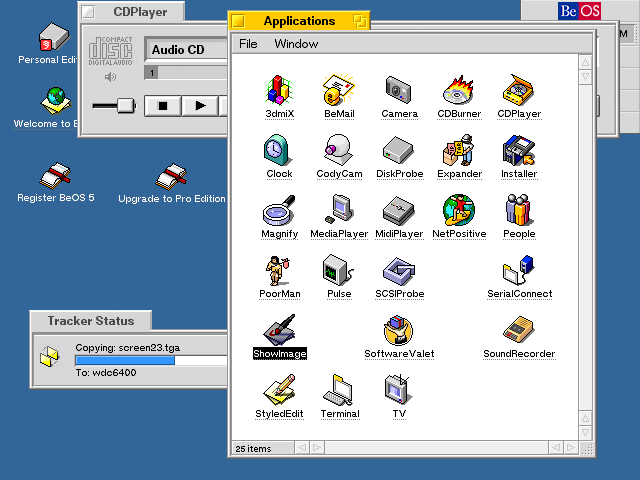
When Be designed BeOS, they tried to start afresh with modern underpinnings. They succeeded brilliantly with the technology but dropped the ball on the interface. They picked various interface options from the Mac, from Windows, and even from X Windows on Unix.
The problem is that the interface seems somewhat patched together. BeOS doesn’t have all those years of minor refining that makes the Mac such a pleasure to use.
For example, a BeOS website used to advertise itself with the slogan, “Little. Yellow. Different.” Instead of having a title bar that covers the whole top of the window, Be used little yellow tabs. The yellow immediately sets BeOS apart from all the grays and blues of other operating systems. One neat feature was that you could slide the tab if you held the Shift key down, so you could stack several windows on top of each other with tabs in different places, much like the interface of Apple’s website. That would be fabulous, but when you close the window or restart the computer, BeOS doesn’t remember where you slid the tab – so they all get stacked on top of each other next time. It is a little detail, but it matters.
Fonts lack some of the Mac refinement, as well. Starting with Mac OS 8, Apple allowed users some limited ability to change the system font. The Mac OS only allows a few fonts to be used as the system font (unless you hack the system with ResEdit), but the fonts that are allowed are all topnotch fonts.  Even Sand (what was Apple thinking with Sand?) is a seamless replacement for Chicago.
Since I wrote last week’s article on BeOS, I’ve gotten three separate requests from folks who loved Gadget and wanted to use it on a Windows computer. (No, you can not convert Gadget to work on a PC. None of Apple’s System Fonts can be converted, as far as I know.)
In BeOS, users can easily change the font and size without resorting to ResEdit. But that flexibility is superficial – most fonts do not work well, and many are downright ugly. If you choose a size that is too big, your dialog boxes will have text that gets cut off. You have to manually try the options to see if they work well.
BeOS commits the sin of allowing the user unnecessary control. I love the ability to tweak, but the OS should prevent me from doing something that isn’t going to work. The Mac OS specifically limits the fonts that work as the system font, but you can be sure that these fonts work without flaws.
Another flaw in the BeOS interface is the Be Menu. Be wanted to have an equivalent of the Apple Menu but wasn’t sure what they wanted it to do. Over the early releases, BeOS used the Be Menu in different ways. Third party programmers didn’t know if they should put commands in the Be menu or not. The Be Menu lacks consistency and seemed to serve several purposes.
Truth be told, this has been a problem with the Mac that is just getting fixed with OS X. Where is the Preferences command for you current program? Is it in the File Menu, Edit Menu, Options Menu, or somewhere else? Left to their own devices, programmers put it it different places, which lowers user efficiency. The Mac OS is flawed, too, but it has more consistency than BeOS. Quit, Copy, Save, New, Close, Print, and Undo are always where you expect them.
Another detail that matters is the menu bar. If you read much about interface, you’ll find that the edges and corners of the screen are especially important. There’s a principle that the amount of time it takes to pick a target depends on the distance and size of the target. For instance, a person will be slower with a lot of small buttons than with a few large buttons.
Corners and edges of the screen are unique, because they are infinitely large. No matter how far you move your mouse up, once it hits the top of the screen, it stays there. It’s this interface concept that makes the Apple menu work so well. I can flick my mouse up and left to get the Apple menu. I can never overshoot it.
One of the most important successes of the Mac interface is the menu bar at the top of the screen. The top of the screen makes the menu bar “infinitely tall,” so it is easy to pick. Windows and BeOS puts the menu bar in a window that can be moved around. Even though it may take up the same number of pixels, the Windows and BeOS menu bar is effectively smaller because it doesn’t include an edge of the screen. Without an edge you actually have to watch your cursor instead of just flicking the mouse in the general direction that you want.
Some people may look at the preceding paragraphs and think that these are just my opinions or that I am biased to the Mac way, since I used Macs before I tried BeOS. But the evidence of a variety of studies in interface research show that a menu bar at the top of the screen is empirically better. You can read more about the science of interface design by reading Bruce Tognazzini’s website. He used to work for Apple and has studied how to make computer interfaces as efficient as possible.
When BeOS came out, it had the chance to learn from the mistakes of Apple, Microsoft, and Unix and create something that was original and compelling. BeOS was designed for geeks, and its underlying architecture is brilliant. While that focus on geeks helps with buzzwords like a journaling file system and pervasive multithreading, it hurts the interface by patching together disparate interface features. Those features may have been cool to program, but they don’t make a cohesive experience.
In some ways BeOS is the exact opposite of the Palm OS. The Palm OS has dozens of built-in limitations, but its interface makes people feel at home. Indeed, I know several people who don’t like technology but absolutely love their Palm. (The Palm OS was inspired by the Mac OS.)
BeOS has one of the most technologically advanced foundations around today, but the interface just doesn’t add up that well.
In future articles, I’ll talk a bit more about using BeOS on an older Power Mac.
Further
- BeOS or NeXT: Did Apple Make the Wrong Choice?, 2001.04.16. Did Be really have the better operating system for the PowerPC?
- BeOS or NeXT: The Right Choice, David Puett, 2001.04.18. Another look at BeOS – and why Apple did right to choose NeXT instead.
- BeOS and BFS, 2001.04.20. “BeOS does things a bit differently than the Mac OS or some other OSes.”
- Using BeOS on a Power Mac, 2001.04.30. BeOS is inexpensive and easy to install. Why you might want to try it.
- NeXT: Apple’s Right Choice, 2001.05.07. Why choosing NeXT instead of Be was the right move for Apple.
- BeForever and BeNews, two BeOS Web sites.
Keywords: #beos
Short link: http://goo.gl/cRf3bV
searchword: beosinterface


I always thought the Be menus should have stacked into tabs when you dragged one windows tab on top of another