Some Panther screen shots were posted on the Web over the weekend
and mirrored from one site to another as Apple legal worked to shut
them down. To avoid such problems, we've scheduled this article for
release at the start of the WWDC keynote address.
I copied these Mac OS X 10.3 images to my hard drive so I could
examine them, but I won't be mirroring them on Low End Mac. We'll have
the full scoop on Panther soon enough, but I do want to discuss some of
the things I noticed, and I'll use reduced images or pieces from a few
of the Panther screen shots to illustrate things.
The first thing I noticed is that the striped Aqua look has been
seriously toned down, which I see as a huge improvement. I never
understood why Apple put them there, and maybe they'll disappear
completely with 10.4. (Based on these images, rumors that Apple would
go to a systemwide metal appearance have been proved wrong.)
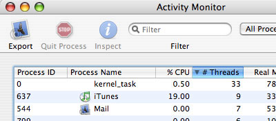
Here's the new appearance, as shown in this snippet from the
Activity Monitor, which seems to combine the functions of the CPU
Monitor and Process Monitor:
The stripes are absent from the top bar and very subtle - almost
invisible - in the rest of the window. Also note the iTunes-like use of
blue bars behind alternate items in the list of processes. Apple just
keeps evolving the GUI, almost always for the better.
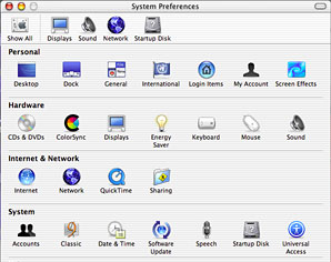
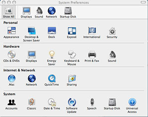
Apple also appears to be changing the names of some System
Preferences, as shown in the Jaguar and Panther screen images
below:
At the top, Apple now puts a gray background behind the selected
category, in this case Show All. A nice touch. In the Personal row,
General becomes Appearance, Desktop and Screen Effects merge into
Desktop & Screen Saver. Security seems to replace My Account, but
we'll have to wait for Apple to tell us more about that.
In the Hardware row, ColorSync is gone, probably incorporated into
Displays. The separate Keyboard and Mouse merge into Keyboard &
Mouse, and a new item is added, Print & Fax. I suspect this will
provide easier access to the Print Center, something long overdue in
OS X.
Nothing changes in the Internet & Network or System rows.
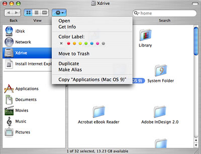
Apple also seems to have a new type of Finder window, as illustrated
below:
I like the way this view separates physical space (drives) and
structural space (Applications, Documents, etc.). Just how this works
remains to be seen, but it looks powerful.
I'm also very grateful to see labels return to the Mac OS, since
I've been using them for years to color code the files on Low End Mac
by the year of publication.
I'm sure there will be other improvements to the OS as well, many of
them "under the hood" and invisible to the user. Overall it looks like
Apple is responding to complaints and suggestions from OS X users
and making Panther a bit friendlier and a bit easier to migrate to than
even Jaguar.
That even goes so far as to replace the intrusive circular "virtual
remote control" for the DVD player with a much more compact, clearly
labeled replacement:
I've never liked the round controller, which seemed to get in the
way no matter where you placed it. The new control pad seems small
enough to sit below a picture box movie.
Kudos to Apple for yet another small improvement. It's things like
this that will convince Jaguar users to make the upgrade and entice
classic Mac OS users to migrate to OS X. It's getting better all
the time.
Page not found - Low End MacLow End Mac
Welcome Image and Text
A time-tested, Ad-free, 0% AI-Generated, community-oriented Apple gear resource.