1998: Some machines are designed to do a simple job simply. The best even do it with elegance.
But some make you wonder what their creators were thinking.
I have a long-term love/hate relationship with ATMs. They’re so convenient: available 24 hours a day (except when you need cash), there’s rarely a line (unless you’re in a hurry), and they don’t do handle the slow transactions that people need tellers for.
Banks sometimes go out of their way to make things convenient – sometimes for you, sometimes for themselves. I still miss $5 bills in ATMs, and I really hated it when my credit union stopped putting $10 bills in its ATMs. (The bank I’m with now still puts in $10 bills.)
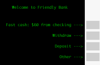
The latest convenience is the fast $60 cash withdrawal from checking. Pop in your ATM card, enter your PIN, and hit one button. The ATM asks if you want a receipt, then give you your money, your card, and your receipt (if you asked for it).
But say you want $70. After logging on, you press the Withdraw button. Then you choose From Checking. Then you type in your amount. 7-0-0-0 plus Enter.
Well, sometimes that’s $70, but sometimes it’s $7,000 – if the ATM is overly friendly and knows you can’t withdraw change. Of course, some work one way, some the other.
Then there are the ones that ask if I want to handle my transaction in English or Spanish. One more button to push.
I appreciate the cultural sensitivity, but I just want to do my transaction and drive off.
Of course, the other problem is that they seem to have a real problem lining up the text on the screen with the buttons sitting next to the screen. If you’re in a van, you look down, and they line up one way. In a sedan, you’re much lower, and they seem to point somewhere else.
Frankly, that’s because most ATMs are living in the dark ages of text terminals while the entire computer world (*@&%#$ IBM AS/400 and a few other models excepted) has gone graphical.
Why not a graphical ATM? Instead of a small text arrow that looks like


This eliminates the need for the tiny ASCII arrows, gets rid of the dark green phosphors, and could eliminate burn-in by running bank ads as screensavers.
While they’re at it, banks should make the dumb terminals a bit more intelligent. When it scans my card, it should recognize my card number, look it up, and know that I always choose English (given the choice) and that I usually take $70 from checking on payday. Use some of that computer intelligence to do more than say “Hello Daniel Knight” after I enter my PIN.
And while they’re doing that, how about a little more speed? I swear the 300 baud modem on my VIC-20 was faster.
Put in the card. Wait. Enter my PIN. Wait. Choose English. Wait. Choose Withdraw. Wait. Type in $70. Wait. Tell it I want a receipt. Wait and wait and wait. Hear it put cash in the drawer. Wait for the drawer to open. Take your cash. Wait and wait and wait for it to recognize that I’ve removed the money. Tell it I’m done. Wait for it to spit out my card and print my receipt.
Press one wrong button and wait even longer while you undo it or start all over again.
ATMs may be convenient, but they can also be frustrating.
This is one case where computers could serve us better with an improved interface – and it doesn’t even require a mouse or pull-down menus.
Update: ATMs have come a long way since 1998. Touch screens. Big, full color touch screens. More options. More intelligence. You can even teach them how much you want to take out as your “quick” withdrawal!
- Follow up: Automatic Frustration Machines, Part 2.
keywords: #atm

