Mac Musings
Good Design, Bad Design
Daniel Knight - 29 February 2000 -
I've been using Macs since 1986, starting with the Plus and moving right up through the G4/450s I set up over the weekend. Each is a mixture of good design and bad - sometimes very bad.
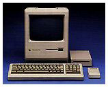
The first Macintosh (1/84) was elegant. The keyboard plugged into the front using a coiled cable like a telephone handset does. The mouse plugged into the back and had a straight cable. The high speed serial ports were on the back of the computer. The crisp 9" b&w display was built in. There was a knob to adjust brightness on the front of the computer. Except for very limited memory and expansion, it may have been the best designed Macintosh ever. The mouse and keyboard were chunky, but it was a very polished design.
The only failings were that the speaker volume could only be controlled through the Control Panel, not from a knob or slider - a situation which persists to this day - and the power switch could be a bit difficult to find while seated in front of the computer. These are pretty minor.
 Apple improved the memory situation with the
Fat Mac, then went a step
further on memory and expandability with the Mac Plus (1/86), which added SCSI to
the equation.
Apple improved the memory situation with the
Fat Mac, then went a step
further on memory and expandability with the Mac Plus (1/86), which added SCSI to
the equation.
Then came the Macintosh SE (3/87), which had room for an internal hard drive and even an expansion card. The SE and Mac II also introduced the ADB port, which was used for the keyboard and mouse. Unlike earlier Macs, the keyboard now plugged into the rear of the computer. I think that was a step backwards, but allowing the mouse to plug into the keyboard was brilliant. However, ADB doesn't lock in place. You wouldn't believe how many Macs I've "fixed" be reseating the ADB cable.
The boxy Mac IIs, followed by more compact models, were also examples of good design. NuBus expansion was pretty much plug-and-play, as was SCSI. But starting in 1990, Apple began to make design compromises in the name of economy.
The Classic (10/90) replaced the SE at a very attractive price, but eliminated the brightness knob, forcing users to change brightness through software. At the same time, memory upgrades required a special card, not just extra SIMMs.
At the same time, Apple introduced the Macintosh LC, which was a cleverly compact modular design. One way Apple saved money was by eliminating the soft power feature which allowed users to start the computer from the keyboard. It was a good move in terms of reducing the cost of building the computer, but it broke with Apple's tradition of starting modular Macs from the keyboard.
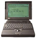 Apple revolutionized laptop design
with the PowerBook 100, 140, and 170 in
October 1991. The first obvious difference from DOS laptops was
moving the keyboard back toward the screen, but the big innovation
was building a trackball into the wrist rest. The power key was on
the back of the computer, where it was covered by a hinged door,
which also protected all the ports except the power plug.
Apple revolutionized laptop design
with the PowerBook 100, 140, and 170 in
October 1991. The first obvious difference from DOS laptops was
moving the keyboard back toward the screen, but the big innovation
was building a trackball into the wrist rest. The power key was on
the back of the computer, where it was covered by a hinged door,
which also protected all the ports except the power plug.
Although the ports were protected, this also meant the door had to be opened constantly. In most cases, it eventually broke off. One clever company overcame this design flaw by creating a replacement door that left both the power button and the modem port accessible. Except for that stupid door, the PowerBook design was practically perfect in every way.
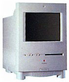 Apple introduced the first compact Mac
with keyboard startup, the Color
Classic (2/93), which may have been a high point in Apple
design. In addition to keyboard power, the Color Classic had
buttons on the front for setting volume and brightness. Very
smart.
Apple introduced the first compact Mac
with keyboard startup, the Color
Classic (2/93), which may have been a high point in Apple
design. In addition to keyboard power, the Color Classic had
buttons on the front for setting volume and brightness. Very
smart.
The Centris 610 came out at the same time. It eliminated soft-power (like the earlier LC series) but moved the power button to the front of the computer. Smart? I thought so, until I saw a PC user attempt to eject a floppy by pushing the power button. Ouch. Bad move, Apple. A power button on the front makes sense, but it has to be moved away from the floppy drive to avoid confusing PC folk. The Quadra 610, 660av, and Power Mac 6100 all share the same flawed design.
Another design flaw with this case: if the keyboard is propped to its highest setting, the CD drawer crashes into it.
With the Quadra 800 and 900 (both 2/93), Apple managed to create two powerhouse computers in some of the most difficult to work with cases since the early all-in-one models. These cases persisted for years, used for the Quadra 840av, Quadra 950, and Power Mac 8100, 8500, and 9500.
Jumping ahead a few years, Apple introduced the Power Mac 7200 and 7500 with one of the most brilliant case designs until the drawbridge G3. The cover could be pulled forward after pushing up a couple tabs. The part holding the drives was hinged and flipped to the right, providing quick access to the motherboard for memory upgrades or battery replacement.
But the epitome of modular Mac design was the Blue Power Mac G3 with it's drawbridge design. Apple made a few internal improvements with hard drive configuration, but the basic design of a motherboard on a fold-down door remains brilliant. The current Power Mac design is nearly perfect.
But not quite. My Umax SuperMac J700 and S900 have one clever feature Apple missed: the microphone and headphone jacks are on the front of the computer, not hidden around the back. These SuperMac cases are a real bear to get into, but the front-mounted jacks make it easy to connect and disconnect my Jabra combination earphone/microphone.
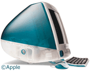 Then there's the iMac,
which was nearly perfect. It was a nightmare to upgrade memory, but
Apple has fixed that in the new design. It was a bother to get at
the ports on the side behind the stupid plastic door, but again,
that's something Apple has fixed with the current iMacs. In fact,
putting most connections on the side of the computer instead of
around the back was a brilliant move. And the iMac has always had
two headphone jacks on the front - very smart.
Then there's the iMac,
which was nearly perfect. It was a nightmare to upgrade memory, but
Apple has fixed that in the new design. It was a bother to get at
the ports on the side behind the stupid plastic door, but again,
that's something Apple has fixed with the current iMacs. In fact,
putting most connections on the side of the computer instead of
around the back was a brilliant move. And the iMac has always had
two headphone jacks on the front - very smart.
But it's not perfect. The round mouse is something most of us would rather avoid, and the keyboard isn't much better. Those can be fixed with third-party mice and keyboards, but the iMac's remaining flaw (and it is a very small one) is how the power cord is connected. It's a real nuisance to plug the cord into such a deep recess - and if that's the biggest design complaint, Apple really has done their homework.
Still, there are things Apple could do to improve future designs. The option to change volume with a knob, slider, or buttons tops the list - this should not be a software only setting. And for those who use a combination headphone/microphone, putting both those connections on the front of the computer would be a very nice touch.
Finally, it would be very convenient of the Power Mac had a single USB port on the front or on the side near the front, making it much easier to temporarily connect a Compact Flash reader, game controller, etc. Reaching around the back of that box to find the USB port is a nuisance. And maybe they could put a FireWire port on or near the front at the same time.
Still, despite a few shortcomings, AppleDesign remains miles ahead of what you'll find in the Wintel world. Shoot, most of those things don't even know how to eject a disk when you unmount it, something Macs have done since 1984. I guess Apple has room for improving their hardware design, but it's a lot less room than you'll find on the Windows side of the street.
Join us on Facebook, follow us on Twitter or Google+, or subscribe to our RSS news feed
Dan Knight has been using Macs since 1986, sold Macs for several years, supported them for many more years, and has been publishing Low End Mac since April 1997. If you find Dan's articles helpful, please consider making a donation to his tip jar.
Links for the Day
- Mac of the Day: Power Mac G3, introduced 1997.11.15. The first G3 Power Mac and the last Mac in a beige enclosure.
- Support Low End Mac