Long before they invented personal computers, I was a math geek. My favorite book on the subject was the Mathematics volume in the Time-Life Science Library. I’d spend hours reading about magic squares, the Pythagorean theorem, different number systems, and more.
 The ability to count, measure, and analyze things using predictable tools fascinated me. It still does, particularly as far as human behavior is concerned. (I was also a huge fan of Isaac Asimov’s Foundation trilogy, which premised the science of psychohistory, which combines history, sociology, and statistics to make predictions of the collective actions of very large groups of people.)
Two articles I came across today make interesting use of mathematics, one on broadband usage trends and the other on “phantom” traffic jams.
Broadband Is More Popular and More Expensive
Ars Technica’s Jacqui Cheng looks at a report that finds that after declining from 2004 through 2008 (from $39 per month to $34.50), the average broadband price in the US went up in 2009, back to $39. Considering the state of the economy and the push by NetZero and others toward low-end dial-up service, this is a bit of a surprise.
Fortunately, that’s not the only thing the Pew study examined. It also found that broadband adoption grew at a slightly lower rate last year than the previous year, and it also looked at the mix of broadband services. This is where it gets really interesting.
The big loser in broadband is DSL, which dropped from 49% of the market in 2007 to 33% at present, a drop of nearly one-third. Cable grew slightly, going from 39% to 41%. The big gain came in wireless and satellite broadband, which more than doubled from 8% to 17%. Fibre is making inroads and now accounts for 5% of the broadband market.
It’s a shame the study doesn’t separate satellite and wireless broadband, as they tend to serve different markets. Satellite access is usually for remote locations where wired broadband isn’t readily available and the population density doesn’t make wireless broadband feasible yet. It is also tied to a fixed physical location. Wireless broadband – which includes 3G, WiMax, and other options – may be tied to a fixed location or it may be pervasive, particularly AT&T Edge, which was the only option for the original iPhone.
Analysis
My guess is that the most price sensitive broadband users have been using DSL and continue to do so or have scaled back to dial-up until their economic situation improves. Those frustrated by DSL’s slow throughput compared to most cable broadband have been switching to cable and, especially since the introduction of AT&T U-Verse, fibre where available.
Satellite broadband tends to be quite expensive, and I doubt it is growing very much, but between Edge, 3G, WiMax, 802.11x, and other options, wireless broadband is just beginning to come into its own.
What seems to be happening is that people are moving away from slower, less costly services to faster, more expensive ones. An extra $5 per month (on average) for twice the data rate or better can be very attractive, especially with more high bandwidth content on the Internet than ever before. And the most price sensitive broadband users, those who may have been using AT&T’s $15-30/month DSL, are the ones most likely to drop back to $10/month dial-up.
In short, the findings shouldn’t be surprising.
Phantom Traffic Jams
I’m sure you’ve run into it – you’re tooling down the highway with moderate traffic, and all of a sudden you have to slow down. “Must be an accident,” you think to yourself, but when you reach the end of the congestion, there’s no sign of one.
You’ve experienced what they call a “phantom” traffic jam, and traffic engineers have been trying to understand them for decades. Fluid dynamics have allowed the gurus at MIT to mathematically model phantom traffic jams, which occur because everyone is driving at a slightly different speed, and as traffic levels increase, so do the waves of congestion.
Speed and traffic density are two significant factors in predicting phantom traffic jams, and engineers hope that by better understanding what causes them, they’ll be able to design or modify roads to help prevent or minimize them. One suggestion is that by reducing the speed limit as traffic density increases, phantom traffic jams could be minimized.
This is an excellent example of psychohistory, as it looks at aggregate behavior and isn’t concerned about who caused the congestion and why. Whether it’s by adding a lane of traffic, dropping the speed limit, or better control of merging traffic (I saw some interesting examples of this is south of Denver two weeks ago), it could keep traffic flowing more smoothly and reduce frustration.
One More Example
I’m a historian, a technologist, a researcher, a writer, and an analyst. I think it shows here at Low End Mac, but that’s not the only place. I’ve gathered quite a family tree on Geni.com, starting with data first collected in the late 1980s and adding a lot more information acquired in the past two years.
When ComputerLand of Grand Rapids closed in early 1992, I cashed in my pittance of a retirement fund and enrolled at Calvin Theological Seminary here in Grand Rapids, Michigan. My intent was to earn a Master of Arts in Missiology and Church Growth and become part of a church planting team – that was not to be.
My first class was Foundations in Church Growth with Dr. Craig Van Gelder (now at Luther Seminary in St. Paul, Minnesota), and for my research paper, I decided to take a look at growth patterns of Christian Reformed congregations in Grand Rapids from 1970 through 1992. Which ones were growing? Which ones were declining? Would any patterns emerge?
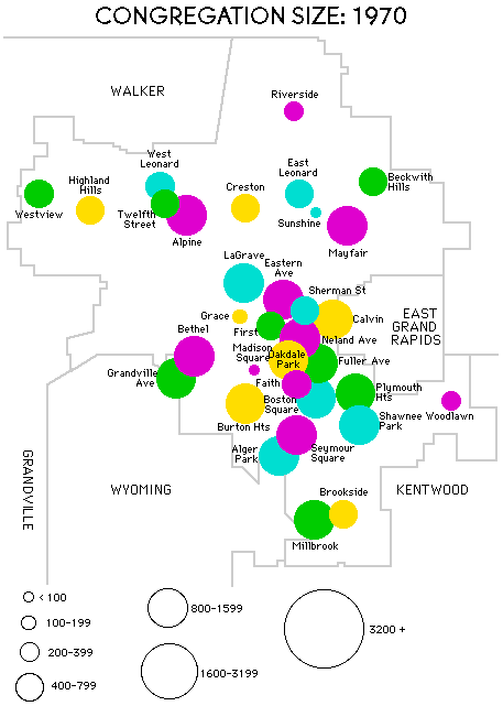
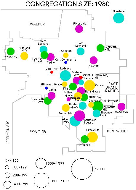
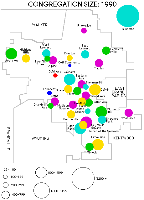
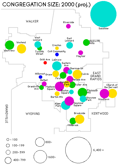
It was quite an undertaking, and all the work was done on my Mac Plus and printed out on an HP DeskJet 500. I’m not sure, but I think A Statistical Survey of Grand Rapids Christian Reformed Congregations, 1970 to the Present came in at about 20-25 pages. The only visuals were some maps showing the locations of these churches and their relative sizes in 1970, 1980, and 1990, along with mathematical projections for the year 2000. (The originals were created with Deneba UltraPaint, possibly the earliest bit-map graphics program with drawing and text layers, on my Mac Plus, so they were black-and-white only. They were updated with color later on, when I had a color Mac.)


My next opus was The Dutch Reformed Presence in Canada, written for Canadian Church History in 1994. This helped me understand my roots, as my parents and grandparents were Dutch immigrants who brought their church with them to Canada. While trying to grasp the broader history of the various “Dutch Reformed” denominations in the Netherlands and North America, I created a Dutch Reformed Timeline, which I think does a good job visually presenting the sequence of events and which groups in North America parallel those in the Netherlands. [I will admit to never having been completely satisfied with the graph. I hope to create a high resolution version someday.]
My magnum opus remains a work in progress. Instead of just looking at 22 years of data for churches in one denomination, it expanded to cover all of the Dutch Reformed groups in the area – over 200 in all, including the Reformed Church in America, Christian Reformed Church, Netherlands Reformed Congregations, Free Reformed Churches, Protestant Reformed Churches, American Reformed Church, Heritage Reformed Congregations, the Orthodox Christian Reformed Church [since merged into the United Reformed Churches], and the United Reformed Churches. Whew!
From the CRC and RCA, I managed to collect all sorts of data the denominations had collected annually, put it in FileMaker Pro, export what I needed, and create nice membership charts using ClarisWorks (now AppleWorks – and now discontinued).
As I looked at chart after chart, I began to see patterns emerge. So long as a church was relatively isolated, it would tend to keep growing until it got large enough to birth a daughter church or other churches from the same denomination grew up nearby. But in the city, where churches tended to spread concentrically from the center of town as the years went by, the pattern was about 20 years of growth, 20 years or so of relatively stable membership (probably due to the size of the worship space), followed by a long period of steady decline.
I had uncovered a typical growth pattern. While you couldn’t simply lay one graph on top of another and find a match, the shape of the membership chart was consistent. Grow, stabilize, decline. And the few churches that broke the pattern generally did so by moving to larger facilities as necessary, which prevented worship space from constraining growth.
Good sociological mathematics or mathematical sociology. Maybe even a touch of psychohistory. I hope it will be a tool to help others understand church growth – just as I hope Low End Mac will help others understand the history and growth of the Macintosh.
Keywords: #psychohistory #phantomtrafficjam #churchgrowth
Short link: https://goo.gl/o7FSGg
searchword: psychohistory

