Pebble brings its new interface to the classic handset. I have been running it for a few days.
When Pebble released its colour successor, the Pebble Time in mid 2015 it came with a new look OS called Timeline. Original Pebble and Pebble Steel owners had been told they would see it on their mono devices and in December it was released.
Well it is here and what an improvement it is. Within minutes of installing it I was loving its new looks, animations and tweaks.
It is always a risk upgrading any older device to a new OS. It can impact on speed and battery life, and the Pebble features very low specs in the first place.
Notifications
While readable, notifications used to look a little rough. Not anymore. Graphics have been tightened up, with a header bar showing where the notification is coming from ie: text message, FaceBook, Messenger etc, and the message is displayed below. This gives it a clearer view.
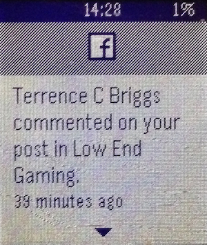
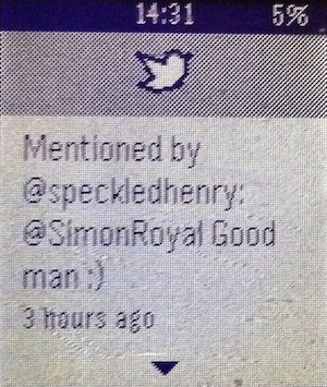

As the name suggests, the new interface throws everything in to a timeline so you can access weather and reminders etc in chronological order.
Connection
Under iOS9 I had numerous connection issues. It would constantly drop bluetooth connection with my iPhone. The new Timeline update has resolved this. I have no had problems at all.
Battery Life
The Pebble has always had excellent battery life. It is one of the things I love about it. However under the new Timeline update, it has gotten even better.
Music
The music screen has been spruced up, offering more text on screen. Controlling music is more reliable now.
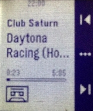
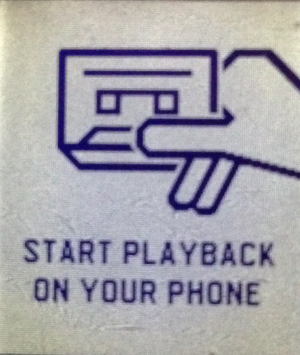
Whereas before switching from the track to volume options in the music player was a bit hit and miss – with it most of the time refusing to go to the volume option, it seems to be working very well now.
Weather
Several Pebble users I know have reported issues with weather under iOS9. It wouldn’t fetch the information needed, or would fetch it initially but then refuse to update. I am pleased to say it has been working well for the last few days.
Watchfaces
Changing your watchface previously could be done via pressing the up and down buttons. This could be annoying as catching your watch slightly could change your watchface.
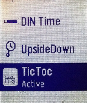
This is now not the default option and pressing these does nothing until the middle menu button is pressed. Watchfaces are switched either in the Pebble menu or via the phone app.
Phone Call
The only small thing I don’t like about the new Timeline OS is when you receive a call, it displays first name and last initial ie Declan R. instead or Declan Royal like it used to.
Delay
While everything was instant before, there is a slight delay in loading apps and switching watchfaces. A new loading screen with loading bar can be seen. It is only there for a few seconds at most and doesn’t interfere with the use of the Pebble.
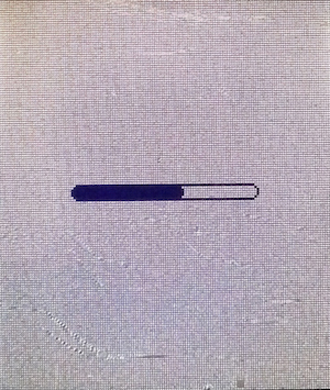
There is also a minor delay when flicking through the notification timeline, but this is a split second and is expected with the new animations.
Menu
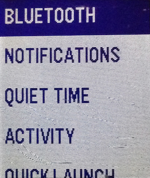
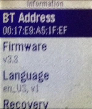
The system menu has changed a little, but not enough to confuse you. Within a few seconds of perusing you will find everything you need.
Conclusion
I am loving the new 3.8 update aka Timeline. It has made my already amazing Pebble a whole lot better. The OS is more consistent and visually looks so much better.
There are no negative points or reasons not to upgrade. If you have a Pebble or Pebble Steel then upgrade now.
Follow Simon Royal on Twitter or send him an Email.
Like what you have read? Send Simon a donation via Tip Jar.
keywords: #pebble #classic #review #timeline #techspectrum #simonroyal
short link: http://goo.gl/CCRItR
searchword: pebbletimeline

