
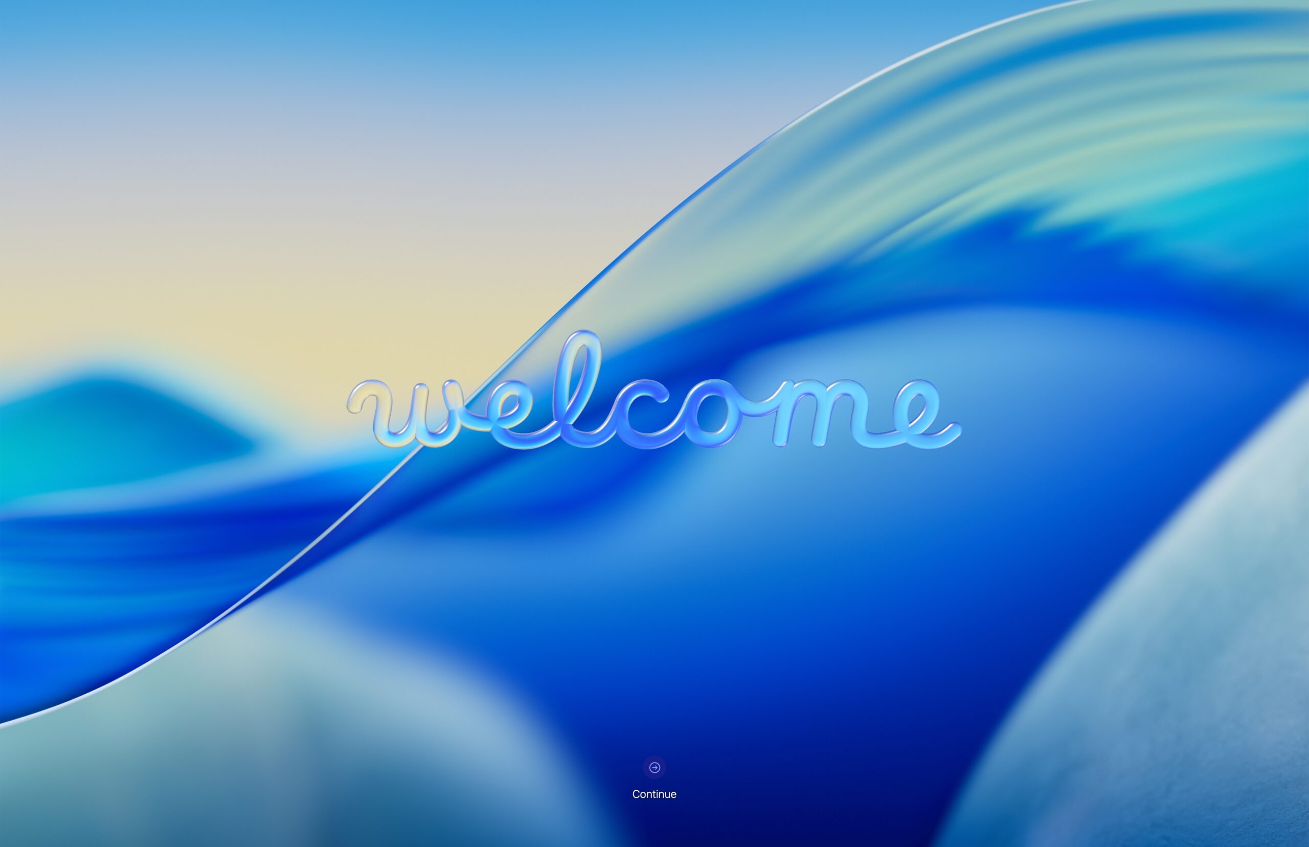
At-a-glance, you’ll notice your desktop is mostly the same after updating (although some settings are reset such as internal drives in Finder). It’s familiar if you’ve used macOS Sequoia – but feels totally different for sure. Different in the sort-of way Yosemite was to Mavericks, or Aqua was to Platinum.
.
Is this Frutiger Aero?
The styling used throughout the OS is a strong throwback to Aqua, a user interface from the earlier days of Frutiger Aero. Frutiger Aero is an aesthetic style coined in 2017 by Sofia Lee of the Consumer Aesthetics Research Institute. The design is seeing a resurgence on social media, particularly with younger generations in a nostalgic way.
.
 |
 |
.
There wasn’t one specific interpretation of this type of design, rather, it is a universal design aesthetic which oozed from companies in the post-beige late 90s/early 2000s to get civilization acclimated to tech. Through the abstractions of blending nature, vibrant colors, bright visuals, aqua/glass/transparency elements, reflective textures, etc; the visual effects of graphical user interfaces enticed the populace.
Lately, it’s seen a resurgence among enthusiasts drawn to its dreamy, polished look, tapping into nostalgia for a more hopeful, tech-forward era. With the full weight of Apple behind the liquid glass UI they’re touting, it’s possible the tech industry will follow suit.
.
.
Key objectives of UI design change
The Liquid Glass User Interface design language is more than skin deep, it has utilitarian elemental objectives as well:
- Content-first: “UI is in service of the experience”
- “Establish creative Consistency, harmony, and usability with a universal design language”
- “A focus on Dynamism, expressiveness, and Joyful/delightful user experiences.”
- Combine optical qualities of glass with responsive fluidity, responsive lensing around edges
- Specular highlights, refractions, hierarchy, etc;
See: WWDC25: Platforms State of the Union | Apple
.
 .
.
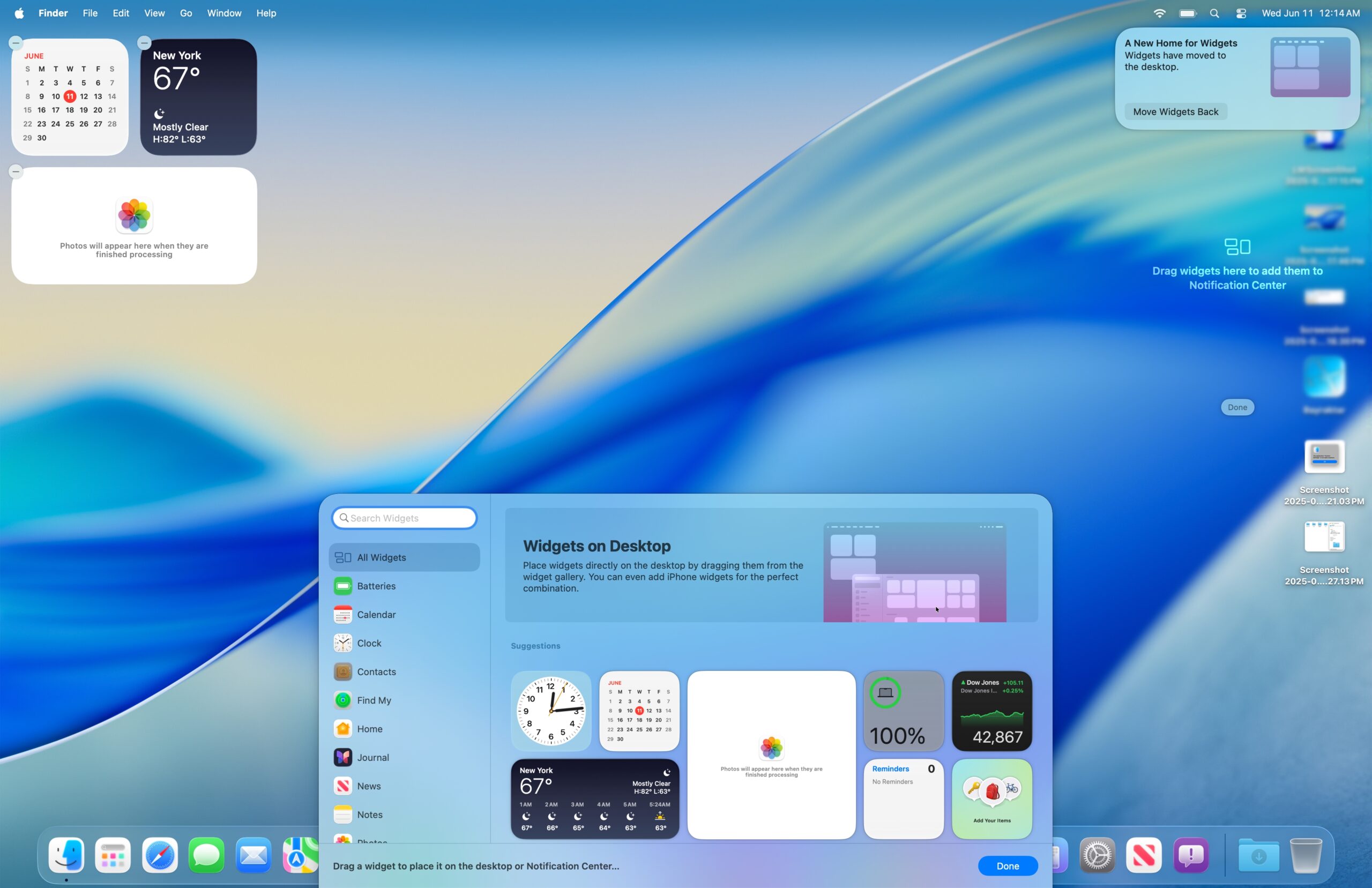
Some quirks
- System Folder icon has a “?” question Mark on it, looks like the default
- There are two sets of system app folders.
- /System/Applications/ looks to contain a set of the default OS apps.
- /Applications/ has a mix of system and user apps.
- Sometimes if you try to open an app too fast while it’s quitting, you’ll get an error message to the effect of “The settings application is not open anymore”.
. - Sometimes when you minimize the Photos app, it will chop the window in pieces then minimize it
. - When you open a new finder window, instead of springing open it could be”bounce” open in an unusual way. It will first appear where it will land, before closing/zooming back into the folder and rapidly springing open again.
- (Sort-of like a broken spring. I notice this tends to happen when trying to open folders with fewer items – this never seems to happen if I open a folder with hundreds of items.)

You can still access your PowerPC Macs from Tahoe
- macOS Tahoe retains the ability to see your PowerPC Macs on the network, interacting with the files, and screen sharing. You can still make that 2-CPU-platforms-old Mac work for you.
.- Side note: Take a look at how crisp the PowerPC Leopard desktop is even blown up to 3840 x 2486 up from a 1080p screen. That’s retina UI scaling working its magic.
.
- Side note: Take a look at how crisp the PowerPC Leopard desktop is even blown up to 3840 x 2486 up from a 1080p screen. That’s retina UI scaling working its magic.
- You cannot, however, use Bluetooth File Transfer on either side. Both ends will say “This device does not have the necessary services.”
 |
 |
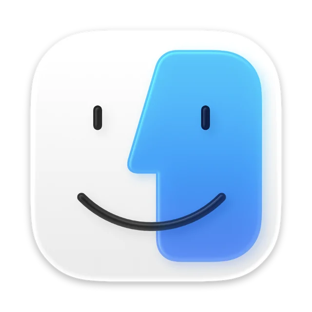
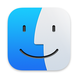
The new Finder icon
It goes right in line with the new Liquid Glass design. Upon closer inspection, it looks like each piece is its own separate layer of glass. The old one is on the right, and they flipped the colors for the new one. You can click on either image to see the full size image.
 |
 |
Artificial Benchmarks
I ran Geekbench 6 on here to see the effect of running macOS Tahoe versus how Sequoia ran, and to my surprise it appeared as though CPU performance increased.
Of course, the GPU is powering a greater UI experience so it will take a slight hit, however, these are artificial benchmarks being run while the machine is idle. Take the numbers with a grain of salt.
The numbers tell a story of a minor potential change and these benchmarks can swing just as far in the negative direction given the right circumstances. Perhaps, however, there is a grain of truth in all this, as some early adopters online are reporting a far better experience.
CPU
- On macOS Tahoe: 3668 (Single Core) 15225 (Multicore)
- On macOS Sequoia: 3638 (Single Core) 14310 (Multicore)
OpenCL
- On macOS Tahoe: 35372
- On macOS Sequoia: 35494
- (See Comparison on website)
Metal
- On macOS Tahoe: 54314
- On macOS Sequoia: 54999
- (See Comparison on website)
.
The New Apps
I’ll have to start checking out games on the Mac again, and all my phone call notifications come through too. It’s always nice to have an additional feature rather than not, not that I will be calling off the Mac often.


A couple new ways to customize your UI
To me, it’s nice how you’re able to have a dark mode theme whilst also retaining the default icons. It was quite jarring to see everything changed all at once – I liked the Mojave interpretation of dark mode.

A new Launchpad combined with Spotlight

Overall
At-a-glance, this is a visual refresh with a few new apps, and deep underworking to improve and shift things around. More time certainly needs to be spent with macOS Tahoe to get a feel for it, I’m still getting used to the glass UI myself. I haven’t had any hiccups writing an article on there for Low End Mac, and haven’t had the chance to run games on it yet.
In the coming weeks there will be more changes and opportunities to make more concerted observations about this Developer Beta.
