
 You might be thinking the Sky Blue color, right? While this new color changes the entire aura of the MacBook Air and gives it a very desirable appearance, the design change is actually a lot more nuanced and can be hard to spot unless pointed out. First pointed out by iCulture.nl, “Apple finally fixes the Mute key on the Mac after 26 years”. The new mute icon clearly indicates “no sound” on it’s own rather than standing in contrast to volume +/- buttons to give the context to the speaker graphic on the key. This is the same design that’s used in software, meshing design continuity across hardware and software.
Old vs. New
 (Above: Left – M4 Sky Blue MacBook Air. Right – Midnite M3 MacBook Air)
 (Enlarge above: Midnite 13″ M3 MacBook Air, Mute button highlighted)
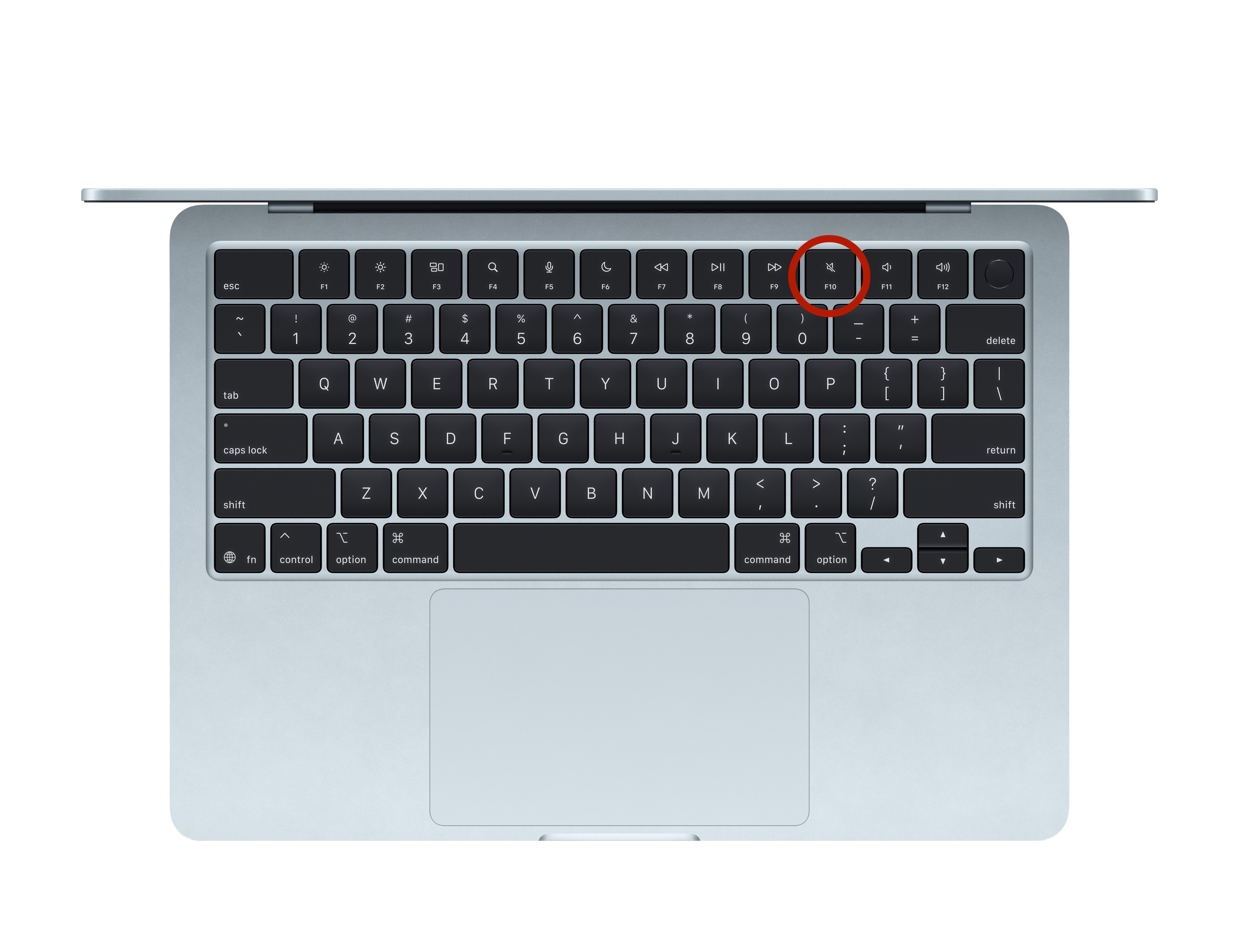 (Enlarge above: Sky Blue M4 MacBook Air, Mute button highlighted)
As 9to5Mac points out, this design change is also being pushed over to the new Magic Keyboard for the M3 iPad Air.
Reminiscent of a similar change
Apple pulled a similar move back in Early 2008 with the release of their Early 2008 MacBook Pro, when the function keys were swapped out. The change was more dramatic as it affected more keys, and this was years before Apple decided to update the volume button on their keyboard.
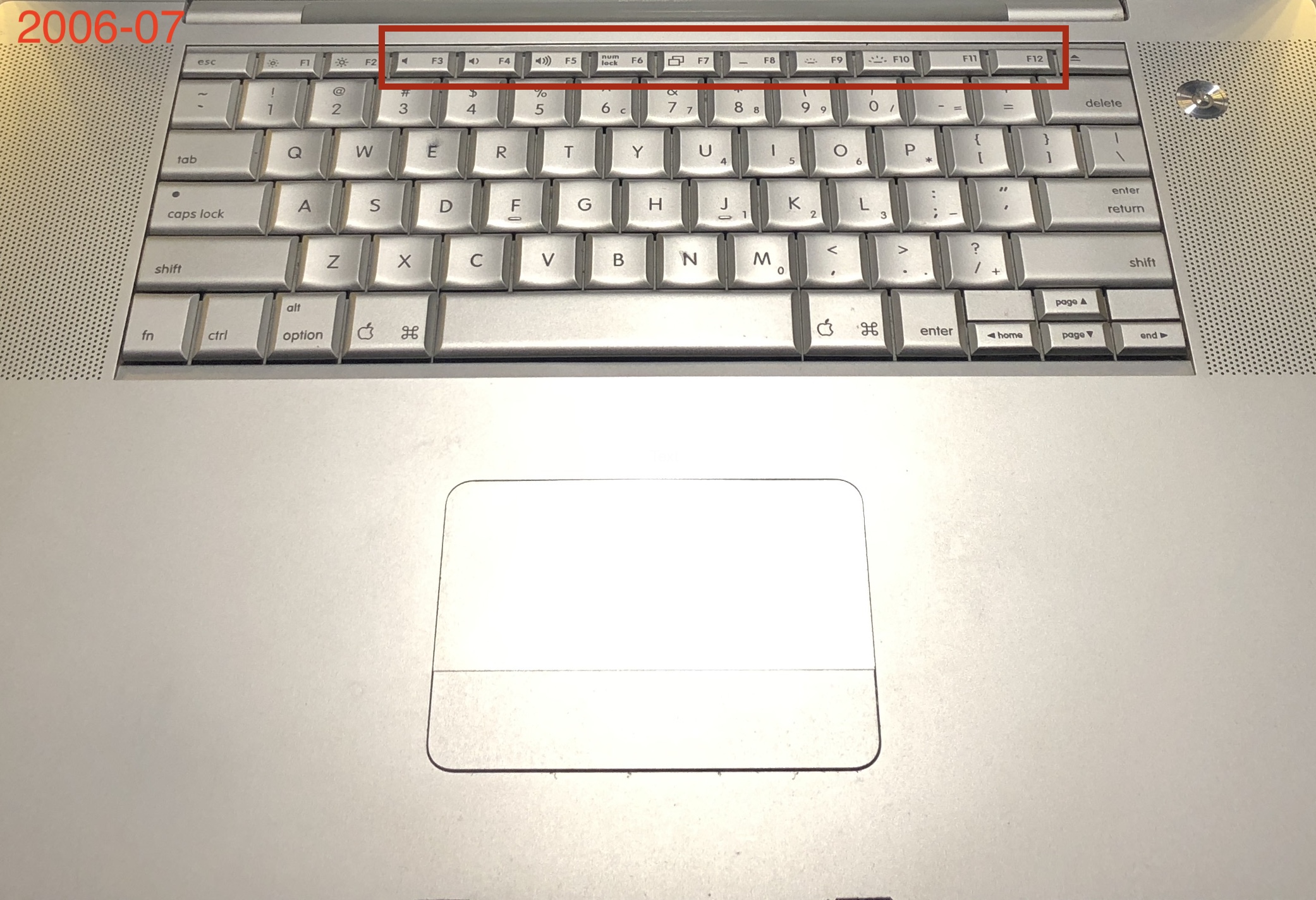 (Enlarge above: A 17″ 2006 MacBook Pro)
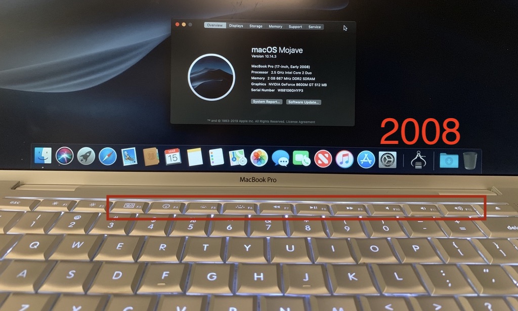 (Enlarge above: A 17″ Early 2008 MacBook Pro, with new function keys)
Small iterative changes like this happen year over year between market, consumer and design choices. Part of the benefit having the same design/body for multiple generations is being able to reuse accessories for those multiple generations – I like it when a good design sticks around too. Looks to me like good attention to detail!
