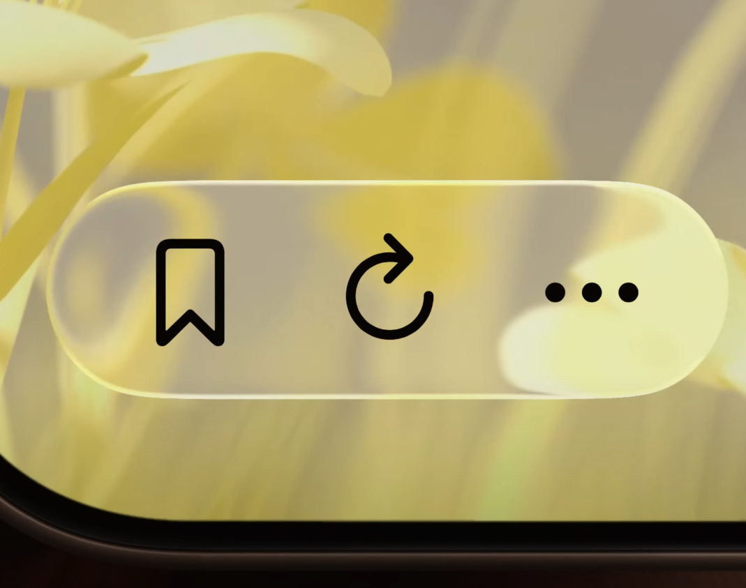
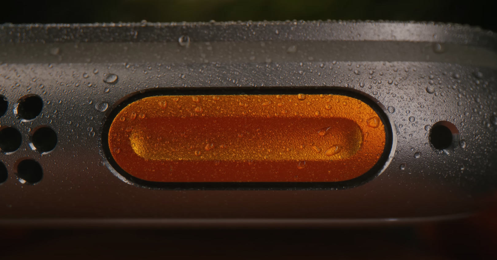
Does anyone remember the smooth intro from the iPhone 17 launch on September 9th? You may come across a brand new Apple commercial strikingly much like the intro to the iPhone 17 launch stream, called “Design is how it works“. The video stuck out to me in the creative way they showcased Apple design, using aesthetic similarities across products to stitch together a vision.
.
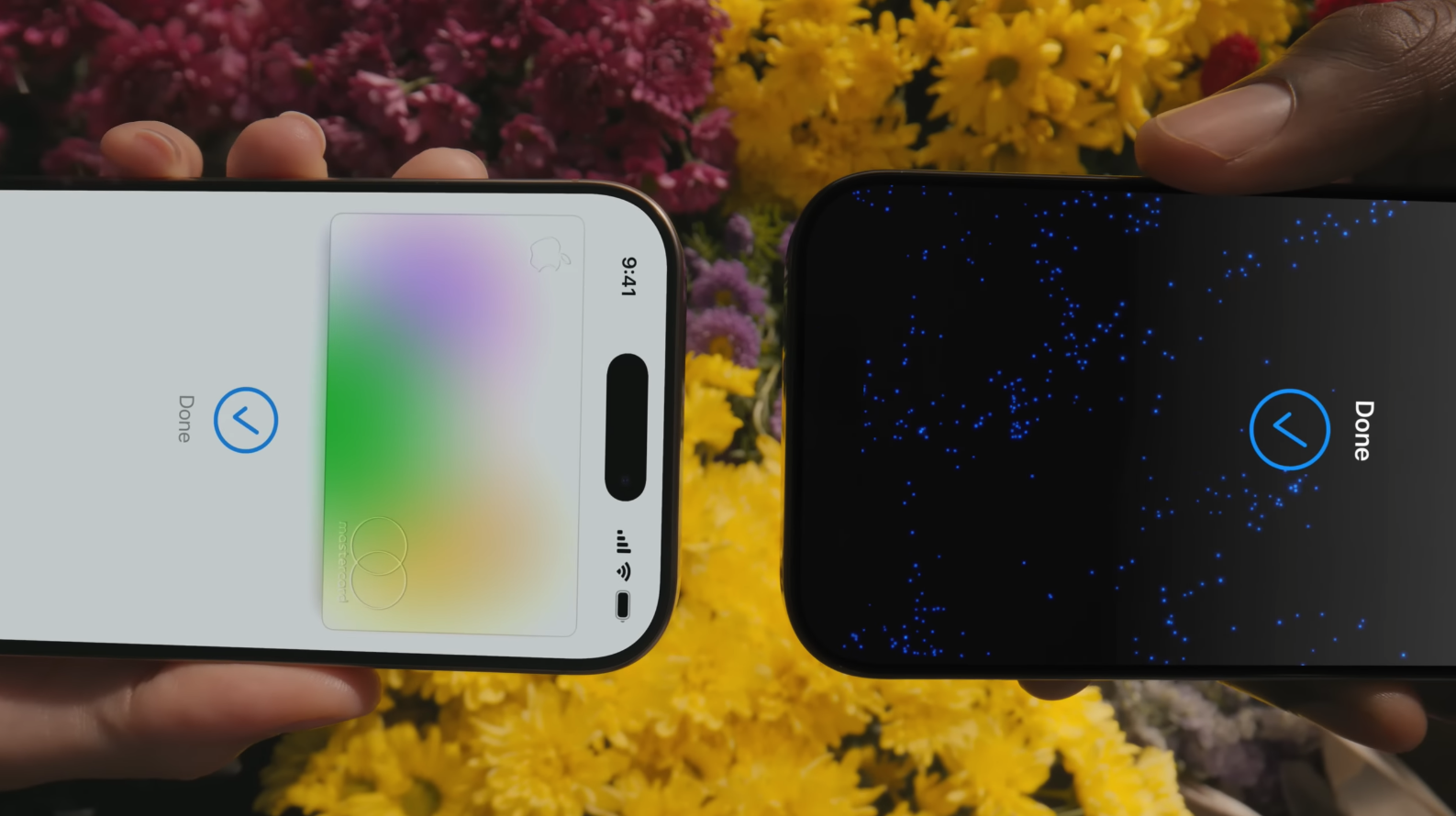 (Above: Screenshot from Design is how it works | Apple – URL)
“Most people make the mistake of thinking design is what it looks like… Design is not just what it looks like and feels like. Design is how it works.” —Steve Jobs, The New York Times, 2003.
.
Impactful in simplicity
You don’t need to know the tech specs of any of the devices to see the magic in the slices of life here, nor the magic of the aesthetic continuity in the video itself.
It feels strikingly similar to the iPhone 4S Siri Assistant Commercial in terms of the music choice, the slice-of-life scenes, plus with how they made jump-cuts go along with the music.
It also kind-of sort-of reminds me of the iPhone 5 TV Ad, “Photos Every Day”. In the same way the new ad highlights bits of device interaction, this iPhone 5 ad highlights the benefits of using a camera on an iPhone 5, from an emotive perspective.
Design over the years
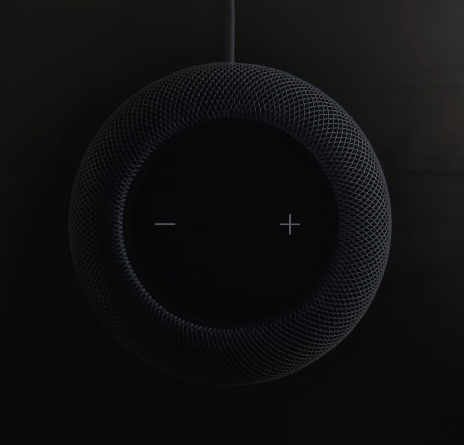
While the commercial is a highlight of the most recent of Apple’s design language, many of the characteristics go way back. The first Apple ‘Book to look anything modern like what’s out there now, was the Titanium PowerBook G4 15-Inch.
 |
 |
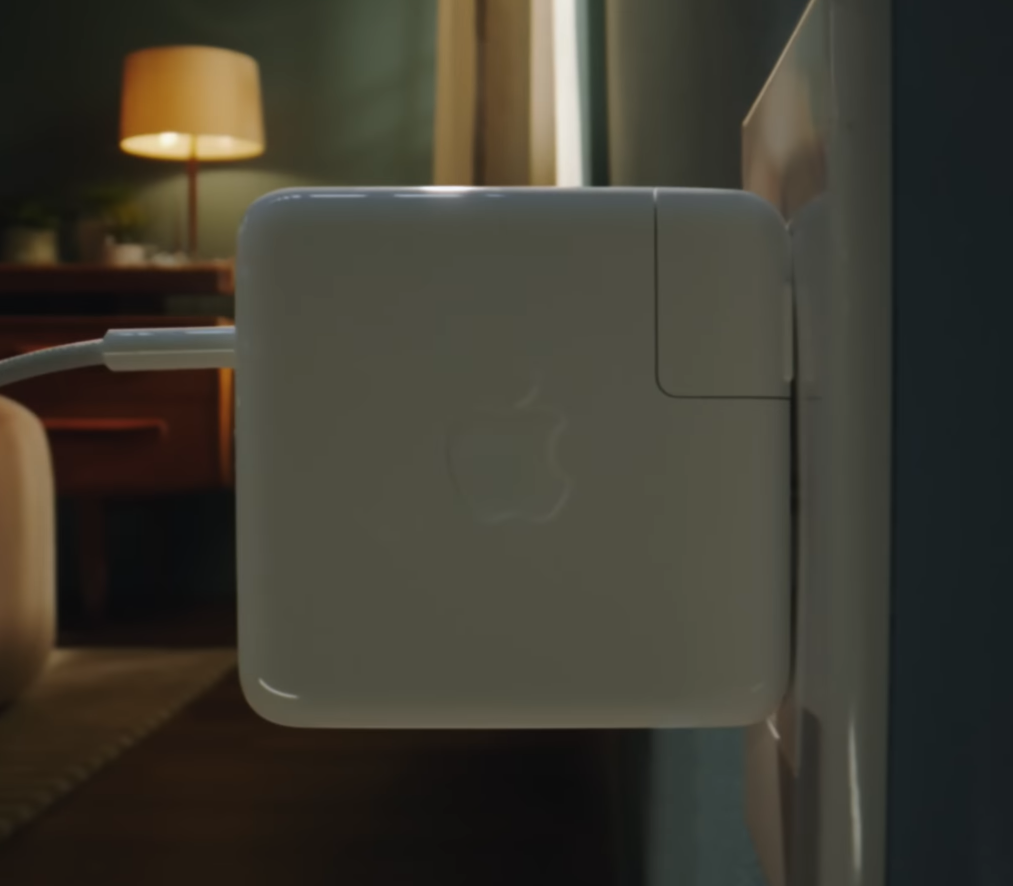
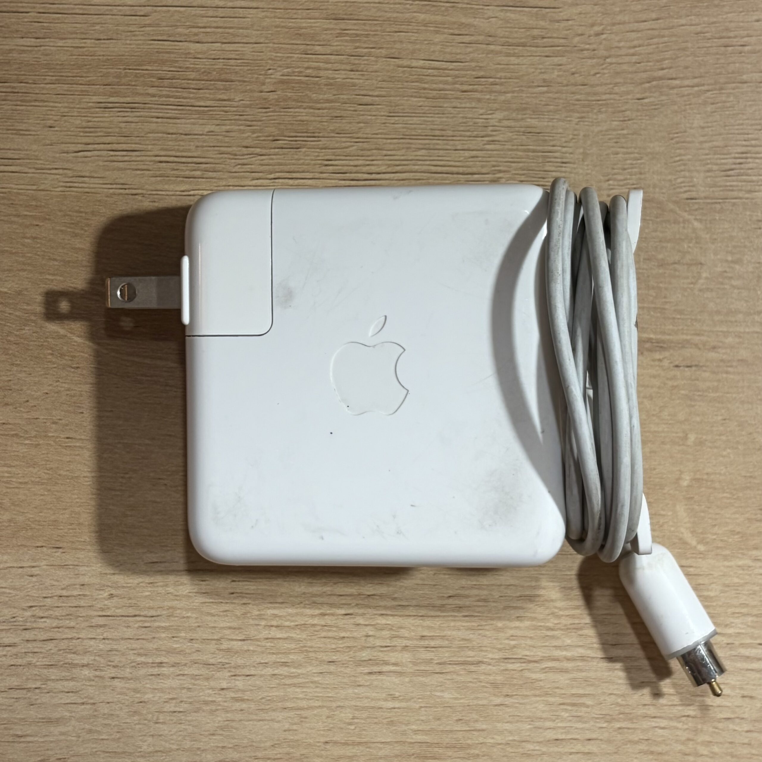
Since the “IceBook” G3, nearly every Apple ‘Book charger has been a polycarbonate charging brick. This style of charger has’t changed much over the last 3 decades, with the exception of the power connectors. Even the long cords/short adapters are interchangeable.
 |
 |
The use of rounded boxes goes way back – here’s a screenshot of System Preferences from Leopard.
 |
 |
When we look at the on/off toggle in iOS 26, it looks almost the same as what’s on this Magic Mouse. This is a first-gen model, which dates back to October 2009.
 |
 |
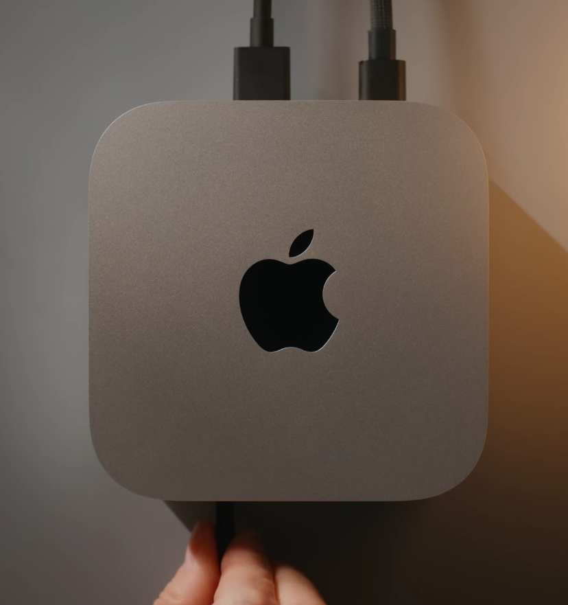
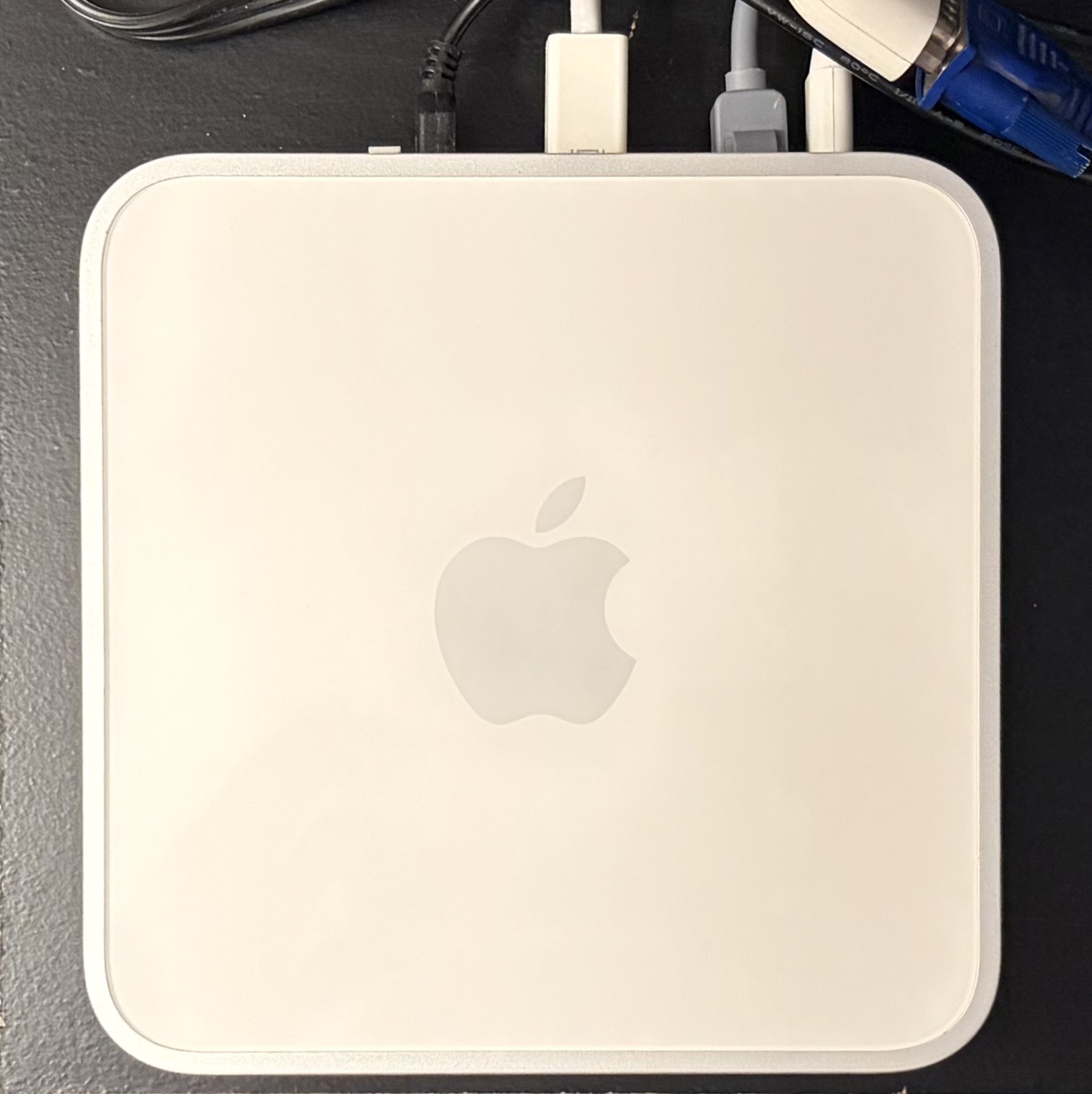
Below: M4 Mac mini versus a 2009 Core 2 Duo Mac mini!
 |
 |
From Tahoe, to Tiger – 2 decades apart, but instantly recognizable to users of either OS.
 |
 |
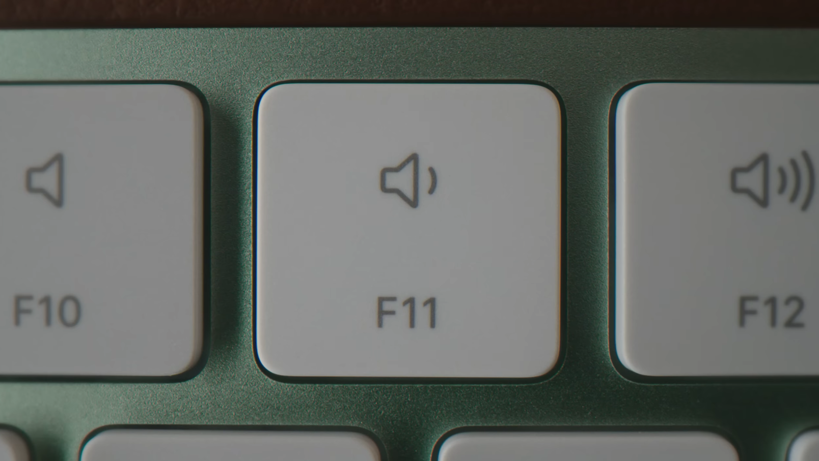
The iBook G3 clamshell and Titanium PowerBook G4 were the first Apple ‘Books to include keyboard volume control keys.
 |
 |
 |
 |
In conclusion
More or less since the transition away from translucent plastics, the brushed metal + aluminum language has increasingly defined the Apple device lineup. Many of the elements we see today originated from trial and error of past products, and continued iterations.
Aqua slowly melted away in Leopard, and by Yosemite we had an entire design overhaul which resembled iOS 7. The liquid glass design language appears to be a modern interpretation on aqua, redefining the user interface with even more graphical hardware acceleration power offered by Apple Silicon. I don’t normally like commercials, but I liked this one – it was inspiration for this article!

