Elefont was the initial name for the bitmap typeface designed by Susan Kare in 1983 for the Apple Macintosh’s operating system. It was later renamed Chicago after Steve Jobs suggested naming fonts after “world-class cities” rather than suburban Philadelphia train stops, which Kare and her colleague Andy Hertzfeld had initially used. The name “Elefont” was a playful pun, reflecting the typeface’s bold, heavy appearance, likened to the weight and presence of an elephant.
.
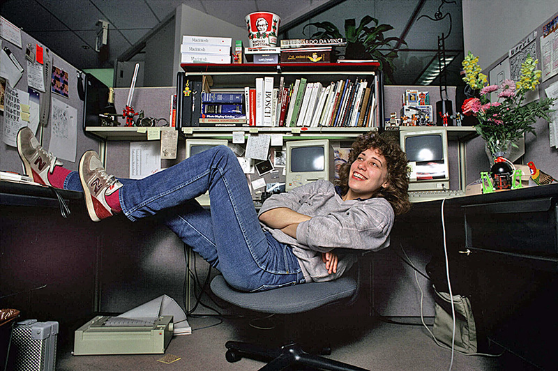
(© Norman Seeff 1984)
.
Finding a Twiggy Mac disk image
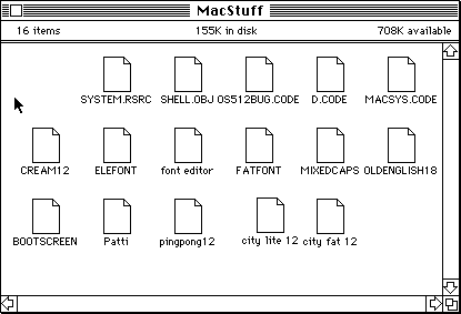
I came a cross discs image of a Twiggy Mac disc that was probably used by Susan Kare in 1983. The disc was labeled Susan’s Fonts, mac Format Font 4.30.83. On the Sleeve there were writings elefont, fat font, patti. The disc image was not bootable on Twiggy Mac Emulator, actually the disc didn’t include a classical Finder or System file, but files like SYSTEM.RSRC, SHELL.OBJ and MACSYS.CODE.
.
 .
.
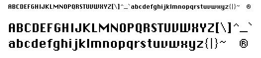
On the discs was also font editor file which I assume it is the very first version of Font Editor for Macintosh and some randome files named CREAM12, ELEFONT, FATFONT, MIXEDCAPS, OLDENGLISH18, Patti, pingpong12, city lite 12, city fat 12. ELEFONT was the first file I tried to open.
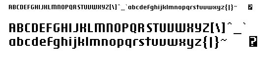
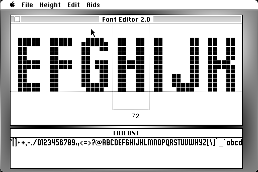
I learned about how to use Font Editor 2.0 thanks to Mark Simonson‘s excellent guide. I was so exited opening this file and I felt like Indiana Jones discovering the Holly Grail. So for the first time ever, let me publicly present you the ELEFONT type here:
 .
.
Design and Characteristics
- Elefont (Chicago) was designed as the Macintosh’s system font, used in menus, dialogs, window titles, and text labels from 1984 to 1997 (Mac OS 1 to 7.6) and later in early iPod interfaces. Its primary goal was to ensure readability on the low-resolution, monochrome screens of the time (512×342 pixels).
. - Each letter was crafted within a 9×7 pixel grid for capital letters, with lowercase letters and symbols fitting similar constraints. This limited space required a design that minimized “jaggies” (pixelated edges) to maintain clarity.
.
- Kare restricted letter forms to horizontal, vertical, or 45-degree lines to achieve a clean, smooth appearance, avoiding the jagged look of earlier mono spaced fonts like Courier. This approach made Elefont one of the world’s first proportionally spaced digital font families, where each character could have a unique pixel width, unlike typewriter-style mono spaced fonts.
.
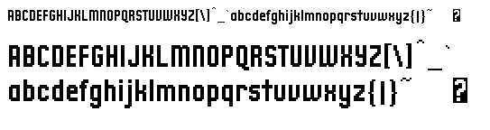
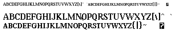
Comparing it to the Chicago font
 ,
,
I could happily open this early font files with Font Editor 2.0 which what we have to say was probably just converted from Twiggy Mac resources to the final Mac128k resources and added #2.0, no serious updates were possibly made because it really behaves and looks like a prototype and incomplete product even tho it was shipped on early Mac developer discs.
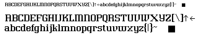
There were some other variants of ELEFONT file on the disc like FATFONT:
 ,
,
The others fonts were CITY FONT FAT and CITY FONT LITE:
 ,MIXEDCAPS font:
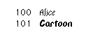
I have opened all this this font files with FontEditor and installed them into suitcase called Susan Fonts. I will upload them to Macintosh Garden. I had to add font ID’s to them from 30 to 34. The allowable ID range in the font manager is from 0 to 255. Numbers 1-127 were reserved by Apple. The orignal Apple fonts came with this Font ID’s:
+ two
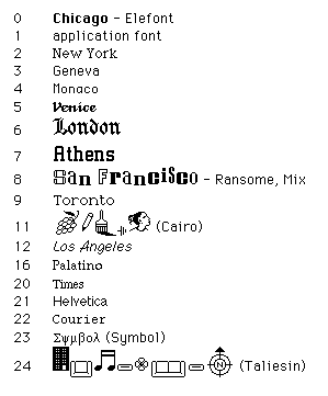
And on the Twiggy Macs there were this fonts available:
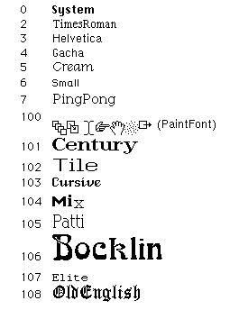
Most of this fonts were built into MacSketch and later into MacPaint application.
The initial implementation of the font manager simply included a few built-in fonts that were linked with the system, and it returned the system font if you requested one that wasn’t built-in. The initial system font that we used through most of 1981 was one that we borrowed from Smalltalk called “Cream”. [ Source ]
I looked for Cream font on the internet and came across fonts that were used in Xerox Alto. So Apple didn’t borrow just CREAM font but also these fonts: ELITE, GACHA,HELVETICA, OLD ENGLISH, TIMES ROMAN.
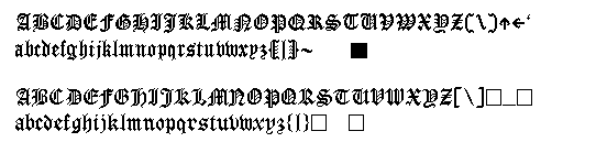
Here you can compare OLDENGLISH found ont the Twiggy discs and final LONDON font included in Mac System Software:
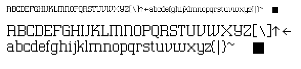
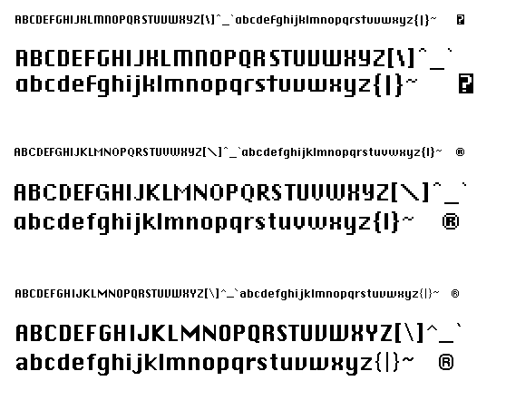
Ok, so back to ELEFONT. Before ELEFONT became CHICAGO it was called SYSTEM FONT (From top to bottom ELEFONT, SYSTEM, CHICAGO):
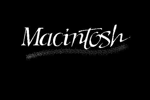
And at the end what I found on that Susan’s discs is beautiful BootScreen (Before it was renamed to StartupScreen) which writes Macintosh across the black screen in its own special type: