
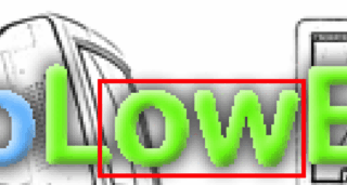
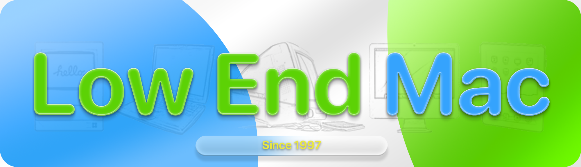
A little while ago, a community member of Low End Mac pointed out the jagged letters on the banner of the website, and I’ve thought about fixing it. The letters were rasterized and the original text layer was deleted, which probably resulted in this. I figured it wouldn’t be so visible being such a small banner, but when you zoom in it looks pretty obvious.
 .
.
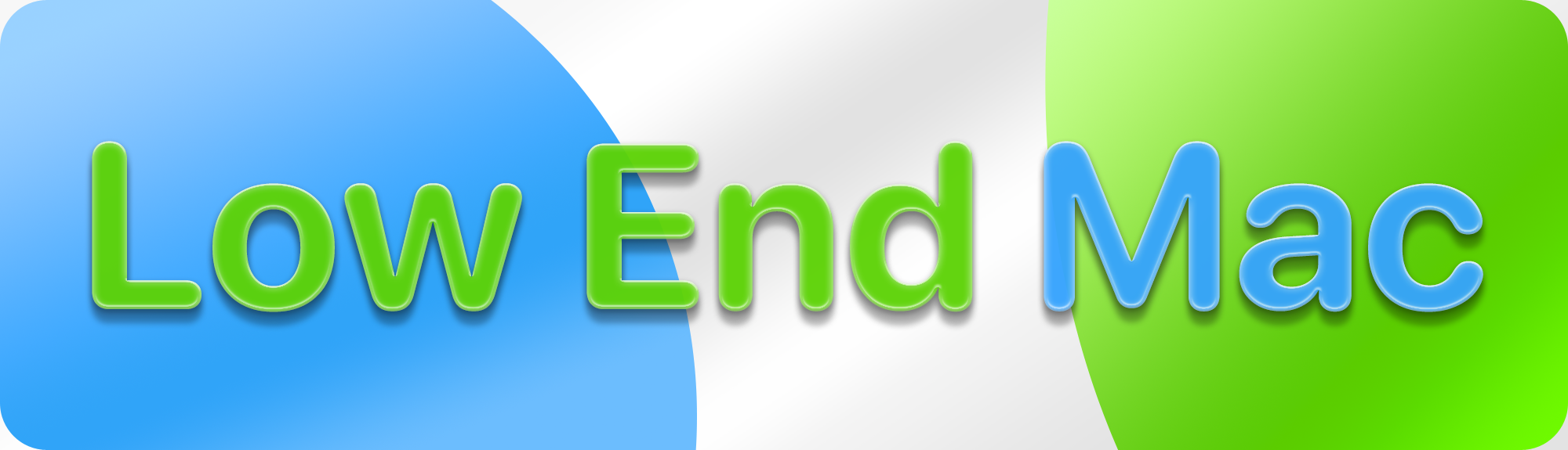
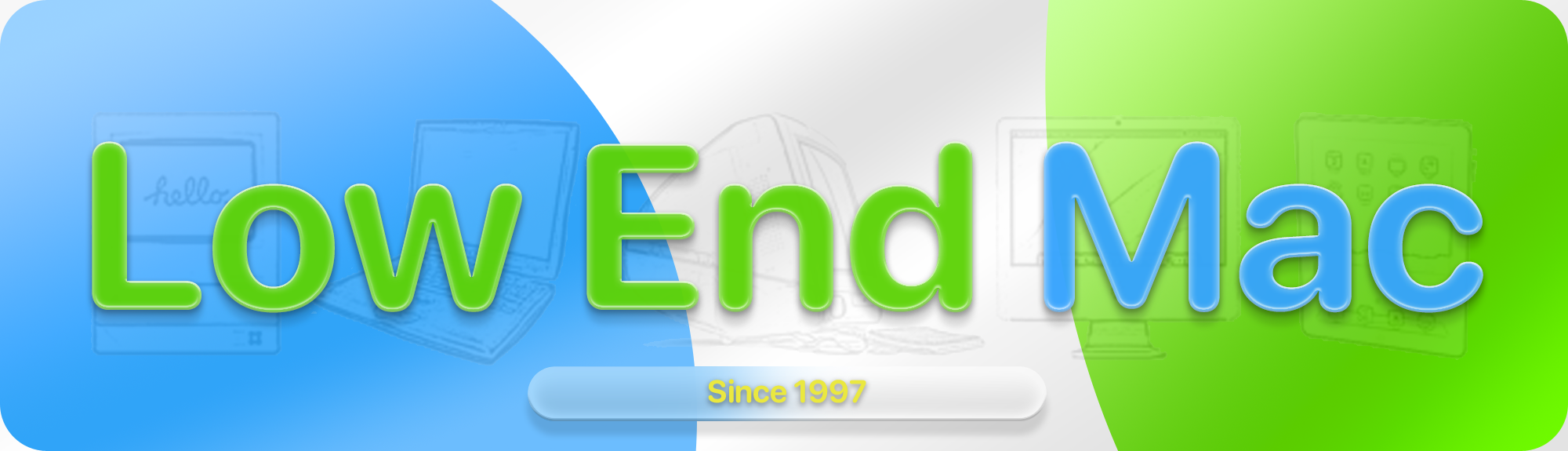
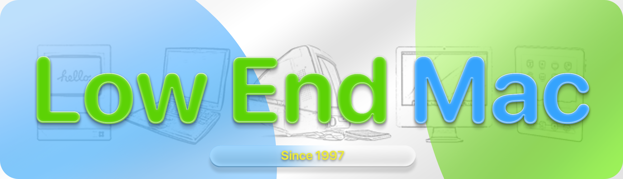
So in the process of looking into this and having a burst of creative energy in Photoshop, I decided to look into this. I’d love to continue to include the array of Macs on the banner, and no idea is particularly final. The idea originally was to lift the Low End Mac logo into the modern age, making it appear similar to the liquid glass elements brought about in the newer Apple OS betas. I went back in today, taking some inspiration from the iOS 26 logo.
.
 .
.
These are all just ideas kind-of put together in a short span of time, and by no means is anything here permanent. One of these may end up becoming the new logo, to fix the old one. Each iteration is slightly different, with a different arrangement in layers and their respective blending options. In total, there are 7 iterations. They may not at all look different at first, until you zoom in.
.

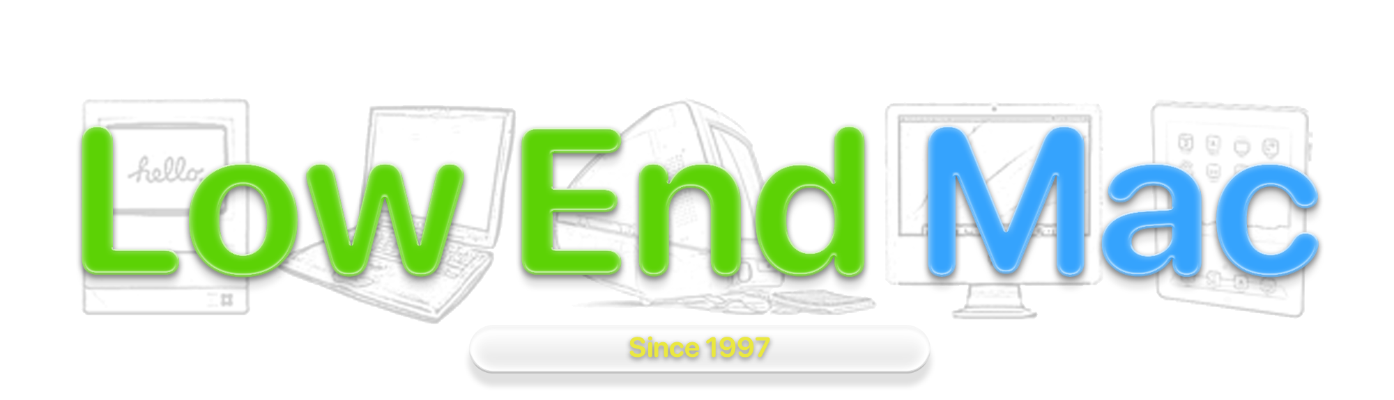
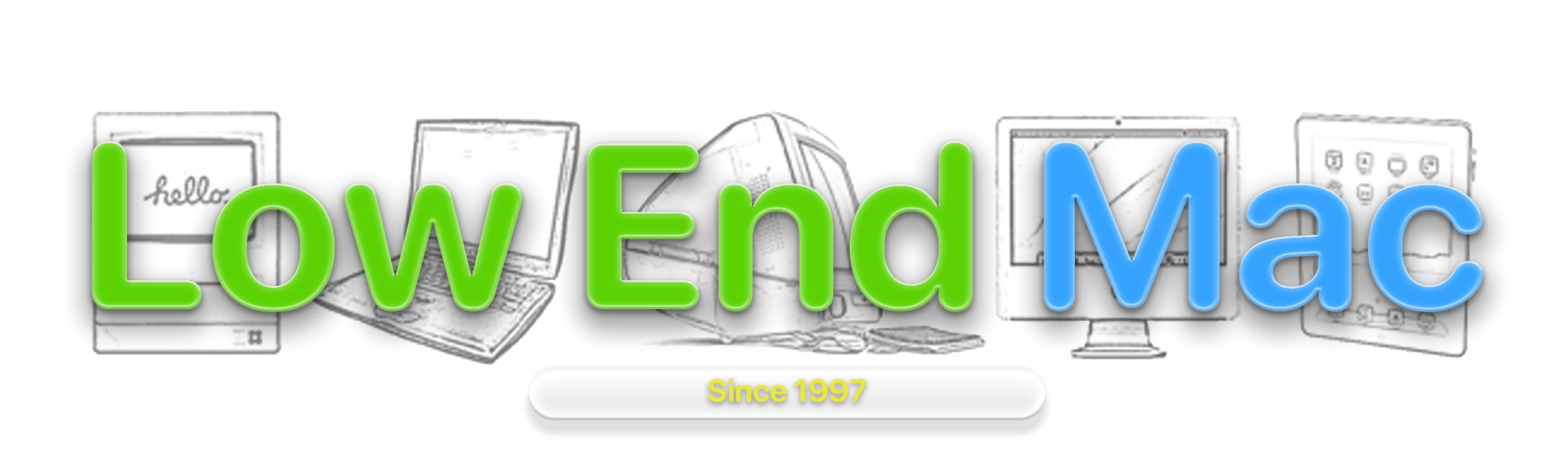
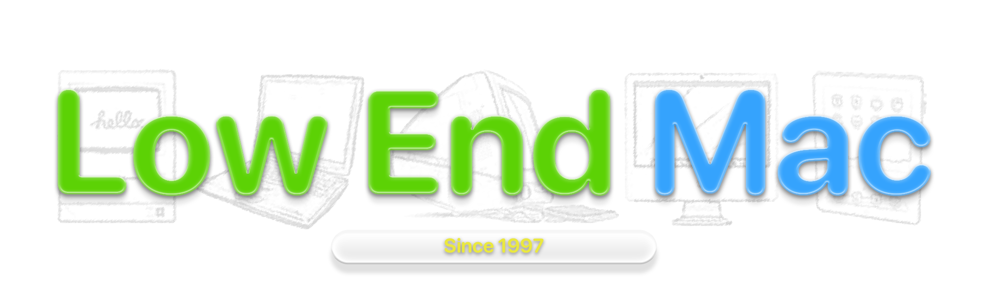
What do you think?
Let us know in the comments, which one you think looks best. For now, out of all these (or any coming in the future), one will be chosen which most closely resembles the current one, but with less jagged lines. Still, I’m tempted to just try the first new idea.
