
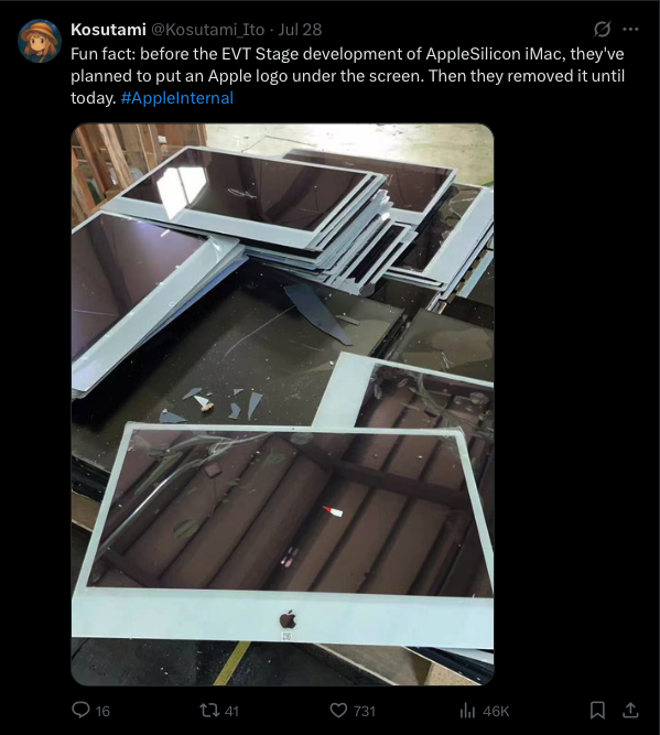
Precisely as the headline sounds, the Apple Silicon iMac almost ended up having this same design cue as the intel iMacs. First shared by Kosutami on X and first reported by 9to5Mac (as well as MacWorld), are some pictures from before the EVT stage of the M1 iMac.
“Fun fact: before the EVT Stage development of AppleSilicon iMac, they’ve planned to put an Apple logo under the screen. Then they removed it until today. #AppleInternal” as Kosutami posted.
 |
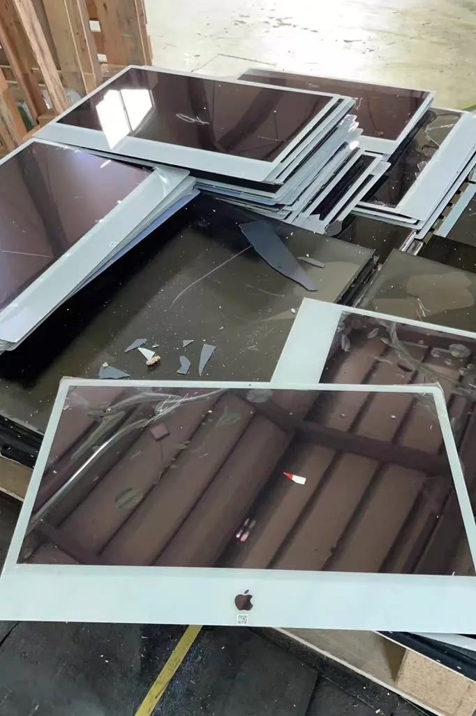 |
The comments surrounding this are strikingly different, with most leaning strongly one way or the other. There are some comments here and there on the original post and 9to5Mac article which stand out, also. It is worth mentioning how some older iMacs had an IR sensor behind the Apple logo and an Apple Remote would launch Front Row. control iTunes, etc.
The article on MacWorld circles back to some interesting wording in the post by Kosutami, which certainly confused me. “The last sentence in the post–“Then they removed it until today”–also brings up questions.” Suggesting this is either an image of an early M1 prototype, or possibly the production of a new M5 iMac that will reiterate the Apple logo on the front of the iMac.
.
Apple’s new product stages
Anytime Apple works on something new which makes it to their stores, it usually has 4 major junction points before hitting the shelves: an EVT, DVT, PVT, then mass production.
- EVT = Engineering Validation Test, DVT = Design Validation Test, PVT = Product Validation Test
. - See: Apple Insider – Inside Apple hardware prototype and development stages
Editor’s thoughts: Looking at the picture, the glass allows light passthrough for the camera and screen panel, so we could assume the same could be done for the Apple logo. In that case, what could possibly be the color of the Apple logo? I think they’d have gone with a white Apple logo on all iMacs, regardless of color. It may have cost extra to develop the same paint or material needed to color-match the Apple logos on every iMac under the glass Apple with a second, darker or lighter tone.
.
What could this have looked like?
It looks like some out there already made some good mockups of what this could’ve looked like! This one from reddit perfectly encapsulates what I imagined.
![]() (Above: Source – reddit.com, r/Mac, u/Wikiwoo, click here to see the original post)
(Above: Source – reddit.com, r/Mac, u/Wikiwoo, click here to see the original post)