
 Happy new year everyone! Over the past year our website has seen many changes, many articles made, graphics created, and more being added to the website. While over the past month I’ve been writing less articles, I’ve turned my attention back to the structure/functionality of the website.
Since our founding, our writers have made a total of over 4,000 articles combined – a wealth of information which makes Low End Mac the website we know and love. Over time, the sheer volume of information can be difficult to navigate through.
In an effort for all our readers to help navigate this site easier, I’m thrilled to announce three new site features:
- Timeline View for our Tech Specs index – Browse Tech specs by the year.
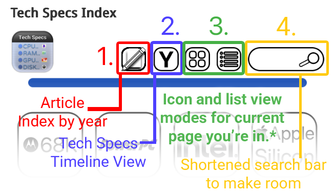
(The “Y” Button in the icon row)
. - A new Timeline View for our Article Index – Browse Articles by Month + Year
(The “Pencil + Paper” Button in the icon row)
.
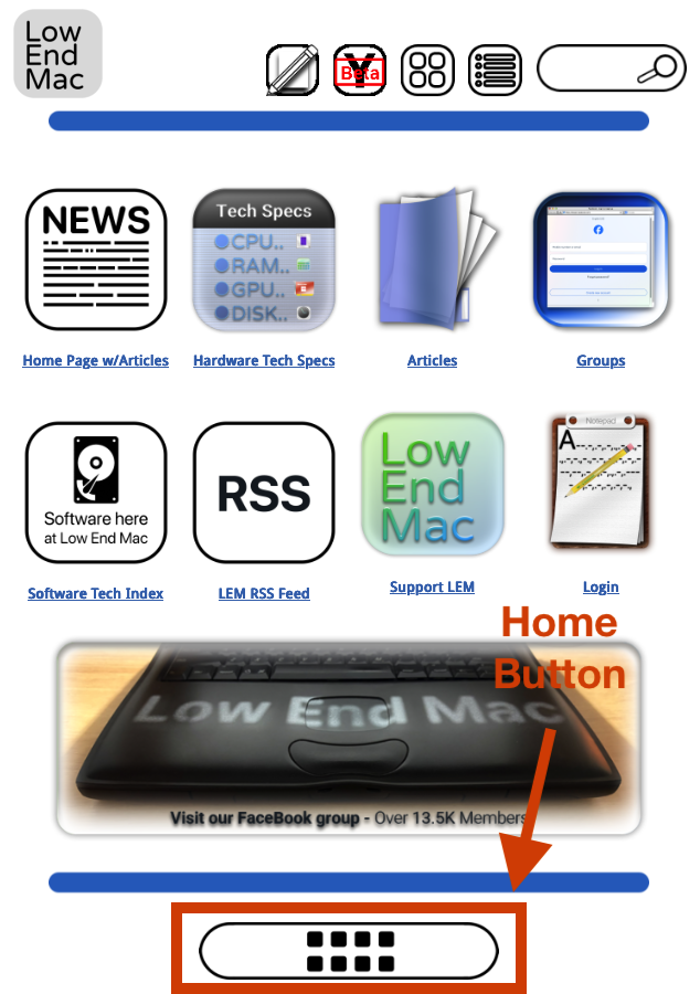
- A Home Screen + Button – we have a listed view of articles for our home page, this will be the companion Icon View for it. The Home Button will always take you to the icon view of the home page, just like the “Home” text in the navigation bar takes you to our site’s main page.
These three new additions build upon the changes made to our website over the past year, continuing the process of site optimization without altering it’s DNA.
About the New Icons
- Buttons are persistent and static: When present in the icon row, they perform the same function every time. This adds to the ease of navigation to the website, with the ultimate goal of helping you find the information you need.
. - *Icon and List view: Changes the navigation page to either an icon or listed text view of the page you’re currently in. This applies to any page you navigate to within the website, as long as it’s not either of the Timeline View functions on our website:
.- The purpose of this is to make our website easier to navigate on mobile devices with icon view, while simultaneously offering a text-based navigation system for older systems, or readers with slower connections. Also adds a flare of modernity.
. - If you’re anywhere on the Tech Specs Timeline View or are in the Article Index, those two buttons will instead return you to the classic Tech Specs index page, in either Icon view or Text/list view of your choice. This should add to navigational consistency and make it easier to navigate out of Tech Specs Timeline View or the Article Index.
.
- The purpose of this is to make our website easier to navigate on mobile devices with icon view, while simultaneously offering a text-based navigation system for older systems, or readers with slower connections. Also adds a flare of modernity.
- Rollout: The “Y” button should be everywhere, whereas the Pencil + Paper icon will roll out to mostly all pages soon.
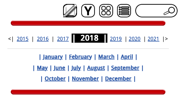
The new Article Index
When you navigate to this page, the website treats it like navigating to a tab in the icon row – like a menu within the tech specs index itself.
- You can navigate and explore down to the year and month. First select the year, then select the month.
. - The Timeline View lets you navigate a few years back and forth at a time on each page, but you may always click on the Pencil + Page icon to “reset” it back to every year. This button is persistent mostly every page of our website.
. - Side note: Currently, the feature is completed for years 2010 through 2025. This will take less time to complete and it will be announced when completed.
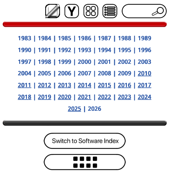
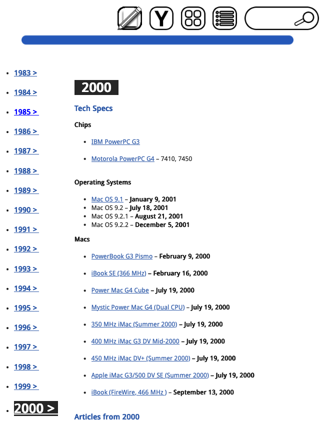
Timeline View for Tech Specs
The new mysterious “Y” button in the icon row of every page points to a new feature of our website, which is a timeline view for our website’s tech specs index in particular. Our readers now have three ways to navigate the articles on our website:
- A Timeline View, Icon View, and Text-List based view.
. - The “Y” Button is another persistent element of the icon row – treating the function as a menu you can jump to at any time, just like the Timeline View for our articles.
. - Side note: Currently, the feature is mostly completed for years 2000 through 2025. This one takes a bit of time to build, and completion will likely be announced concurrently with the Timeline View for Article Index.
A new Home Screen
In conjunction with our website become increasingly like an “operating system”, I decided to make a Home Screen which mimics the blue navigation bar up top. The idea is, since we’re so used to our smartphones and having apps, I may as well make a companion “Home Screen” to the website’s actual main page/article feed.
- This page will act as the “Icon View” main page, and will treat the website more like a smartphone.
. - When you click on “List view” on the Home Page, it will take you to the site’s actual home page, which is a list of articles from the most recent onward.
. - Home Button: That’s what the icon on the bottom of every navigation page is for. Always takes you back to this page.
In conclusion
Think of these as like a “Version 1.0” of how these features will work – they can be tweaked over time, feedback is welcome although major changes will take time if implemented. They’re about halfway done, are actively being worked on, but are functioning well enough to show to readers how they work. By tweaking some smartphone navigation logic into the simplicity of our website, I believe it was improved substantially.
I hope these projects will fix the website’s longstanding issue with being organized, or at least make a leap in the right direction. I want to channel my creative spirit into building this out, for our readers to have an easier time finding what they need, and for Low End Mac to keep on keepin’ on! Thank you for taking the time out of your day to read.
