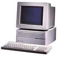
In this series of articles, Jason Walsh takes a look at how to run a design studio on low-end Macs. Whether you want to get off the upgrade treadmill, are just out of art school and want to set up shop on a budget, or just want to pick up a few tips and tricks, The Low End Designer will help you along the road. This article is the introduction to the series; we will be getting down to business next week.
Even during the wilderness years of the 1990s, Apple had an absolutely solid base in one industry – graphic design.
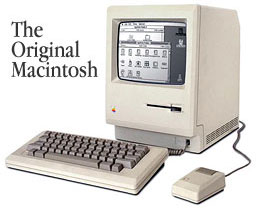
This dates back to the launch of the Mac back in 1984. This tiny machine with a laughably small screen was about to revolutionize art and design, but not everyone could see how. Famously, Andy Warhol turned down a free Mac offered by Steve Jobs – just think how much many more silk-screens he could have made, had he realized what he was seeing.
What he failed to see was this – a computer with a then-unique graphical user interface (GUI) that allowed for direct onscreen manipulation of images and text. This was soon followed by a collection of related technologies: the laser printer, Adobe’s PostScript programming language, and innovative software like PageMaker, Illustrator, and Quark XPress.
In essence that is what graphic design is, manipulation of graphics and text.
Design is high-end stuff, and manipulating graphics requires serious number crunching power. Little wonder than that Apple’s dual processor G5s are popular in the studio.
So what? This is Low End Mac, not Top of the Range Mac. What we have set out to prove is that good graphic design can be done on older Macs.
Can It?
 Of course it can. When this series of articles was initially commissioned, Dan Knight, Low End Mac’s editor and publisher, remarked, “People used to run PageMaker 1.0 on Macs with 9” black and white screens, and I used to do book design on a Mac IIci, so I know how capable – and sometimes slow – an ancient Mac can be.”
Great graphic design was created on the original Mac 128k back in 1984. Although we won’t be going quite that far back, it is important to note that superb design was around long before computers; computers just make the work easier.
 Several of my former colleagues at the (Belfast) News Letter – incidentally, the oldest continually published English language daily newspaper in the world founded, as it was, in 1737 – where I was a lowly typesetter, can remember the pre-Mac days of manual paste-up. My boss could remember hot lead.
Now, I’m not suggesting that the News Letter is a paradigm of good design (frankly, it isn’t), but it does go to show that the work can be done very successfully without computers. The News Letter was founded even before the Times of London, and it managed to survive for exactly two hundred and fifty years before a single Mac was brought in.
The fact is, Macs are partially responsible for the proliferation of bad design. Access to relatively low cost technology has resulted in the nonsense idea that graphic design and typography are merely IT tasks and not disciplines in their own right. The result has been a proliferation of poor design, bad in both concept and execution.
True, a Mac, Quark XPress, and Photoshop are literally all you need to put together a one hundred percent professional print design – I should know, I’ve made them with less – but it continues to sadden me that people think having the latest and greatest Mac or the newest copy of Photoshop is a substitute for talent, skill, or even hard work.
I continually see work that looks like it’s been made by a myopic, color blind, dyslexic orangutan vomiting into a press. This is particularly prevalent in publishing. I cannot state this point clearly enough – press-capable DTP systems are what have made bad design become so widespread.
Prior to 1984, ugly magazines were made by oddball groupsicles with a Roneograph and a missionary zeal; today they’re made by businesses on Macs and printed professionally.
And with the Web, it’s getting worse.
After some time as a freelance journalist and designer, I became the art director at another newspaper in Ireland, a brand new one. Instinctively, I wanted to break the mold, to make my mark. We all do. What I did not bank on was the fact that most staff were simply not interested in the details, particularly of typography. The result? A newspaper that looked fine on first inspection but was all wrong under the magnifying glass.
If you don’t know the difference between a hyphen and a dash or can’t work out a lpi/ppi* ratio, you need to go and learn before you inflict your mistakes on the general public. Poorly rasterized text, screen resolution images, garish and incoherent color schemes, variable font size, and ugly, overused typography are real headaches for anyone trying to make sense of your work.
Having a copy of Photoshop CS isn’t going to stop you making mistakes. Remember this: Design is all about communication, and we communicate without computers every day.
This series of articles will not make you into a good designer – even a four year course at art school will not do that on its own. You need a willingness to learn, a keen eye, and some ideas.
What this series of articles will do is show you how to set up a studio on a small budget using low cost Macs and teach you the tips and tricks to get the most out of your Macs, allowing you to keep off the upgrade treadmill for a while longer.
Along the way, I hope to impart basic knowledge and design skills – and even a bit of design history. The rest is up to you.
Before I leave you altogether this week, I should explain my credentials.
I am a journalist and designer living in Ireland and have worked in design for several newspaper groups, including Mirror Group Newspapers. I was the art director at Gorgeous, a women’s lifestyle glossy, and the East Belfast Observer, a weekly local paper. The editor and publisher of Low End Mac, Dan Knight is a former book designer, so rest assured, he’ll keep me from passing off my opinions as facts.
Next week we will be diving right in with information on which Macs to consider for which tasks – and which ones to avoid. The following week we will be taking our first look at software. Over the coming weeks we’ll talk about peripherals, typography, Web design, Wintel PCs, color management, and more.
* Don’t worry, both DPI and LPI will be explained later in this series.
NEXT: Which Macs Make the Most Sense and Why You Want OS 9
Keywords: #lowenddesigner
Short link: http://goo.gl/jrVqhm
searchword: lowenddesigner


