I recently had the insight (or rather, read an opinion on the matter) that being an extremist takes you nowhere. So here’s what: Windows is not as bad as most of me thinks. (Wow, finally got that out.)

Me, I’m a power user. This means I use computers until they choke, and then I push a little more juice out of it. No rest, no peace. So let’s look at Windows from my perspective for a while.

Take the task bar, for example. The task bar is very useful for switching between programs regularly, and the more you do it, the more it pays off. For best results, place it on the top of your screen – hey presto, mean machine goes task-switching several times per second. No problem. Actually, I like that kind of working. Any of you figure out why GoMac is so popular yet?
Now, the command line. While geeks may argue about Command Line Interfaces (CLI; such as DOS) versus Graphical User Interfaces (GUI; such as my very own Mac) I believe that a mixture of both is the way to go. As a computer student, I do a lot of programming. What way could possibly be easier to output loads of debugging information than the command line? Exactly. And the command line is also scriptable in a very basic sort of way; take repetitive commands (such as compiling our current Java project), stick ’em into a .BAT file and all you have to do is build them.
Another thing not to forget: Windows multitasks. Macs may be able to have several applications open at once, but Windows is a lot better at switching between them.
Memory. The Mac’s memory model plain sucks in comparison, by allocating chunks of memory to an application and thus fragmenting its memory more and more for each application launched and quitted. No memory protection, no dynamic allocation, no nothing.
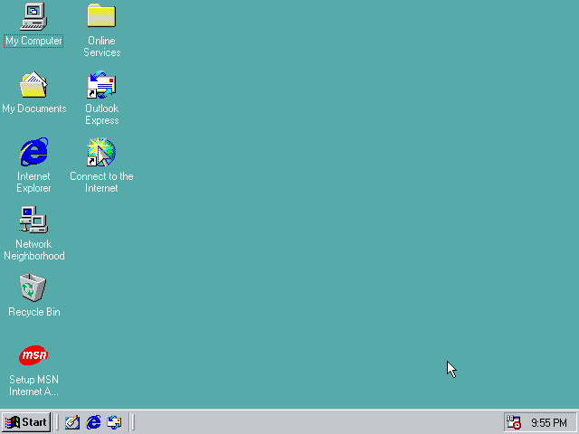
Also, see it from a beginner’s eyes. The first thing they notice after starting up Windows and logging in is that something moves on that grey bar way down. “Click here to start”, it says. Annoying for power users, but not bad if you are looking for a clue.
And take those “shortcuts” they have. There’s a nice little arrow marking them as shortcuts… now what? Apple copying Windows – come on! Well, it is actually a good idea.
Anyway, nothing good without bad points – and certainly not so in a Microsoftified environment.
That task bar – well, had Windows not had its irritating way of “maximizing” programs to make them occupy the entire screen, task switching would have been a mere “click at inactive window, get going”.
Command lines – that’s one feature I really miss in the Mac OS. Really. It’s darn useful sometimes – but to beginners, it is confusing to say the least. And it is the ultimate proof that Windows still lives on top of DOS. Fortunately for me, Mac OS X will have plenty of command lines to enter, and fortunately for most others, one won’t have to.
Multitasking – Macintosh’s weak point #1. Has gotten better over the last year or so, but it is still nowhere near Windows. Of course, Windows 95/98 has a much worse scheduler than NT, which in turn is worse than Unix. Which, by the way, is the base for Mac OS X.
Memory – no, can’t do that quite yet. We’ll simply have to wait for Mac OS X… 8.6 might take a step towards better memory management, but it’s not far enough.
“Click here to start” – well, “click here to quit” would be a better phrasing. That’s exactly what one does. The start menu’s first item is “Shut down…” How’s that for a big “DUH!?!
Shortcut arrows – Microsoft did them first (as far as I know), but in a very blunt, ugly way. They hide a large part of the icon. Apple did them right, by making the arrow tiny, and by removing the square that haunts Windows’ shortcuts.
My conclusion? Windows is good. Anyone who has tried X-Windows (for Unix) would probably have to agree. But the Mac is better.

