Apple just released iOS 7, the biggest change to their mobile OS since its introduction. But how is it?
The wonderful world of Apple has always been able to create hype and produce news stories out of the smallest rumours. Prior to its announcement at the WWDC in June, rumours of a major change in the iOS look had spread across the Internet like wildfire. Streamlined? Flat? Ditched skeuomorphic design? Major new features?
Well, they were correct. Apple showed off iOS 7 in June along with its radical new bright and bold look. Fast forward to September, and after months of beta testing, Apple have finally released it to the public.
Available to iPhone 4 upwards, iPod Touch 5th generation upwards and the iPad 2 upwards.
Gone are the shadows and bezelled icons for flat solid colours. Thin line type faces and white menu backgrounds, replace the chunky text and dark menus from previous versions, giving the whole OS a light feeling.
Check out the screen grabs below.

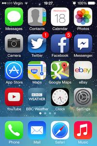
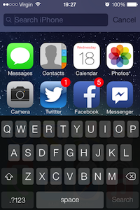
lock screen – home screen – search screen
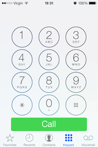
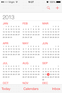

phone dialer – calendar – calculator
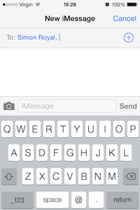
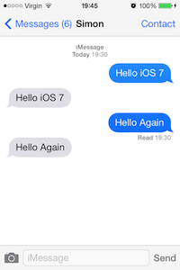
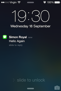
writing a new message – inside a message thread – lock screen with incoming message
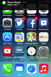
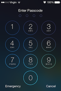
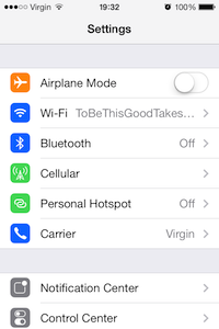
home screen with incoming message – passcode screen – Settings screen
Performance
I am running iOS 7 on an iPhone 4, the oldest iPhone to support it. With this in mind, I wasn’t expecting it to run well, but I am pleasantly surprised.
Speed is just about on par with iOS 6 with some of the animations lagging a small amount but nothing annoying. They really have optimised it as much as they can for older hardware, which in turn should have an excellent knock-on effect for the 4S and 5 and the recently announced 5C and 5S.
Battery Life
Well it is still early days, but battery life seems fine. It is too early to tell. But in the just over an hour I have been running it, battery life seems about the same as it was with iOS 6.1.3. I did turn off Background App Refresh, which allows apps to refresh content in the background. I didn’t think this was necessary. This should save some battery life.
Early versions of iOS 6 were quite battery heavy, drastically improved in 6.1 so if there are any battery issues in iOS7 further optimisation in subsequent updates should resolve this.
New Features
Apart from the new visual look, there are some new features. The biggest being Control Centre, swipe up from the bottom and you get a control panel giving you quick access to WiFi, Bluetooth, brightness, music controls, flashlight, and camera.
Safari has had an overhaul and features a new tab scrolling system. There is a new multitask manager and also updates to Siri (which I didn’t have access to, as I only have an iPhone 4), and Maps and Notification Centre which offers a lot more info. There is also a new look music player.
The camera app has new filters too. For the first time in iOS, you add effects to your images.
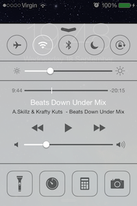

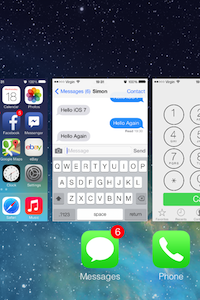
new Control Centre feature – new look Music Player – new look multitask manager

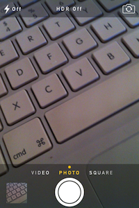
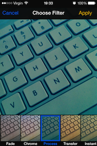
Safari web browser – redesigned Camera app – new camera effects
Missing Features
One of my most used features of iOS 6 was the ‘tap to’ buttons in the Notification Centre. Sending a quick tweet or post to Facebook was so easy. This has disappeared. I am hoping it is returned in future updates.
Conclusion
My first impressions of iOS 7 are I love it and of course happy that my aging iPhone 4 can run the current iOS for another 12 months at least and with the recent news that Apple now offer older versions of iOS the ability to download last compatible versions of apps – keeps me using an iPhone for a lot longer.
I shall be testing it out fully over the next few days.
Follow Simon Royal on Twitter or send him an Email.
Like what you have read? Send Simon a donation via Tip Jar.
keywords: #ios7 #ios7firstimpressions #iphone4 #techspectrum #simonroyal
short link: http://goo.gl/1nJafs
searchword: ios7firstimpressions


What about burst photo in iPhone 4? I have ridden that in the beta was available, but in the final version (at the moment) has been canceled.
Maybe in future minor updates of iOS 7 will be available.
Biggest issue I have with iOS 7 is on the iPad with its bluetooth keyboard case. On iOS 6 I could tap the shift key (Or any other key) to bring the password box up, however now I have to hit the home button on the iPad and swipe the screen.
Bit of a retrograde step.
Other than that, loving iOS 7 on all my devices.