2008: For the second time in a year, Apple is being sued for Macs that display “millions” of colors but using displays that can only display 262,144 colors per pixel.
The first suit came almost a year ago when Dave Gatley and Fred Greaves of San Diego filed suit against Apple, claiming that the LCD screens on the MacBook and MacBook Pro models were not suitable for high-quality work, especially photo editing, because the displays could not display the “millions” of colors claimed in advertising, spec sheets, and the Displays system preference pane. These notebooks still [in 2008 when this article was originally published] use 18-bit displays with 6 bits for red, 6 for green, and 6 for blue.
At the same time, MacBook Pro owners had been complaining of “grainy” and “sparkly” displays, and the conjecture was that Apple was simulating more than 262,144 colors by rapidly changing the color of individual pixels. By doing this, Apple would be able to display “in between” shades, essentially providing 7 bits per color channel for a total of 2,097,152 colors. This would also explain why images seemed to shimmer a bit.
The other theory was that Apple was dithering the display. Dithering is using two or more pixels to create the illusion of in-between shades, and it was widely used in the early days of the Mac when the built-in displays were only capable of displaying black and white with no shades of gray. By averaging two adjacent pixels together on an 18-bit color display, you again emulate a 2 million color display, thereby meeting the “millions” claim.
After the suit was filed, we pointed to How Good Is Your Color?, a page on the No, Dave, It’s Just You blog that included sample pages showing 18-bit and 24-bit color [images no longer online] visitors to the site widely reported that they didn’t see the same banding in the 24-bit image that they expected based on the 18-bit sample – even though they had notebook computers with 18-bit displays. The general consensus was that Apple and others were using dithering to smooth things out so that the 24-bit images looked smooth, not banded.
I wrote Apple Sued: Can 262,144 Colors Be Considered ‘Millions’? and asked, “Does it really matter? Is a quarter million colors good enough, regardless of what the lawsuit contends?”
Apple settled with Gatley and Greaves earlier this year, so the case never went to trial. No judge had to determine whether Apple was misleading customers and whether the use of an 18-bit display made a computer unsuitable for photo editing.
To this day Apple continues to advertise that the entire MacBook line supports millions of colors on the built-in display.
The 20″ Aluminum iMac
The issue has come up again after someone discovered that the 20″ iMac introduced last summer uses an 18-bit display. Earlier flat-panel iMacs had used 24-bit displays, and the 24″ model still does. And, as with MacBooks, Apple continues to claim that these iMacs can display millions of colors on the built-in display.
Lawyers, never known for understatement, are claiming that this makes the 20″ iMac “vastly inferior to the previous generation it replaced” and that Apple’s claim to support millions of colors is “grossly inflated”. Then they point out that the 20″ iMac displays 98% fewer colors than the 24″ model. They claim that 18-bit video is “particularly ill-suited to editing photographs because of the display’s limited color potential and the distorting effect of the color simulation processes.”
We’ll see what happens in the legal realm, but the question remains, How much difference does it make?
GIF

256-color demo image from Mac II.
When Apple introduced the Mac II in 1987, it introduced color to the Macintosh world. Apple’s 8-bit video card could display 256 colors from a palette of over 16 million colors – the same number of colors that a true 24-bit screen can display. And it was very impressive what Apple could display using just 256 carefully selected colors. (The Mac OS supported 1-bit, 2-bit, 4-bit, and 8-bit video, displaying 2, 4, 16, and 256 colors respectively.)
At about the same time that Apple introduced the Mac II and IBM introduced its first 256-color displays, CompuServe introduced its Graphics Interchange Format, commonly known as GIF (pronounced “jif” like the peanut butter). GIFs can display up to 256 colors from a 16 million color palette, and images are compressed, so it soon became the dominant format for sharing images online. To this day it continued to be used widely, particularly on the Web.
By 1990, 24-bit video has become the new high-end in Mac graphics, and accelerated video cards were the choice of power users, and in 1992 the JPEG standard was finalized (the Joint Photographic Experts Group had been working toward it since 1986). JPEG supports compressed 24-bit images, and it is the most widely used image standard in the world, used by computers, digital cameras, mobile phones, digital picture frames, and more.
15-bit Color
Apple introduced a new video mode with the Mac LC in 1990 – 16-bit color. You had to upgrade from 256 KB to 512 KB of video memory and use Apple’s 12″ 512 x 348 display, but for the first time, it was possible to display more than 256 colors on a Mac without the expense of a 24-bit video card. It wasn’t until the LC III, Centris 610, Centris 650, and Quadra 800 were introduced in 1993 that any Mac supported 16-bit video on the standard 640 x 480 display, and it also required upgrading VRAM (from 512 KB to 1 MB) to do so.
With 16 bits, you can theoretically display 65,536 colors, but Apple scaled that back to simplify things. By using 5 bits per color channel, it was easy to map images from 24-bit color space to Apple’s 15-bit color space, and 32,768 colors was a huge improvement over 256. TidBITS’ Glenn Fleishman writes,
“…16-bit video is more than adequate for video replay and most multimedia. Although full-screen, full-motion, 24-bit-per-pixel video capture is possible . . . most video is sampled down to 16 bits, or initially digitized at that bit depth. No more than 16 bits is necessary for representing the dynamic range (or numbers of discrete colors) that occur in a standard video signal.”
He also notes that “Apple believes that few non-experts can distinguish between 16- and 24-bit video.” Macworld refers to this video mode as “near-photo-realistic”, and most non-pro users agreed that it was plenty good enough. The new video setting was simply listed as “thousands” in the Monitors control panel, just as 24-bit video was and remains “millions”, and it looked great.
18-bit Color
Apple’s original thousands of colors setting was plenty good enough for watching QuickTime movies and looking at photos. For critical color adjustment, 24-bit video with its millions of colors was better, but 15-bit video was nice, kept costs down, and typically provided better speed than 24-bit video on those old Macs.
“The difference that makes no difference is no difference.” – William James
Today it’s still sometimes recommended to switch older Macs from 24-bit/millions to 16-bit/thousands for viewing YouTube videos, as just one example. And the difference in quality between thousands and millions of colors can be hard to notice – if you’re using a Mac, go to the Monitors control panel or Displays system preference, switch to thousands of colors and see if you notice the difference.
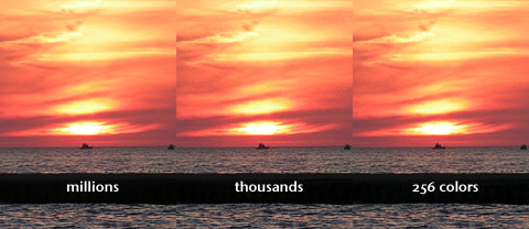
Here’s an example of 24-bit, 16-bit, and 8-bit video using a sunset I shot over Lake Michigan a few years ago.

Sunset displayed with millions, thousands, and 256 colors.
The 256-color part of the image was made by exporting to a 256 color GIF with dithering off, and the thousands image was done as a screenshot after switching to thousands of colors in my Mac’s Displays system pref. The three images were then put together in Photoshop and saved as a high-quality JPEG image. There are some subtle gradations missing between thousands and millions of colors, but in general, you can see why it was called “near photo realistic”. Even the GIF image is pretty good, selecting 256 colors from a 16 million color palette.
Unless I had to do very precise color work, thousands of colors would be good enough for everyday use. That said, 24-bit is nicer.
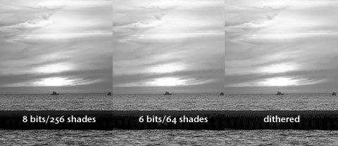
We don’t perceive color as sharply as we do light levels, so I also created a grayscale image from the same sunset. This was simply converted to grayscale in Photoshop:

8-bit and 6-bit grayscale images.
The 6-bit image was created by saving as a 64-shade GIF image without dithering, and the dithered image was saved as a 64-shade GIF image with dithering on. Why 6 bits? Because the displays in question use 6 bits per color rather than 8, so this should be a reasonable way of simulating the difference.
Again, there are smoother, more subtle gradients in the 8-bit image, but the 6-bit image is pretty darn good, and the dithered one is better than the straight 6-bit image.
I can’t claim that my results emulate what Apple does, and my “thousands” sample is done using 15- or 16-bit color, not the 18-bit color the MacBook and 20″ iMac screens can display, but they should be a step in helping you see and understand the difference that Apple is being sued over.
As much as I like the new 20″ iMac (despite its glossy display), this could give me pause before buying one. I don’t do critical color work, and I’ve certainly been impressed when looking at the iMac at the local Apple Store. Still, I’m glad I know that it doesn’t have a true 24-bits-per-pixel display like all of the other iMacs offer.

