I started using Match.com over a year ago, but I didn’t become a subscriber until this summer. I wasn’t having a lot of luck with Yahoo! Personals, so I thought I’d broaden my horizons.
Match.com claims to be the world’s largest online dating service. Founded in 1995, it has millions of members and helps build hundreds of thousands of relationships every year.
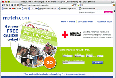
Match.com has a very different look from Yahoo Personals.
Although you can search without creating your own account, a big part of getting on the personals sites is marketing yourself. To sign up, you start by creating your profile. Match.com even walks you through the questions, as in the screen shot below.
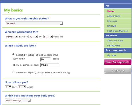
One really nice feature is that you can type in your search radius, which is an improvement over the discreet steps Yahoo uses (city only or 5, 10, 15, 25, 50, 100, or 200 miles). It still suffers from measuring distance as the crow flies – and even then sometimes suggests matches beyond your search range.
You can access your profile (image below) at any time to update your information. If you want older or younger partners, want to change your search radius, or want to check out possible matches in another area. You can also edit your appearance, interests, lifestyle, background, values, introduction, and what you’re looking for in a partner and a date.
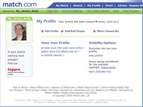
Profile
Match.com profiles include a photo (when available) and most of the same kind of information Yahoo does, but there are some extras. Match.com will also tell you how many emails and winks you’ve sent or received from this person.
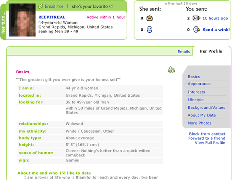
I’ve blurred and used a mosaic filter on the photo and edited the ID of this person, and I have to admit that it’s one of my favorite profiles. She hasn’t responded yet – I’ve found that only a small percentage of those I reach out end up replying.
This is what really got my attention:
![]()
True words indeed, and exactly what I’m hoping to give and receive in a relationship.
She also talks about wanting a “sexy man of God” (referencing Raising Helen), and that’s something I aspire to. (I look for a sense of playfulness in profiles. If it makes me laugh, that’s a good start.)
My Matches
Yahoo has several options for viewing your matches, including one similar to the one Match.com uses (below). I really like this interface. It shows 12 matches at once and lets me know at a glance when we last corresponded, whether it was a wink or an email, and whose turn it is to correspond. (If she wrote last, the surrounding graphic is magenta instead of green.)
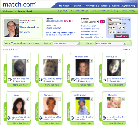
One more nice feature here: I can click on “more like her” and have Match.com find similar profiles. Sometimes that picks up someone interesting that I didn’t come across in earlier searches.
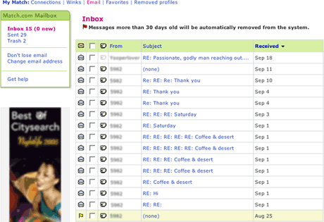
If Match.com falls short in one area, it’s email. It does some nice things, like forwarding messages to your regular email account, but it doesn’t let you archive your outbound messages, and it only stores emails you’ve received for 30 days. Then it deletes them.
The email interface is much more linear than Yahoo’s. Where Yahoo manages messages by user ID and threads them, Match.com just gives you a list of what you’ve received in chronological order.
Match.com is about 50% more expensive than Yahoo Personals at $30 for one month, $51 for three months, and $78 for six.
I’ve spent quite a bit of time on Match.com in the past month, yet I’m getting nowhere near the kind of results I’ve seen on Yahoo Personals. I’m using essentially the same settings on both, so I’m not sure why that might be. Maybe it’s Match.com’s size working against me – these women are probably being overwhelmed (something I’ll touch on in the concluding article in this series).
At this point, I don’t plan to renew my subscription when it runs out. Match.com may be big and have some features that Yahoo doesn’t, but it isn’t working for me.
- Online Personals: Dating for the Internet Generation
- Working with Yahoo! Personals
- eHarmony Is Different
- Tips for Getting the Most Out of Online Personals
Keywords: #onlinepersonals #datingsites
searchword: matchdotcom

