
Fonts have been central to the Macintosh experience since the very first Mac. By looking at the history of font technologies on the Mac, I’m hoping to derive some suggestions about how you can get your fonts to work best for you. This is the first article in a short series.
![]()
Bitmapped Fonts
When the Mac first came out, it was revolutionary, because it had bitmapped fonts for its screen. At that time, computers used a character-based approach that made screen text look like something typed on a manual typewriter. The Mac used little maps of black and white pixels (that is, a bitmap) to describe how to make a letter on the screen.
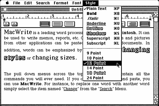
Bitmaps made Mac programs look much more elegant, because they could easily control how letters looked on the screen. Nowadays, people think nothing of saying, “Let’s make this word 18 point Bold Helvetica.” The Mac introduced those concepts of size, style, and font to computers.
PostScript Fonts
A few years later, the introduction of the LaserWriter spawned desktop publishing on computers. The LaserWriter used PostScript to define the shape of letters. Instead of a little map of black and white dots, PostScript contained a mathematical description of the outline of each character. While bitmap fonts look great at the sizes they are designed for, they get jaggy when they they are printed at a different size. Because PostScript is a description of lines and curves, letters can be made bigger or smaller and still look smooth.
PostScript fonts can also be used on your screen with Adobe Type Manager (ATM). Just as a LaserWriter has a renderer that takes the PostScript outline and turn it into little dots of toner, ATM renders PostScript fonts as pixels on your screen. ATM is a necessity for people who have PostScript fonts, but it also seems to break every time a new version of the Mac OS comes out. At one time in the past, Apple and Adobe agreed to make ATM part of System 7. but it never happened, although the ATM control panel was shipped with several versions of the Mac OS.
TrueType Fonts
When System 7 debuted, it introduced TrueType fonts. Like PostScript fonts, TrueType described the outline of the letter and allowed smooth resizing of fonts. Combined with inexpensive inkjet printers like the StyleWriter, TrueType brought high quality, smooth printing to all Mac users. The printouts from a StyleWriter with TrueType fonts was nearly as good as a LaserWriter with PostScript fonts – but cost only a fraction as much.
With the introduction of TrueType, the Mac started doing a two step process for drawing letters on the screen. It would first check to see if there was a bitmap for a font, because bitmapped fonts are designed to look best on the screen. If there wasn’t a bitmapped font, the Mac would use the TrueType font to draw on the screen.
As you might imagine, using a premade bitmap is quicker than calculating the font with TrueType. Early Macs like the Mac SE and Mac Plus are a lot slower when using TrueType instead of bitmapped fonts. As computers got faster, like the Mac IIsi that I own, the difference in speed became negligible.
Anti-Aliased Fonts
In Mac OS 8.5, Apple brought the technology of anti-aliasing to the Mac. When the Mac calculates a font with TrueType to decide which pixels to make black or white, the results can look slightly different on the screen and on a printer. Anti-aliasing (in this simplified description) allows the Mac to display grays on the screen to smooth out the fonts, as in the top two lines of the figure below.

If you like anti-aliasing, Macs with System 7 can get it with a control panel from Greg Landweber called SmoothType (see our review). Just as TrueType slows down the Mac, anti-aliasing slows it down even more. It works on many Macs, but it is better on faster computers.
So there you have it. The four main technologies in Mac fonts were the original bitmapped fonts, PostScript fonts, TrueType fonts, and anti-aliasing on the screen. In my next article I’ll talk about the fonts themselves.
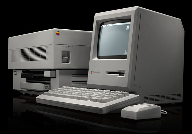
- I’d like to introduce myself. My first Mac was a Macintosh IIsi. I had that Mac in it’s factory-shipped configuration of 5 MB of RAM and an 80 MB hard drive for five years. I learned much of my Mac knowledge on that computer – especially my understanding of computer value that is at the heart of Low End Mac. I spent several years trying to get my IIsi to be the fastest and friendliest Mac that it could be.
Keywords: #fonttechnology #postscript #truetype #antialiasing
Short link: http://goo.gl/39kY7R
searchword: fonttechnologies
