
This week the low-end designer tackles more typographic woes, including leading, kerning, tracking, and justification. Before we launch straight into the new article, I’d like to take an opportunity to apologize to my readers (and editor) for the lack of a column last week. All I can say is, I’ve been reading your responses to the reader survey and great things are afoot! Now on with business.
Talking the Talk
Typography is, from the perspective of newcomers, plagued with confusing terminology. On the other hand, the technical vocabulary does allow for serious and precise discussion and manipulation of text. Let’s take a look at some of the key terminology.
Leading and Line Spacing
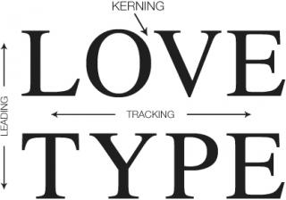
Leading isn’t what you probably think it is. In fact it’s pronounced ledding – as in lead, the metal. In this case, lead is referring to the strips of lead once used to create space between lines of text in the days of mechanical typesetting.
In other words, leading is line spacing. It’s purpose is to allow the designer to alter the density of blocks of text. Newspapers are quite dense and as such use a tighter line spacing value than you would find in magazines, brochures, or posters.
Page layout applications like Quark XPress, MLayout, and Adobe InDesign tend to use a default setting for leading of 120%. This means that 10 point text would be set with 12 point leading.
Every document will require different treatment, but here are some useful generalizations:
- Long lines of text may require extra leading.
- Bold face or sans serif type requires more leading.
- Type set at very small sizes, say 8 point or below, may require extra leading.
Leading affects the density of your page, so if your page seems a bit dark, try adding more leading.
Headlines may require negative leading, where type actually (or almost) overlaps.
The leading setting used will always depend on your type size. What size you set your type at will depend on the individual metrics of the font. For example, for body text in a publication, a relatively large font like News 701 could be set at 8 pt., whereas with Times you may want to go as high as 12 pt.
Kerning and Tracking
When a typeface is designed, the designer assigns each character a width allowing for consecutive characters to be placed on a line without touching. However, the type designer’s intentions may not be the same as your own. Kerning and tracking are two frequently confused typographical methods for controlling type spacing. Both refer to the adjustment of space between characters of type.
Kerning allows you to manually adjust the space between any two characters. Tracking allows the user to apply a form of universal spacing between all characters. As such, it’s a powerful option, and once you’ve found a setting that you feel is suitable, you’d be well advised to leave it alone and adjust the kerning manually for further changes.
Justifying Text
Text justification is a matter of opinion. My preference is for serious and news style material to be set fully justified (line ends creating a vertical line on both sides of the column). This contributes to a serious feel in the text.
Opinion-pieces, fictional stories, and lighter pieces can be set flush-left (ragged-right), which creates a somewhat lighter look.
Centered, flush-right, and forced justification can produce interesting results, but are quite extreme settings – handle with care.
Fitting In
Take a close look at a newspaper, and you will notice that, unlike many magazines or posters, stories fit exactly into the allotted space with no white-space below the last line. This helps give a sober and professional feel to news pages, and obviously we want to replicate that in our design, so, what’s the trick behind this?
Well, subtly adjusting the kerning and tracking will get you some of the way there, but the only way to perfect it is to edit (or “sub”) the text to make it fit. This is one of the key reasons why pages are laid-out by sub-editors and not designers: An understanding of the rules of language and how to make a story flow well will go a long way.
Kerning image from http://graphicdesign.stackexchange.com/questions/19498/what-is-the-name-for-making-words-equal-in-length
PREVIOUS: Text and Typography: Serifs and Dashes
NEXT: Low End Designer Survey Results and Feedback
Keywords: #kerning #leading #tracking #justification #lowenddesigner
Short link: http://goo.gl/XTJjOC
searchword: textandtypography
