
2008: Bigger, more, cheaper! Those are the cries of computer buyers – and successful manufacturers answer in spades with faster CPUs, more RAM, bigger hard drives, and higher density displays. Oh, and sometimes smaller, cheaper computers as well.
Apple has generally been a trendsetter, not a pack follower – witness the iMac, which has rethought and redesigned the all-in-one form factor three times already; the Cube, which proved that a computer could be beautiful even if it couldn’t be marketed adequately; the Mac mini, the small desktop computer against which all other small desktops are measured; the 17″ PowerBook, the first 17″ notebook computer and, at 1″, also the thinnest; the iPod, which redefined the MP3 market with its innovative design; and most recently the MacBook Air, which demonstrated that Apple could create a hot selling ultralight notebook with a full-sized screen and keyboard.
Apple is willing to create trends as well as buck them. There are no MacBooks where the graphics processor can be replaced. There are no expansion slots in the Mac mini and iMac. In fact, there is no desktop Mac shy of the $2,200-and-up Mac Pro that has expansion slots – the complete opposite of the way things are in the PC world, were almost every computer has more slots than you’ll ever need.
Think Different
Call it thinking outside the box, but Apple is doing very nicely going its own way. I hope they’ll continue to do so as the computer industry is poised to move to 16:9 displays instead of the 16:10 ones we’re used to.
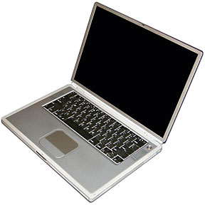
15″ Titanium PowerBook G4
It seems logical: widescreen TV is 16:9, and all else being equal, you can get more 16:9 displays from a production run than 16:10 screens. (For the record, Apple started the whole widescreen notebook trend back in 2001 when it introduced the first PowerBook G4 with its 1152 x 768 screen. That was a 3:2 ratio, which is not quite as widescreen as today’s 16:9. And it was good.)
Historically computers have followed television with few exceptions (there have been a handful of portrait displays, which are oriented vertically). In the early days of personal computing, we attached our computers to composite black-and-white monitors or color TVs. The computers with built-in displays also used screens with the same 4:3 ratio as our televisions.
Look at the numbers: the original 9″ Macs used a 3:2 ratio (512 x 342), but later Macs standardized on 4:3 – the 512 x 384 Color Classic, the once ubiquitous 640 x 480, the SVGA 800 x 600, the popular 1024 x 768, the even nicer 1280 x 960, and so forth. Except for some early PowerBooks with 640 x 400 screen (16:10!), until not too many years ago, 4:3 was the norm.
Some of us are even less widescreen than that. I work on a 1280 x 1024 display, which is a 5:4 ratio. And I love it – as I’ll explain in a moment.
Since 2001, notebook displays have moved from 4:3 to 3:2 and then to 16:10. All of the scuttlebutt from Taiwan points to 16:9 becoming dominant within a year.
The Golden Ratio

Replica of the Parthenon in Nashville, Tennessee
At least since the Renaissance, artists and architects have recognized that the “golden ratio” makes for harmonious design. Building designed around it, such as the Parthenon (and its restored duplicate in Nashville, TN), have stood the test of time.
What exactly is the golden ratio? Rather than look at the theory, I’ll boil it down to a number: 1.618:1 – or almost exactly the 16:10 ratio of most of today’s notebook computer screens (and iMacs and Cinema Displays). Maybe the aesthetics of the golden ratio will be enough for Steve Jobs to say that Apple won’t follow the crowd to 16:9 displays.
Why am I opposed to 16:9 computer displays? And why am I so happy with my 1280 x 1024 (5:4 ratio) display?
I can answer that with two words: menubar and Dock. While it’s true that HDTV uses a 16:9 ratio, it’s also true that computers aren’t televisions. We have things like the menubar and Dock taking up screen space at the top and bottom of the display. Go to a 16:9 display, and you have no room for them when you’re working with HD video content. I think that’s a compelling argument for not going to 16:9 for computer displays. [Update: Since this was first published, Apple has given us Full Screen Mode, which hides the Dock and menubar, but hiding the menubar seems a high price to pay.]
The other reason is that there is no reason that our computer displays should match the proportions of our television displays. You need enough pixels in both dimensions to work efficiently. For me, having 1024 pixels top-to-bottom is a real treat, and working with the 1440 x 900 display on a MacBook Pro makes me feel that I’m missing something even though it has more horizontal pixels. There just aren’t enough pixels vertically to make me happy, but the 1440 width is wonderful.
The ideal for me would be the 1680 x 1050 of the 17″ MacBook Pro – not because I need all of that width, but because I need that much height to work efficiently. The width is just an extra blessing. [As I migrate this article to WordPress in July 2018, my main desktop Macs are a 20″ Early 2008 iMac with a 1680 x 1050 screen and a 2007 Mac mini with Apple’s 20″ 1680 x 1050 Aluminum Cinema Display. They are very nice indeed, practically perfect for the way I work.]
The Way We Work
I’ve noticed that I work differently on a widescreen display than on a less wide one: On my 1280 x 960 eMac, the 1280 x 1024 display attached to my Power Mac G4, and my G3 iMac, I almost always have the Dock at the bottom of the screen. And I don’t hide it, as I hate the way it wants to pop up when you get too close to the edge of the screen. The net effect is to give me a more widescreen workspace.
But when I used my PowerBook G4 with its 3:2 ratio widescreen or when I use the 16:10 ratio display on a MacBook Pro, I put the Dock on the right side. The icons are much smaller, but it maximizes my use of the vertical dimension on widescreen display. It makes my workspace a bit less widescreen.
I’ve tried changing it on both types of displays, but I keep coming back to this way of working. I don’t know if this is the norm for others, but it works very comfortably for me. [Update: With the 1680 x 1050 displays, I keep the Dock at the bottom of the display.]
Going to a 16:9 ratio display will either cost us vertical pixels (turning a 1280 x 800 MacBook display into a 1280 x 720 pixel screen – perfect for HDTV, but not so good for computing) or tack on even more width than we already have (turning a 1280 x 800 screen into a 1420 x 800 one). Reducing the number of pixels on the screen won’t improve productivity and may slightly reduce it, but it’s just as questionable whether 11% more pixels horizontally are going to measurably improve things.
My advice is that Apple stick with the golden ratio 16:10 widescreen displays that we’re used to. They look good, and there’s really no reason computer displays should be wed to the 16:9 ratio of HDTV. Using CRTs with their 4:3 ratio made sense in the early days of personal computing, but in the era of flat panels, we should pick the ratio that works best for doing work on our computers – even if it no doesn’t match our TVs.
keywords: #goldenratio
short link: https://wp.me/p51SSp-dd8
