Which One's Broken, Low End Mac or Internet Explorer 6?
Daniel Knight - 2005.05.27
A week
ago we moved to a CSS-based design at Low End Mac. CSS has been
supported by all the major browsers since version 4.0, and only the
tiniest fraction of a percent of our visitors are not using modern
browsers, so I spent some time learning CSS design, pretty much
replicated our existing look-and-feel, and started posting pages
with the new design last week.
I did a lot of reading, typed in a lot of examples, did a lot of
testing on my eMac (Firefox, Safari, Shiira, Camino, Opera, even
Internet Explorer 5.2), and tweaked things until it looked almost
the same on all these browsers. There are some differences, and
iCab 2.9.x doesn't support the design at all (3.0 will), but
between following established standards and testing in all my
browsers, I though I was safe.
I didn't count on Internet Explorer 6.
Go figure. In no time at all I started getting emails about Low
End Mac being "broken". Broken? But it worked in each one of my
browsers and was directly based in samples published in CSS
manuals. It should have worked.
It took a while, but by midweek I was finally getting some
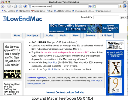
screen shots. Those of you who don't use IE 6 know that the
LEM home page looks like this:

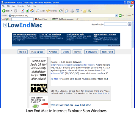
Visitors using IE 6 were seeing this instead:

It didn't make any sense at all. The vertical bar with the ads
is supposed to be absolutely positioned on the left side of the
page. It is in every browser except IE 6. I have to believe
that this is some sort of Microsoft bug, since my style sheets and
XHTML validate.
If you do a Google search for Internet Explorer CSS bugs, you'll
discover there are a lot of them. From my research, none of them
matched this problem, so I'm hoping some LEM reader will be able to
help solve this problem. After all, 36% of our visitors are using
Windows XP, and 90% of them are probably using IE 6. That's
one-third of our visitors who can't read the site properly - and
that's a big problem.
(Yes, I really should invest in a WinXP computer, but my 17
months with an old Dell have convinced me that a Windows computer
on the Internet is trouble just waiting to happen. I spend more
time updating and running antivirus, anti-adware, and anti-spyware
programs than actually using the computer.)
Here's the CSS code that defines the main section of our
pages:
#content {position: relative;
background-color: #ffffff; }

#main-text {margin-left: 168px;
margin-right: 0.5em;
position: static;
top: 0px; }

#adbar {position: absolute;
background-color: #eeeeee;
top: 0px;
left: 0px;
bottom: 0px;
width: 160px;
line-height: 1.25em; }
The "adbar" section should place a 160 pixel wide bar down right
at the left side (0px) of the page. The "main-text" section puts
the bulk of the page 169 pixels from the left side of the page. It
shouldn't be possible for these sections to overlap.
And here's a very reduced version of the XHTML code that shapes
the page:
<div id="content">
   <div id="main-text">
      INCLUDE TEXT HERE
   </div>
   <div id="adbar">
      INCLUDE ADS HERE
   </div>
</div>
The first and last "divs" mark off a section of the page. The
2nd and 3rd divs display the main text in accordance with the CSS
rules above. The 4th and 5th divs display the advertising bar on
the left side of the page - except in IE 6.
(For the record, I've eliminated the "adbar" section on this
page so IE 6 users can read it.)
If any of you can shed some light and help me find a solution to
this problem - other than going back to inefficient table-based
layout - I'm all ears. Please email me. Thanks!
Daniel Knight
Feedback
Several visitors have emailed to answer the question in the
title of this article, "Which one's broken, Low End Mac or Internet
Explorer 6?" They each say it's definitely IE 6.
See our follow-up article, Making Low End Mac's Design Work with Internet Explorer 6, to see how we solved this problem.


