Making Low End Mac's Design Work with Internet Explorer 6
Daniel Knight - 2005.06.02
Last
Friday I asked the question, Which One's
Broken, Low End Mac or Internet Explorer 6? The universal
answer: IE 6.
I'd created a simple, elegant design for Low End Mac using
Cascading Style Sheets (CSS) instead of a table-based layout. I
looked great in Firefox (my primary browser) and Safari. And in IE
5.2 for Mac. And one reader even reported that it worked great in
iCab 3.0 beta.
But it didn't work with Internet Explorer 5.5 or 6.0, and I
couldn't understand why. Sure, usual Microsoft thumbing their nose
at standards, breaking things that had worked in earlier versions
of their browser - but what exactly was wrong with IE 6 and
how could I work around it?
Going Windows?
The biggest part of the problem is that I had no way of testing
my design on Windows, so I did a little research, compared the
price and convenience of low-end desktop PCs vs. laptops, and
bought a very nice Windows laptop on Tuesday.
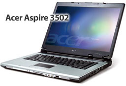
 The model I settled on is the Acer Aspire AS3502WLCi - a
name only a geek could create or love. CompUSA sells these for
US$699, and they didn't even have a display model. That's how fast
they sell. Fortunately a shipment had just come in.
The Aspire 3502 has a 15.4" 1280 x 800 (WXGA) screen that's
crisp and bright. The Celeron M runs at 1.4 GHz. The computer has
512 MB of memory (from what I hear, a minimum for good Windows
performance, and twice as much as most entry-level laptops have) on
a 400 MHz bus. There's a 40 GB hard drive, a Combo drive, built-in
802.11b/g, and the most important thing of all - Windows XP Home
Edition.
Compare that with Apple's $999 12" iBook, and you can see why
Windows is popular. Not only is the CPU marginally faster in clock
speed, but the Aspire 3502 has twice as much RAM, a much faster
memory bus, lots more ports, and a much bigger widescreen display
with 30% more pixels.
On the down side, the battery is only rated at 100 minutes vs.
360 for the iBook, and the Acer is huge by comparison. At 14.3"
wide, 11" deep, and 1.5" thick, it dwarfs my four-year-old 15" PowerBook G4/400. It's also nearly a
pound heavier than my PowerBook and 1.3 pounds heavier than the 12"
iBook.
And then there's Windows, which even in its latest version
doesn't come close to having the elegance and friendliness of any
Mac OS. Window XP is prettier than earlier versions, but there's a
difference between simplicity with elegance and eye candy.
Another oddity - the hard drive is partitioned, so the 40 GB
drive has a 3 GB PQSERVICE partition, a 17 GB main partition,
and a second 17 GB partition. Weird. I'm sure that first partition
serves a crucial purpose, but I can't comprehend why they'd take an
already-small 40 GB drive and not create a 34 GB user
partition.
Another Windows thing - the first thing the computer wants you
to do is backup everything. That required four CD-R discs and took
nearly an hour. Unlike the Mac, there doesn't seem to be a simple
restore disc. What, that saves Acer maybe 50¢ while tying up
an hour of your time. Not cool - and cheap.
Finally, this being Windows, the computer keeps reminding me
that I don't have any antivirus software installed yet. Constantly.
Hey, I'll get to it, but first things first. I need to install
Firefox, my favorite messaging clients, and get Low End Mac working
on Microsoft's broken browser.
Making LEM Work with IE 6
I spent most of Wednesday experimenting, testing, and fiddling
with page layout. I created a minimum page that just included the
troublesome section, and I discovered what the problem was.
<div id="content">
   <div id="main-text">
      INCLUDE TEXT HERE
   </div>
   <div id="adbar">
      INCLUDE ADS HERE
   </div>
</div>
When I removed <div id="content"> and the last
</div>, everything worked perfectly. The ad bar on the left
side of the page no longer covered the main text. And the minute I
put that div back, the problem returned.
That created a new problem. Now the adbar sat at the top left
corner of the page, covering the Low End Mac logo and part of our
navigation bar. That's the problem the content div avoided. But it
broke in IE 6, which at least one-third of our visitors use.
(Windows XP accounts for 36% of our traffic, Windows 2000 for
another 9%. I'm sure at least 80% of them are using Microsoft's
browser.)
I'd have to modify the description of the adbar in my style
sheet. Here's what it looks like now:
#adbar {position: absolute;
top: 195px;
left: 0px;
bottom: 0px;
width: 140px;
line-height: 1.25em; }
Update Oct. 2005: We still haven't found a line-height system that works consistently. However, using ems broke under Firefox 1.5b. Switching to percentages fixed it there.
After a fair bit of trial and error, I determined that setting
the adbar 195 pixels from the top of the page worked in all my
browsers. Because it was no longer flush with the gray navigation
bar, I removed the gray background, and I made it narrower, which
also leaves more room for text.
I made a few other changes. The text links in the adbar are no
longer centered, and they have a 5 pixel margin to keep them from
running into the edge of the page. Also, the "Newest Content on Low
End Mac" and "Around the Web" headings are now reversed against a
blue bar.
And once I had all of that fixed, I had 200+ pages that needed
to be updated with one or more changes - primarily removing the
content div.
It works, but Microsoft's broken browser is a costly mistake.
They broke things that had worked in the past, and because of that
I spent $699 on a computer and spent a whole day testing and
recreating a design that worked on all the other modern browsers
with CSS support.
Two suggestions:
- If you design websites on a Mac, get a cheap Win2k or WinXP
computer so you can test it using Internet Explorer 6.
- For Microsoft, don't wait until Longhorn - fix your browser
now. The whole world shouldn't have to waste their time modifying
designs that work in everything but IE 6.
 The model I settled on is the Acer Aspire AS3502WLCi - a
name only a geek could create or love. CompUSA sells these for
US$699, and they didn't even have a display model. That's how fast
they sell. Fortunately a shipment had just come in.