
2000 – Unless you know your visitors have browsers that support Flash, PNG, QuickTime, and other recent innovations, stick to JPEG and GIF images on your website. Knowing the audience of Low End Mac includes a lot of people surfing on version 3.0 and earlier browsers, you won’t find any other graphic formats here.*
A good server and log analysis program can tell you more about your site than you’d learn from an online survey, since it counts every visitor. Failing that, some banner exchanges (including MyBannerSwap.com) can track that information for you. According to their data, the following browsers were used when visiting the Low End Mac home page and displaying their banner:
- Netscape 4.x, 49.8%
- Internet Explorer 4.x, 21.6%
- Netscape 3.x, 4.0%
- Internet Explorer 3.x, 0.7%
- Internet Explorer 2.x, 0.7%
- Netscape 2.x, 0.6%
- Other browsers, 2.4%
I’m completely surprised to see IE 5.x didn’t register at all, since it’s been on PCs for over a year and on Macs for the past week or so.
The other important thing to know is what computers your visitors are using, since IE 4.x for the Mac doesn’t support PNG images, while the Windows version does.
- Macintosh, 43.1%
- Windows 98, 13.6%
- Windows NT, 10.5%
- Windows 95, 10.2%
- Other, 22.5%
These are just indicators, since they don’t evaluate the entire site, but it lets me know that maybe half the visitors to Low End Mac are using browsers with no PNG support. That’s one reason you won’t find PNGs here.* I need to serve the needs of my readers. (Based on older stats, I know the mix on my site is about 55% Mac, 40% Windows, 5% other.)
GIF
The graphics you’ll see most often on the Web are GIFs (for Graphic Interchange Format). These images can be any size and can display up to 256 different colors. The format supports animation, so almost every animated banner ad you see online will is a GIF. [This was true in 2000, but Flash soon displaced animated GIFs. In 2016, animaged GIFs have made a big comeback, particularly in social media.]
GIFs can be pretty compact, supporting as few as 2 colors (black and white), as many as 256, and any value in between. You might be surprised at how few colors can make up a stunning graphic. I’ve seen one photograph of a rose using 64 colors that I would have sworn had to be a 16-bit image.
The key to GIFs is knowing when to use them and how many colors to use. GIFs work best for graphics: banners, logos, and other things with large areas of strong color. They sometimes work for photographs, but JPEGs (below) usually do a better job there.
Creating a GIF

The current [2000] Low End Mac logo started out as a Photoshop image with multiple layers. The bottom layer is white. The next layer contains the words Low End Mac in black using the Bodega Sans Black typeface with antialiasing turned on. Because I didn’t like the amount of space between the words, I duplicated this layer three times.
 On one layer, I removed everything except the word Low. On the next, I only left End. On the third, Mac was the only part retained. Then, using the nudge tool, I moved Low to the right one or two pixels, Mac to the left by the same amount, and then flattened the three layers into one, since I don’t expect to ever change that positioning.
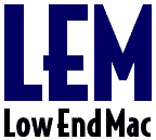 On top of these two layers comes the logo layer, which is simply the letters LEM in my current theme color.** (I have several logo layers, each with a different theme color, making it easy to alternate the look over time.) The letters are again Bodega Sans Black with antialiasing enabled, but in a much larger size and in color.
As with the second layer, I create two duplicates of the logo layer, leaving only one letter on each, nudged them closer together, and then flattened them. The end result is three active layers: a white background layer, one with Low End Mac in black, and one with LEM in color. Now I go in and clean up the edges of the letters LEM to make them as single-colored as possible.
The next step is to export the artwork as a GIF image. At this point, the image has 33 colors, so I first export it as a 32-color GIF (top logo). It’s very attractive and uses 2,036 bytes. Next, I export it as a 16-color GIF (above left), which looks pretty sharp, too. It’s also smaller at just 1,850 bytes.
 The third image (above right) goes one step further, using only 8 colors and occupying only 1,689 bytes of space. And finally, I drop to 4 colors (left), which is an even more compact 1,474 bytes.
Then I look at the images. It’s hard to distinguish the first three. The fourth, with only 4 bits, isn’t too bad, but does show some stair steps on the angled part of the letter M. So I rule that one out, choosing the 8 color image as offering the best compromise of sharpness and file size. It’s only 225 bytes larger than the jagged 4 color image, but also 347 bytes smaller than the 32 color image.
One key is not to depend on the Photoshop preview for GIFs. Save the image and then open it up next to the original.
Your results will vary based on the number of colors in your image. Color gradients need a lot more colors to look good. With most images using one color on a white background, 8 colors will usually be decent. Going to two colors usually means at least a 16 color palette, and often 32. Three or more colors will often look best in 64 color mode. Those are starting points. I suggest you always try going one step above and below that, then visually compare the output.
The key is an image that’s both pleasing to the eye and loads quickly – a small percentage of surfers are still using 14.4 modems to access the Internet.
JPEGs
Most photographs you see on the web are JPEGs, which are not limited to a 256-color palette like GIFs. The key with JPEGs is balancing sharpness, artifacts, and file size. In fact, JPEG is the native format of most of today’s digital cameras.
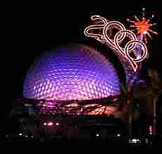
I brought my Canon PowerShot A50 on vacation in late January, the week at Disneyworld where we were glad to have our Michigan winter gear – it was cold! The pictures below were originally shot on the A50, cropped and reduced in size in Photoshop, and exported as JPEGs using GraphicConverter.
I have not done anything to color balance, although I have slightly sharpened the image using the curiously named “unsharp mask” filter.
 JPEG at 85% |
 JPEG at 50% |
 256 color GIF |
 JPEG at 15% |
I include the 15% image mostly to show the danger of going overboard in compressing JPEGs. The image in only 4,668 bytes, but it looks like something off a heavily used videotape. The 50% image isn’t bad, and it’s just 8,372 bytes. Compared with the 15,151-byte 85% image, it loses some sharpness, but it’s not bad. The 85% image is quite good, but significantly larger than the 50% image.
Overall, I’ve generally found 60-75% settings produce the best compromise of image quality and file size, but this will vary from image to image – and from app to app. If you’re going to be placing family photos on the Web, find that sweet spot where quality and image size complement each other – otherwise the images will take too long to load. (The original Photoshop image is 148 KB, and a 100% setting on JPEG results in a 48 KB image.)
The 256 color GIF image is shown primarily because this image does quite well with a limited color palette, probably on par with a 60-70% JPEG. On the other hand, it also demonstrates why JPEG is generally used for photos instead of GIF – the GIF image is 22,506 bytes in size, about 50% bigger than the high quality JPEG!
Conclusion
The key to site graphics is knowing what image formats your visitors can view, knowing when to use each format, and then choosing the settings that will provide the best balance of file size and image quality.
Next: Web Content to Go
* That was then. This is now. With all modern browsers supporting PNG and 8-bit PNG files being more compact than GIF files, we have converted the vast majority of our GIFs to PNG. We also use ImageOptim to further reduce file size of GIF, PNG, and JPEG images with no loss in image quality. Recommended!
** Speaking of color themes, Low End Mac has almost always used blue as a theme color, although for a while we went to green. We have been using blue and green for several years now (Sept. 2016).
Our Web Design Series
- Using Include Files
- Site Organization
- Cascading Style Sheets
- Site Graphics
- Web Content To Go
- Reading Your Web Log
- Redirects, Naming Files, and Some Rants
Keywords: #imageoptim #gif #animatedgif #jpeg #png #graphics #images
Short link: https://goo.gl/wegryP
searchword: sitegraphics
