Apple released OS X 10.10 Yosemite yesterday, and I take a look at their latest offering.
Another year and another free version of OS X. Some says it a good thing, and some say it is just a way round Apple releasing a new version so quickly.
It’s free so – as always – I was quite excited and decided to be an early adopter. There are those who tend to wait until the first point release or to ensure their software is supported.
For me, I have no patience. I wanted it straight away. I have very little in the way of software on my Mac, so I didn’t see there was going to be a big problem with compatibility. Besides, it has been a long time since a new OS X broke any software I used.
Download
The Apple site was showing Download Now within a very short time of the live event. However, it seems the Mac App Store hadn’t quite caught up. Eventually it popped up, offering a download and set it off downloading.
Mine took a very painful 11 hours to download. I know my internet connection is working fine, so I can only assume it was crowded servers. I left it going over night – and still a way to go when I got up this morning.
Installation
After the lengthy download time, the usual install screen popped up. Normally at this point I would have cancelled it, grabbed the DMG for future use, and created a bootable USB stick.
However, this time I decided to upgrade over OS X 10.9 Mavericks. After all, it is how Apple prefers it, and my Mavericks was only reinstalled a few weeks ago.
Installation was fairly quick and painless. Once you set it going, it was case of leaving it to do its thing.
First Impressions
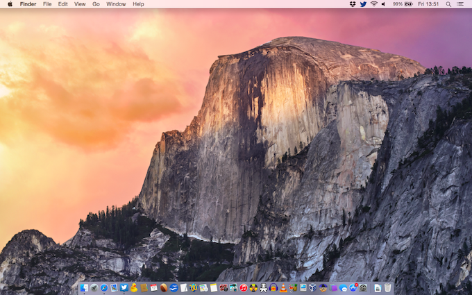
Yosemite seems to be getting the same reaction iOS 7 did when it was first released. There are those who like the bright, bold new look and some who claims it looks quite childish.
I do like the new look, with its funky bright icons and flattened look, but I can see that could detract from the fact that this is a serious and professional operating system.
I have been running it now for a few hours and have had no issues so far. The upgrade went without a hitch, and all the apps I had in Mavericks appear to be working fine.
Twitter, Cyberduck, Bean, OpenOffice, TextWrangler, Burn, Audacity, VLC, HandBrake, MacTracker, VirtualBox and UnRarX all work fine.
Tiny Umbrella required a Java installation, but once installed worked fine.
New Features
Apart from the new look, Yosemite has new basic features such as a revamped Spotlight and the dark mode, which turns the menu bars, menus, and dock background dark. I prefer the normal mode.
Then there are the HandOff/Continuity features, which means you can work on your iPad or iPhone, and as soon as you get close to your Mac, it will pick up where you are and you can continue straight with your Mac. I have yet to try this.
The one feature I was looking forward to, but seems like I will have to wait until iOS 8.1 (scheduled for 20th October) is released is the ability to SMS anyone from my Mac and not just iMessage recipients, as before.
General Speed
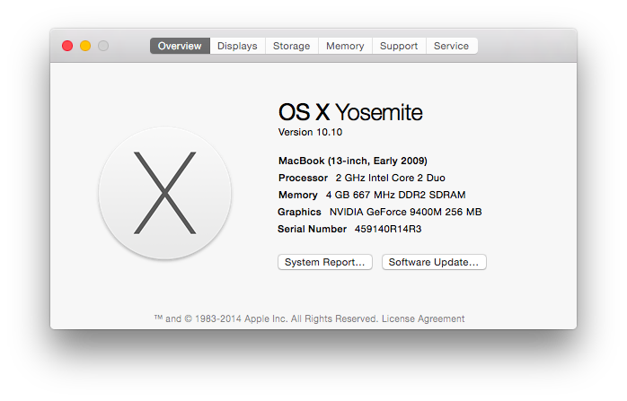
My Mac is a 2009 MacBook white model. It has a 2.0 GHz Core 2 Duo processor, 4 GB of DDR2 RAM, and the stock hard drive. It is one of the lowest to support Yosemite, so how does that affect performance?
 I have played with the public betas and was seriously impressed with the speed. The final seems no different. It is very fast. It is without a doubt faster than Mavericks. Navigating around the Finder and opening apps has definitely improved – and the general usage in apps seems a lot snappier.
Time Will Tell
You cannot judge an OS totally within a few hours – although you do get a general impression. It would be interesting to see how it goes over the next few days, whether I run in to any glitches with app and how it affects battery life on my MacBook.
First Few Annoyances
Whilst checking out Yosemite and writing this article, I have stumbled across an annoyance and a bug.
- I couldn’t find my Bookmarks Toolbar anywhere. I thought I had lost it. However, it seems if you highlight the text in the address bar and clear it – or click in the address bar if it has no text in it – then the bookmarks that used to sit in your toolbar will pop up in a panel.
- When opening TextEdit and then selecting Open, the box pops up with your documents. These are iCloud documents (not iCloud Drive documents). However, every time you scroll down to reach the documents further down, it springs back to the top. I had to type the first letter of the document I wanted open and press Enter quickly to get it open.
This is a first release, and you do expect a few bugs or glitches.
Conclusion
Yosemite is shaping up to be a great version of Mac OS X. It seems very fast so far – even on my older hardware – and I personally like the new look.
Another great, free offering from Apple.
Follow Simon Royal on Twitter or send him an Email.
Like what you have read? Send Simon a donation via Tip Jar.
keywords: #osxyosemite #yosemite #techspectrum #simonroyal
short link: http://goo.gl/RMN8dg
searchword: osxyosemite


