 Low End Mac has been through a lot of changes over the years. For much of Low End Mac’s earlier days, we used Claris Home Page to edit and design our content (many different table-based designs). We switched to Cascading Style Sheets some years back and then to WordPress, so every now and again you may run into an older page on our site. This logo on the left is our current site icon that shows in the browser tabs.
Fast forward to 2025, and nowadays the work is done in Adobe Photoshop CS4 on a Power Mac G5 Dual 2.0, sometimes CS6 on a Mac Pro 3,1, and other times just the basic preview editing tools available right in macOS Sequoia.
April 1997: Welcome to the New Low End User Site
We’ve gone through a lot of changes in our logo over the years. Even our name has changed: We began life as Low End User on Dan’s personal web space in April 1997, adding “Mac” and expanding that to The New Low End Mac User. We have an archive of the site as of late April 1997 and another from June.
 June 1997: The New Low End User Site
We refined the name, eventually settling on the brief, simple, descriptive Low End Mac, which we’ve used since late 1997.

1998: A user-submitted logo
 The logo to the left was designed and submitted by a reader, although we originally used it at a much larger size. To the best of my recollection, we used this some time in 1998, and we resurrected it briefly in late 2007.
Low End Mac was part of the MacTimes Network from Nov. 1997 through March 1999. We registered and began using the lowendmac.com domain in February 1999.
February 1999-2000: Infinimedia Network, an Apple, and Bodega Sans
After the demise of the MacTimes Network, we joined the infiniMedia Network and adopted a logo that incorporated its swoosh.
 We went back to a logo with an apple in it in late 1999, although we made sure to remove the leaf and bite to avoid problems with Apple Legal. In retrospect, this was not one of our better designs.
Next began a long love affair with Bodega Sans, a typeface that McDonald’s also fell in love with. We settled on dark blue as our theme color and a simple, stark logo. Though we made more than a couple designs with this font in mind, it didn’t stick around forever.
2000 – 2001: More Bodega Sans

 Around May of 2000, we switched our layout. The new design had a narrow bar on the left with the LEM logo in black and the Low End Mac name vertically reversed out of a green background. I think it was one of our better table-based designs, but by August we’d switched back to dark blue as our theme color.
It was also about this time that we moved from lowendmac.net back to lowendmac.com (tranferring ownership from MacTimes took some time), so the new logo included “.com”  to help build identity for the restored domain.
Around the start of 2001, we moved from blue and white to blue and yellow, which I still think was a striking combination. Same layout; different colors.
in early 2002, we moved to a darker background and were using some of the cool effects in Photoshop to give our name a bit of a 3D feel. We also began using a design with a tab at the top of our interior pages.

2002: Blue and White theme
We left Bodega Sans behind around May of 2002, going back to a blue and white theme – and still using a 3D appearance.

We changed our look again in July 2003, moving back to a sans serif font and eliminating the 3D look from our lettering. This was the first time we used a compact Mac icon with our name, something that has been part of Low End Mac ever since.
![]()
September 2004: All Blue
By Sept. 2004, we moved from the simplicity of one shade of blue with white to a new color scheme with two shades of blue. We used a lighter shade and alternated the two shades of blue in our site name and column headers.
![]()
October 2004: A cleaner look
We changed our color scheme in October 2004, moving to a less stark, less dark family of colors and adding an outline of a compact Mac to our logo. The art was deliberately chunky to simulate the look of a MacPaint graphic scaled up to a larger size.
![]()
2006: A new font
We launched into 2006 with a new look: a single shade of blue as our theme color and a brand new font, Eaglefeather based on the work of Frank Lloyd Wright. The new shade of blue was cleaner and less muddy that the one we had been using for over a year.
![]()
2007: A teal logo
A year later, in January 2007, we moved to an italic version of the font and a color more in the teal family. We also made our logo smaller and made the graphic less chunky.
![]()
Late 2007: Resurrecting an old logo
Late in 2007, we resurrected that airbrush logo from 1998, adding a new tagline done in the Zapfino typeface. This logo met with a strong reaction, both positive and negative, and it was replaced within 3 months. We decided to continue on with the blue and white theme the website was building on for a while.
2007: A compact, compact Mac logo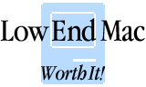
We stuck with Zapfino, this time using it for the site name, and added a new tagline: Sharing the Mac experience since 1997.
2016: The familiar banner
Since 2016, we have used this site on our banner with no changes whatsoever, and we’re about to update it slightly with a rounded San Francisco font to bring the site up with the times.

2025: The new logo
As a representation of the new effort put into the site and to also show we are modernizing in the era of Apple Silicon – we chose to retain what’s familiar while giving it a modern touch.