
 What originally started as a way to reorganize the splash page for the tech spec index quickly evolved into a deep-dive into every tech spec article – turning into a multi-week long retooling and design project that culminated into a completely re-engineered tech spec index.
It seemed like there was a good amount of positive feedback on the way the splash page was done, so the idea was taken deep into the rest of the tech spec index. This article covers all the changes.
Hearing your feedback on the website
It was heard and acknowledged the website was disorganized, unfriendly to visitors on a mobile device, many articles were cluttered with “Online Resources” links, and overall it seemed like the articles were buried within the site.
It’s also been acknowledged the website was in a state of decay, coasting along as an information resource without much updating past 2015-2018.
Since 2021 Dan Bashur has taken the lead as Captain of Low End Mac, Mark Sokolovsky has stepped in to write articles again in 2023 and stepped up in late 2024 to work on the website again. He is now our editor in chief. Our community members on FaceBook send us ideas for articles called the “Low End Mac Mailbag” adding more to the site, and just like in the earlier days of Low End Mac we are once again taking CustoMac submissions! Slowly but surely, we’re getting back into the swing of things. (How do you eat an elephant..? One bite at a time…)
What has changed
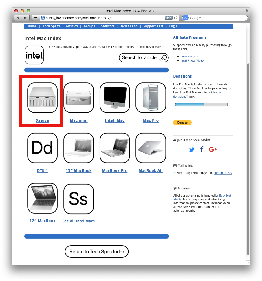
- 1: The Tech Spec index has been completely redesigned to be more organization-first, while also being mobile friendly, staying low-resource, and keeping the familiar LEM theme.
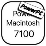
. - 2: Large icons were designed for individual buttons so they can be tapped on a touch screen easily. These are KB-sized PNG files and load quickly in Webkit on a Power Mac G5 or Safari on an original iPad Air.
 |
 |
 |
 |
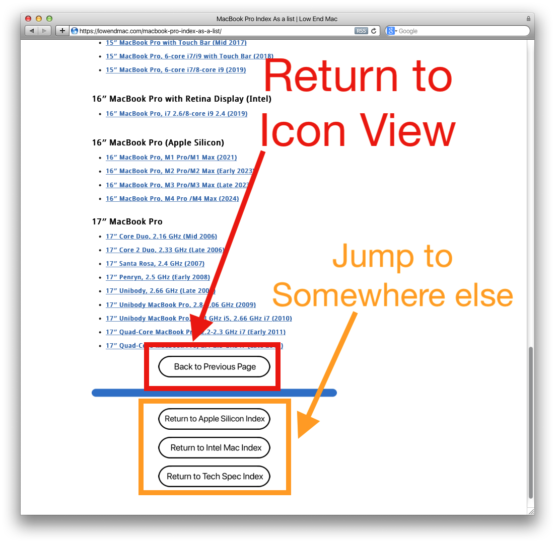
- 3: Each page also has a separate, text-only list view option. Always listed as the last option named “See as a list” under “Ss”. Typically on both Pages 1 and 2 but will soon be updated for those which don’t have this feature on the first page.
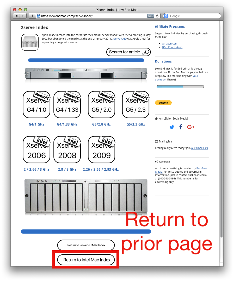
. - 4: All pages within the Tech Spec navigation structure have navigation keys at the bottom of the page. These let you return to the corresponding index you entered so you can easily bounce between articles in the same category, or also easily navigate back out into the tech spec index.
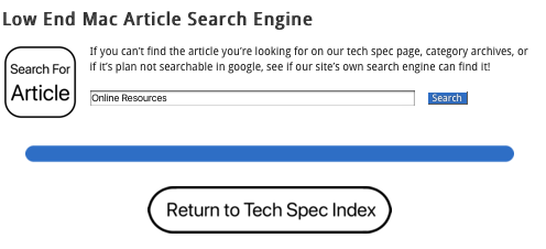
. - 5: Most main navigation pages have a search hyperlink at the top-right that looks like a search bar, which takes you to a page to search for articles.
. - 6: The blue separator bars also turn into page navigators when you view a category within the tech spec index with multiple pages.
. - 7: The design is meant to evoke familiarity through a UI that sort-of resembles an iPhone Home Screen. While some elements were used like vintage computer images and the SF-Pro rounded front was used, much of everything was custom-designed in Adobe Photoshop CS4.
. - 8: Careful consideration was thought out to make sure navigation and design elements were as consistent as could be. There was consideration to make sure all tech spec pages have the same buttons in the same places, so muscle memory is consistent. The hyperlink structure was preserved so if you’re used to navigating Low End Mac the old way, the buttons are all in the same place but now there’s more of them and there’s labels.
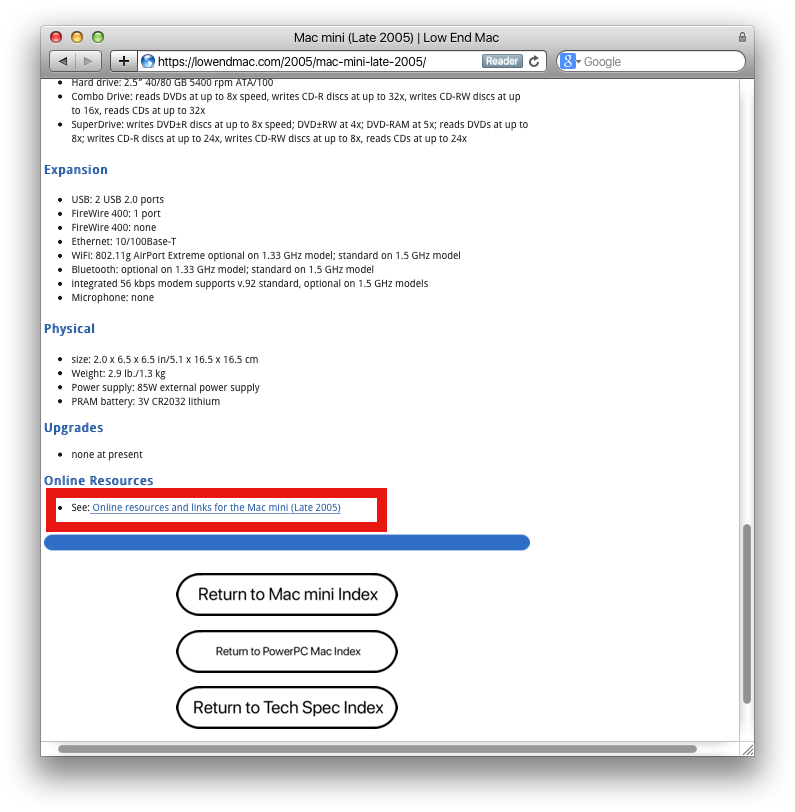
. - 9: Every single tech spec page on the entire site had it’s “Online Resources” section moved to it’s own dedicated page specific to that device or index section. If applicable, you will find a hyperlink under a small section named “Online resources” and then the name of the computer.
. - 10: Lastly, the Tech Spec index was built-out a ton more to accommodate the changes. All the buttons should now lead exactly to their corresponding labels, and consideration was made so this site continues working on older Macs. We used a vast increase in low-size PNG files, but that’s entirely it.
What it looks like
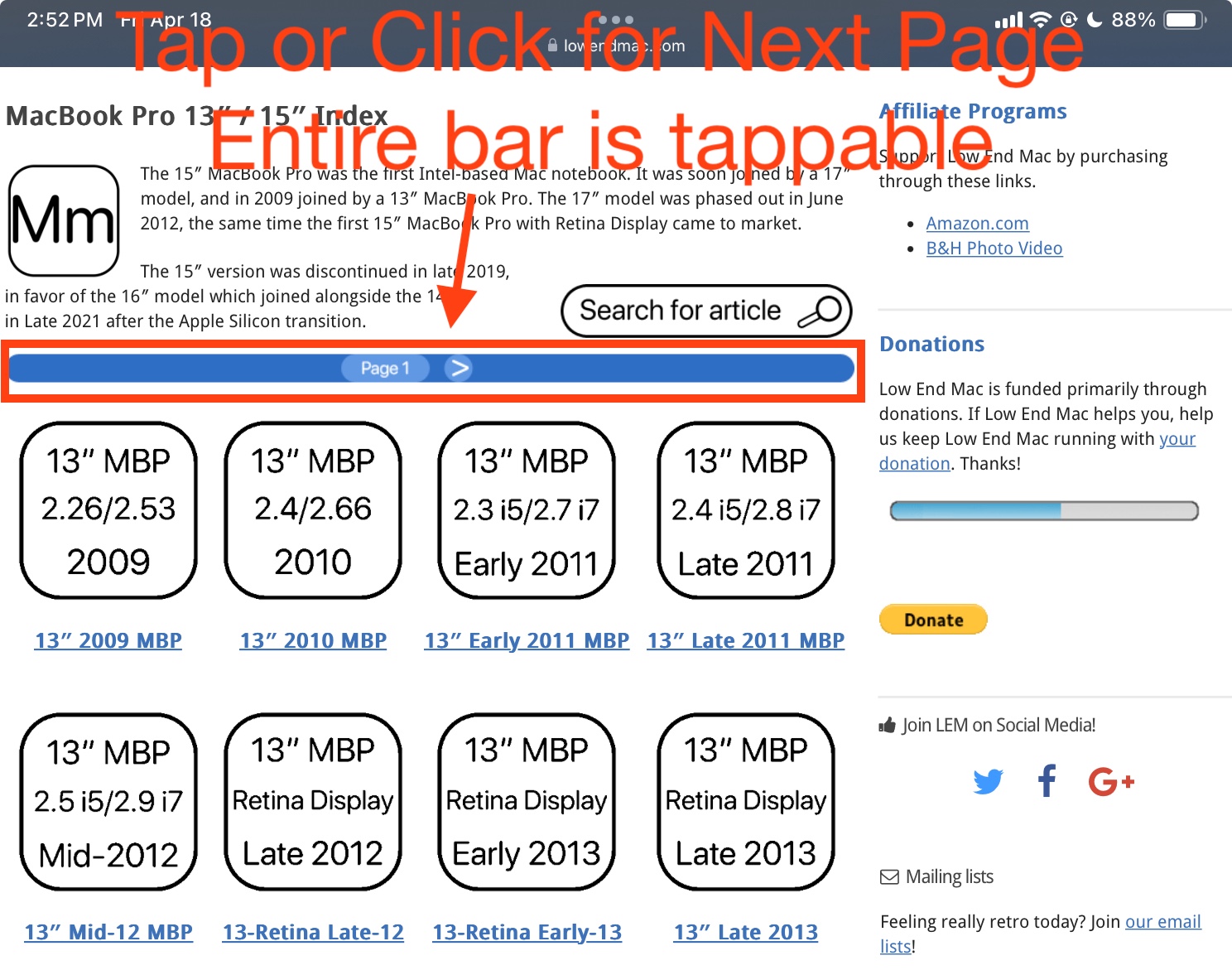
(Above: On an iPad mini 6)
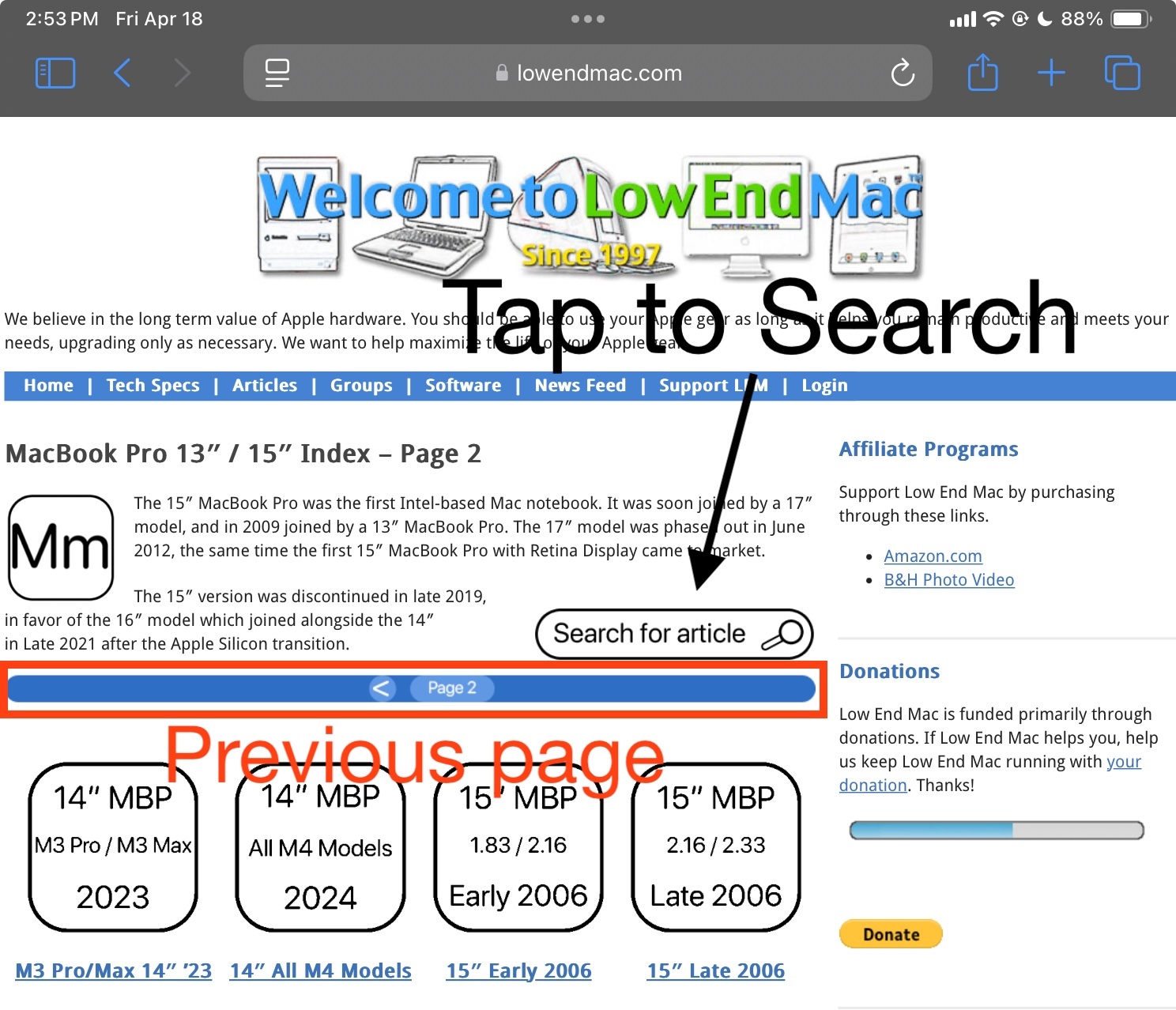 (Above: Page 2 on an iPad mini 6)

 (Above: On a Dual 2.0 Power Mac G5 running Sorbet Leopard)
Navigate any way you need to
- Everything is now organized, subcategorized, structured, and should be easily navigable. All pages typically will look something like this – a page of icons with an option for a list view, a search bar link on the top-right, and navigation burrows on the bottom.
- One you navigate into any page, you should be able to navigate back easily. (See Below)
Online Resource links are moved to separate pages
In an effort to declutter the tech spec pages, at the near-bottom of any applicable tech spec page is a hyperlink to their “online resources”.
It’ll take you to a page where you can see relevant links as well as click to go back to the tech spec article you were just in. The navigation buttons are standard across all pages like this and should help readers on mobile devices. These pages are searchable on our site’s search engine too – letting you search for chunks of links at a time categorized by device/OS/etc;
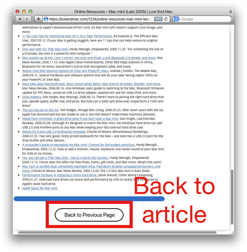
Those Online Resource lists are searchable

In Conclusion
This was not at all an easy task – there were late nights, over 200+ new pages were created and hundreds of custom icons were designed to make this happen. I did this because I sincerely wanted so badly to get the website organized and listen to the feedback from others.. so hopefully these changes and this project results in a better more navigable website for our readers. While the article contains a few screenshots, the changes are deep.
I hope it’s understood there are rough edges while this rests presumably complete in structure. There will be a couple glitches here and there, a couple missing hyper links, and maybe a page or two has slightly different navigation features. But overall everything should look sincerely uniform in such a way where it becomes muscle memory. If there are any issues, let us know.
The iOS/iPad index is not quite fleshed out yet but it is on the horizon, so an icon view will also be added once more articles are made or once I extend this project a little more. For now I am going to give it a rest and focus back on articles and other things too – this was all one heck of a process!
