There’s a lot more to using an image online than just uploading it and linking to it. While that works, there are some steps that should be taken to tweak the image before resizing and otherwise optimizing it.
Uploading and Naming Images
WordPress has an Upload/Insert tool above the text editing tools, and you can easily drag-and-drop your images into the Media library. Once the image is uploaded, you can give it a title (often easier to reference than a file name), specify alternate text for it, add a caption or description. You can also specify whether you want right, left, center, or no alignment for the image and whether to display it as a thumbnail (reduced to 160 pixels), medium, large, or full size before inserting the image into your article.
Our design limits images to 680 pixels wide. Anything larger should be scaled down to that size, but it will load faster if you set the width to 680 or less. One of the WordPress plug-ins takes care of creating an image at that size and serving it rather than the full-sized one that would take longer to load.
Photos
Your photos should be sharp to start with, and if they can be taken under good lighting, so much better. If not, you can use Photoshop (I use Photoshop Elements 6 on my Mac mini with OS X Snow Leopard, and before that I used version 3 for many years) and most other image editors to adjust the color cast if your photo is excessively yellowish, which often happens with available light shots done indoors. I have not been too impressed with Auto Smart Fix, but Auto Color Correction sometimes does a nice job – and sometimes not.
If the contrast seems a bit off, try the Auto Contrast setting under the Enhance menu to see if that does the job. If not, try Adjust Lighting and then choose Levels. That will let you make the midtones lighter or darker.
Photos should almost always be saved as JPEG images using the Save for Web option, which eliminates metadata and thumbnails that are not required on the Web. I then use ImageOptim to optimize image size with no loss of quality.
Some images will do very well as 256-color/8-bit PNG images, but that’s mostly for images with reduced colors. Too many colors in an image and an 8-bit PNG will posterize the image.
I read somewhere years ago that if you make your JPEG image dimensions multiples of 16, everything works a bit better, as JPEGs work by breaking images down into 16-by-16 pixel sections. This isn’t a hard and fast rule, but I tend to work with those numbers to also create a bit more consistency in image dimensions.
Text and Graphics
Text doesn’t generally do so well in JPEG images unless you save at the higher quality settings, and that ends up creating very large files. Fortunately, we have two image formats that are optimized for keeping your image crisp.

Low-quality JPEG (3.5 KB) at twice usual size shows lots of artifacts.
Even at normal size, the low-quality JPEG shows fuzzy text.

Medium quality JPEG (4.9 KB) at twice usual size shows annoying artifacts.
 At normal size, the medium quality JPEG still looks a bit fuzzy.
High-quality JPEG (7.1 KB) at twice usual size still shows some artifacts.
At normal size, the high-quality JPEG looks good, but still not great.
Very high-quality JPEG (9.5 KB) at twice usual size looks pretty good.
The very high-quality JPEG looks really good at normal size.
GIFs have been around forever and allow up to 256 colors. If that doesn’t look good enough, you can emulate thousands of color by dithering the image (88% is a good starting point), although that can create artifacts, so look carefully at the preview image before saving. Photoshop will do a good job of choosing an appropriate color palette when you Save for Web, letting you choose between Perceptual, Selective, and Adaptive options, showing you how the image looks with the selected option and telling you how large the image file will be.
PNGs are a newer alternative designed to be more efficient than GIF, and except for very small files (under 2K), I’ve found that to be the case. PNG has two options, full 24-bit color (which creates huge files with absolutely no loss in quality) and 8-bit images, just like GIFs. Because 8-bit PNG images tend to be smaller, we use them in preference over GIF nowadays. (However, animated GIFs are a different story – there is no PNG equivalent, so keep them as GIFs.)
Reduced Color Images
Studies have shown that people can barely perceive the difference between text displayed with 16 shades of gray or more than that, so when we publish something like a table image taken from a news release, I tell Photoshop to save it as a 16-color image. If there are two colors, say blue and black, 32 colors will be adequate. For three colors, 48 will do, and should there be four colors of text, a 64-color image does the job.
GIFs don’t show the kind of fuzzy artifacts that JPEGs do, and even a 16-color GIF (above, 2.8 KB) is easy to read. The 256 color GIF (below, 4.8 KB) isn’t much better and takes 75% longer to load.
That assumes text on a single background color. If the table has some cells with white backgrounds and some with yellow or blue, you’ll want to use 32 colors if there’s a single color of text, 64 if there are two.
A 16-color PNG (above) weighs in at just 2.1 KB, 25% less than the equivalent GIF, while a 256-color PNG (below) is just 2.8 KB.
We often reproduce graphs, and the same rules apply. When we create our own charts, the text and grid are always black with some gray, which requires 16 colors. If we are using bar charts, we need to add only one additional color for each bar color used, and Photoshop will let us create a 20- or 21-color image if that’s what we need.
However, if we’re making a line graph, those colored lines will each need to have 16 shades available per color, so take the number of colors used (including black) and multiply by 16 to determine the optimal number of colors to use.
LibreOffice does a great job making line graphs and has one feature that AppleWorks never had – curve fitting, which makes many graphs look that much nicer.
Dithering
In general, you want to avoid dithering GIF and PNG images (dithering is an option when you Save to Web), as it tends to make the files larger. That said, sometimes you’ll see significant color banding even at 256 colors, and dithering will smooth that out. In fact, you may find that a dithered 64-color image looks better than an undithered 256-color one, particularly with Mac screen captures that show the red, yellow, and green gumdrop buttons. You’ll probably need to fiddle around to determine which number of colors works best for each specific image.
In general, you’ll keep the dithering set at 88%, Photoshop’s default, but sometimes you’ll need to tweak it all the way to 100% to make things look their best.
Retina Ready
Apple’s Retina Display has been a real game changer, and for content to look its best on a Mac, iPhone, or iPad equipped with a Retina Display, you need a higher resolution image. Ideally, that image will have double the horizontal and vertical resolution, so if your image is filling a 320 x 240 area, its actual resolution will be 640 x 480 – you’ll just specify that it displays as though it were 320 x 240 pixels.
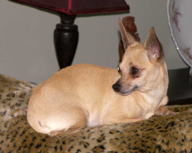
My chihuahua in a medium quality JPEG at normal size (23.4 KB 640 x 480 image).
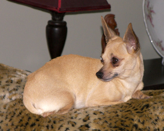
My chihuahua in a high-quality JPEG at normal resolution (54.4 KB 640 x 480 image).
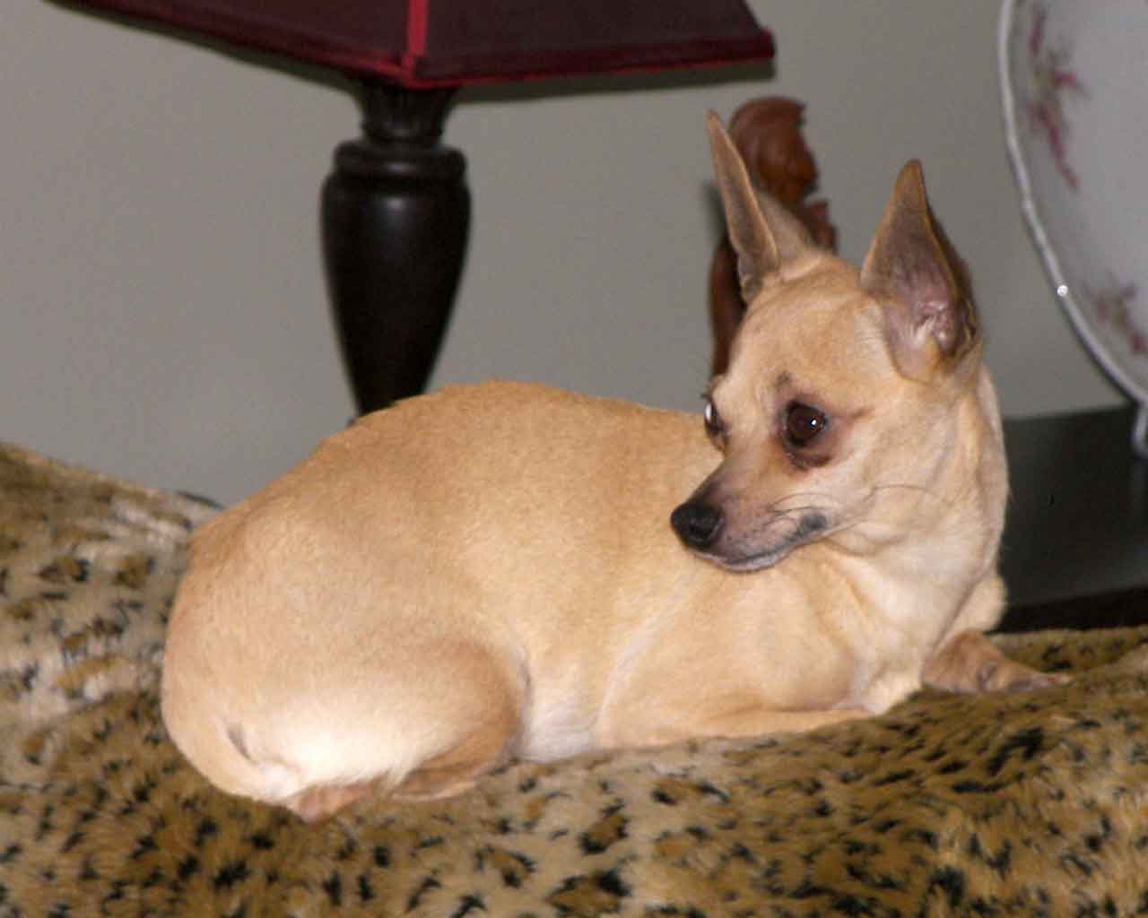
My chihuahua in a low-quality JPEG at Retina resolution (1280 x 1024 41.8 KB image displayed at 640 x 512).
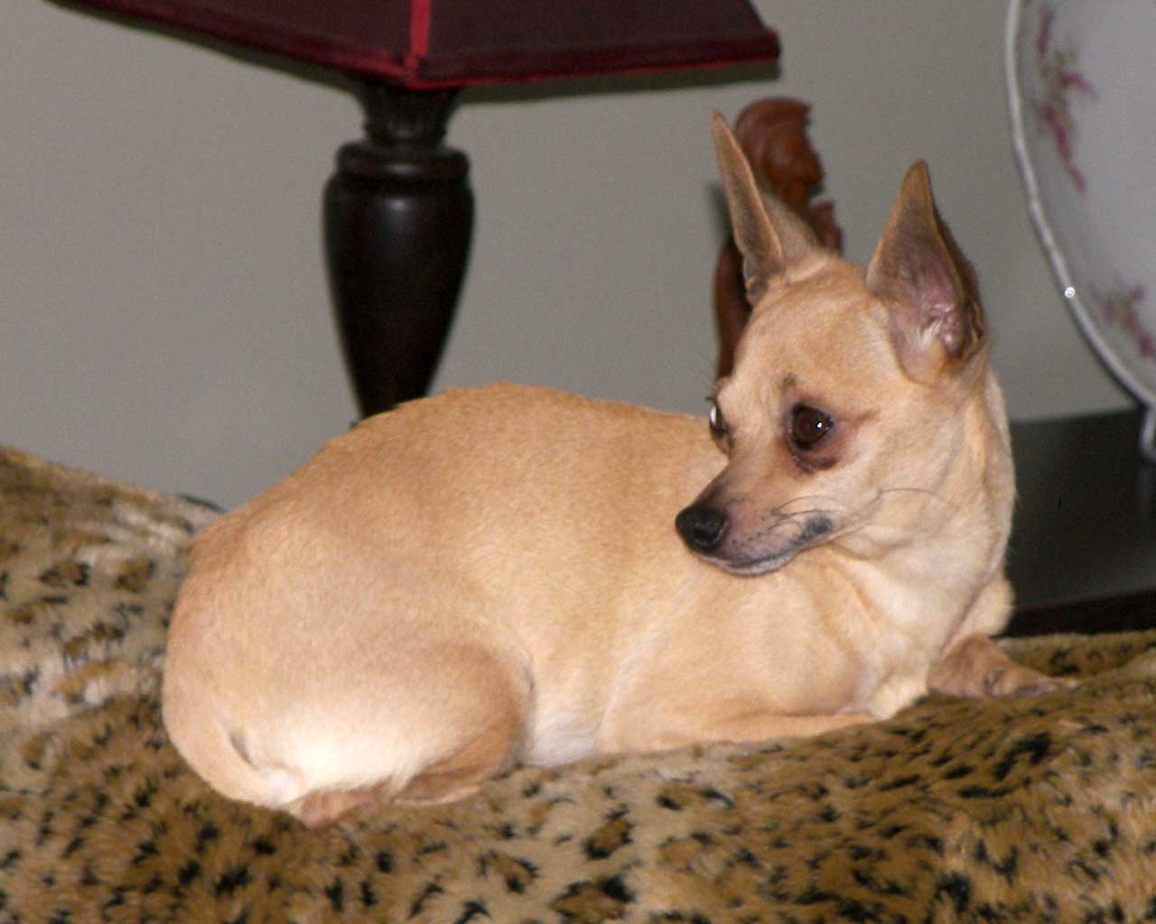
My chihuahua in a medium quality JPEG at Retina resolution (1280 x 1024 69.7 KB image displayed at 640 x 512).
One benefit of the Retina Display is that your JPEG images don’t have to be as crisp as regular resolution images to look just fine. Where I typically use Photoshop’s high-quality setting – or even highest quality – when saving images for use at their full resolution (only going to medium quality when the image doesn’t really need to be high quality or is simply too many KB in size – which I try to keep under 20 KB so things load more quickly), if you’re doing the Retina thing, those images look just great at medium quality and often look good even at the low quality setting.
As I don’t have anything with a Retina Display, I can only guess how these images might look. On a normal resolution display, the medium quality Retina image and the high-quality normal size image appear to be similar in quality, but the Retina image comes from a file about one-third larger. We’ve been using a lot of Retina quality images created in this way in recent months.
Our current layout is designed for images up to 680 pixels wide – 1360 pixels for Retina images.
The 70% Alternative
The media manager in WordPress makes it very easy to scale images to 60%, 70%, 80%, or 90% of original size, and there’s something special about the 70% setting. It’s very close to the square root of one-half, and for reasons we won’t go into here, an image reduced to 70% will tend to look very good on a Retina Display, although not quite as good as a true Retina image. Then again, it’s 70% of the horizontal and vertical dimensions, so the file should be about half as big. Again, without a Retina Display MacBook Pro or iPad at Low End Mac HQ, we can’t test that.
Here’s the Edit Images screen in WordPress’ media manager at full size, which should look great on a normal resolution display:
Now exactly – the same image at Retina Resolution is sharp but more difficult to read:
And here’s the 70% solution, which is larger than the Retina version and easier to read, although not as crisp as the full-size version:
As you can see, 70% is a decent compromise between sharpness and legibility. It should look pretty good on a Retina Display. And this image also shows the basic options when inserting an image using WordPress:
- Set size from 60% to 100%. No 50% Retina option, which requires Advanced Settings. You can resize more than one, but we recommend against it.
- If you set the alignment to Left or Right, the text will flow around the image. If you Center the image, it will appear centered on its own. If you choose None (the default), the image will appear inline and text will not flow around it. The only time we use None is when we have more than one image next to each other so we can center the entire line – using Center on individual images in the same row does not work. More on left, right, and no justification below in the Advanced Settings section.
- Alternative Text is what search engines and browsers for the visually impaired will use.
- We generally avoid using Caption unless it’s not obvious from the rest of the article. WordPress will center caption text and not let it go wider than the image.
And then there are the Advanced Settings:
I end up using Advanced Settings for most images. For instance, to go to Retina Resolution, I would set Size on a 640 x 512 image to 320 x 256. Also, if I’ve messed with percentage sizing and botched things, clicking the Original Size button brings the image back to its original dimensions.
I tend to put a Border of 1 around full-screen captures and images that are mostly white and benefit from a border (that’s a judgment call), but not usually around other images. The exception is if we’re doing a lot of iPhone screen captures, in which case they should all have a 1-pixel black border or no border at all – don’t mix. When using an image with right or left alignment, I almost always set Horizontal space to 4. With two or more unaligned images in a single row, I set it to 2, and then I type a single character at the start of the line with the images so I can center it – and then delete that character.
Also, as a rule, I try to always use images with the same height when putting them in a row. It just looks better that way.
I haven’t used any of the other Advanced Settings.
Final Preparation
The last step I take is to run each image through ImageOptim, a freeware that runs JPEG, GIF, and PNG images through various processes to reduce file size. I’ve seen some images decreased in size by over 20%, but under 5% is more common. Still, the goal is to make things load quickly, so every byte of reduction helps, especially over slow Internet connections.
Short link: http://goo.gl/jIUAog
searchword: imageprep


