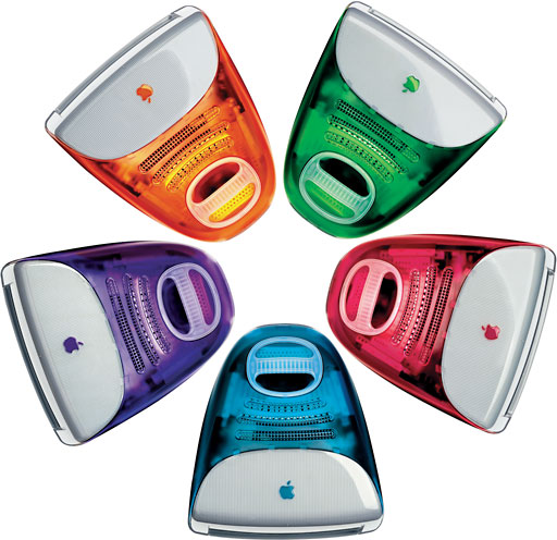
1999: If you thought the iMac was nearly perfect, think again.
 The July print edition of Macworld pits the iMac against a Gateway 2000 system. I could quibble about a few things, like the fact that they compared the 266 MHz iMac with a 366 MHz Celeron system when the same issue reviews the newer 333 MHz iMac. But that isn’t the point.
In user comparisons of the two systems, Macworld made some surprising discoveries. At least, I found them surprising. And I think a lot of longtime Mac users and designers will, too.
Seven of the nine testers were familiar with both Macs and Windows. The other two were occasional computer users.
The iMac is an obvious winner at setup time: one box, three pieces (computer, keyboard, and mouse), a few cables. Average setup time: 6 minutes, vs. over 20 minutes for the Gateway 2000 system. Of course, you usually only set up a computer once, but the iMac does make a great first impression.
Going Online
We all know the i in iMac stands for internet. Like all Macs, the iMac is designed for connectivity. It has ethernet and a 56k modem.
However, the testers consistently found it faster to connect to the internet for the first time on the Gateway. Using Gateway.com, the average user signed up for an account and was online within 15 minutes.
On the iMac, it took about ten minutes longer. Macworld blames this on the “long-winded tour guide in the Internet Setup Assistant.”
Apple should seriously look into a way of speeding up this process. The slow internet setup time eats up most of the time saved when initially setting up the computer.
Using CDs
Longtime Mac users are familiar with the way the Apple CD Player and control strip work. Newbies are not.
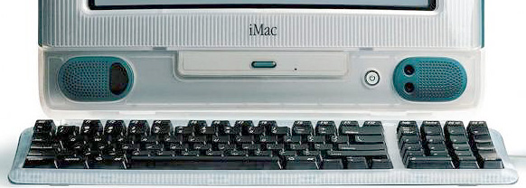
 First off, some users had a hard time finding the CD-ROM drive. It doesn’t look like a typical optical drive with a squared-off rectangular face and a button beneath the drawer. And nowhere is the faceplate marked with the “compact disk” logo. While adding the logo to the front of the iMac might slightly clutter an otherwise pristine design, it would help new users locate the CD-ROM drive.

Buttons on front of the Color Classic control volume and screen brightness.
For setting volume, users didn’t find the software volume control intuitive. Controls on the front of the iMac, as Apple used on the Color Classic, would be very helpful.

Front of iMac with un-intuitive CD eject button. No, don’t press power!
Then there’s the CD-ROM drive itself. On most computers, the drawer opens completely. On the iMac, it comes out a bit, and then the user has to pull it open the rest of the way. If Apple doesn’t want to switch to conventional drives, it should mark the carrier “pull open gently.”
Finally, it’s not obvious that you should push the button on the CD drawer to open it. A few Macworld testers pushed the large button next to the drawer – and inadvertently turned off the iMac.

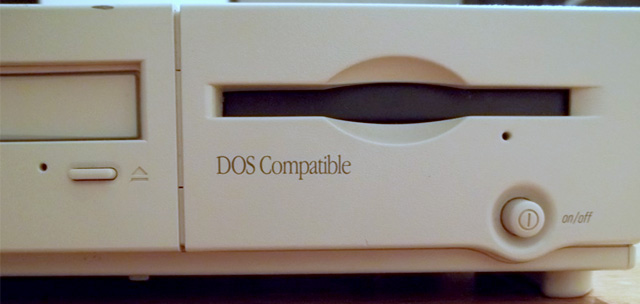
Floppy drive on Power Mac 6100 DOS Compatible. Note the placement of the power button.
For newbies, ugly Windows boxes with clearly marked CD players and volume controls are more comfortable. Fortunately, most of these seem to be things Apple could easily address. (The power switch reminds me of the one on the Centris 610 and Power Mac 6100 – located to the right of the floppy drive, I’ve seen too many users power down the computer when trying to eject a disk. Apple should have learned the danger of a front mounted power switch in 1993.)
The Mouse
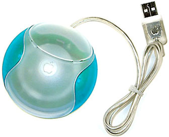
 The iMac’s round mouse is a loser. An entire industry has sprung up to sell alternative mice or casings that change the shape of the iMouse (see Low End Mac’s review of the UniTrap as one example).
The Windows world is not only populated with ergonomically shaped mice, but they also have two buttons (normally – some have even more).
Apple could address the first shortcoming by introducing an ergonomic mouse for the iMac (and Blue & White Power Mac G3), and the second by finally admitting its longtime commitment to a single-button mouse is no longer realistic. More buttons means more options, more shortcuts, and hence more productivity.
Terminology
When asked to go to the Finder, some testers were unsure what it was. A few looked for the Find command.
Seriously, the term Finder has never been a good one. For one, it doesn’t find, although it does now have a good Find utility. When talking to users, I just tell them to go to the desktop. Click on the desktop pattern or hard drive icon; there you are.
Of course, Apple can’t call it the Desktop since that’s a completely different file used by the operating system. But maybe with Mac OS X they can come up with an improved term for what we now know as the Finder.
Horsepower
On the last page of this article, Macworld looks at the one thing geeks really care about: benchmarks.
Startup time and copying from a Zip drive were comparable on the 266 MHz iMac and the Gateway 2000 Essential 366c. Although the Gateway was about 25% faster when copying to the Zip drive, the iMac was twice as fast when duplicating files.
In printing to an Epson Stylus 740, the iMac won by about 17%.
But then came the Quake frame rate test. Sorry to say, the Gateway and it’s 366 MHz Celeron chip had nearly twice the frame rate of the iMac (42 fps vs. 22). Although the newer 333 MHz iMac might outperform the 266 in this respect, the $1,200 Windows system undoubtedly would still beat it.
Conclusion
The iMac is a great personal computer. That, plus style, has made it the best selling computer since the day that it was introduced. It has a lot of horsepower, a lot of features, and great ease of use.
But there’s always room for improvement, as Macworld discovered by pitting the iMac against comparably priced Windows systems.
Some suggestions for Apple:
- Speed up the Internet Setup Assistant.
- Mark the CD-ROM player with the Compact Disc logo.
- Put a “pull open gently” sticker inside the CD-ROM tray.
- Move the power button further away from the CD-ROM drive.
- Place volume control on the face of the iMac, as you did on the Color Classic.
- Ditch the round mouse for a one- or two-button ergonomic design.
- Find a better name for the Finder; adopt it with Mac OS X.
Most of all, don’t rest on your laurels. The iMac is a great computer, but that doesn’t mean there isn’t a little room for improvement.
Best of all, most of these will add little or nothing to the cost of the iMac, making it even more user friendly than the current model without an increase in price.
keywords: #imacg3
short link: https://goo.gl/ZiyGTg

