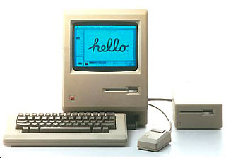
The Macintosh was released to the public in 1984 and changed the way we interact with our computers. The Macintosh operating system gave the Mac a competitive edge in the computer market.
Before the Mac, people used their computers by typing commands at a command prompt. The Mac changed all that. The Mac brought the Graphical User Interface (GUI) to the masses.
The first place users began to interact with their Macs was on the Desktop. From the Desktop users could access their files and move items to the Trash to be thrown away. The desktop metaphor appealed to both novice and advanced computer users because it represented items that were used in an everyday office.
Let’s see what exactly made System 1 so great. I’ll show you around the operating system and point out things that have changed throughout the years. I created the screen shots for this article using Mini vMac. To learn how to set up Mini vMac, see Operating System Nostalgia.
The Desktop
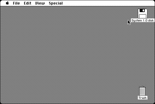
![]() Starting with the desktop of System 1, one of the most glaring differences is the lines on the Trash. You may have never noticed that the lines on the Trash usually face the right. Seeing them pointing toward the left looks strange – probably because you are so used to seeing them facing the right.
Starting with the desktop of System 1, one of the most glaring differences is the lines on the Trash. You may have never noticed that the lines on the Trash usually face the right. Seeing them pointing toward the left looks strange – probably because you are so used to seeing them facing the right.
The first time that the lines in the Trash faced the right was in System 4. This appears to make the Trash look a little more natural.
Also, if you put a file in the Trash, it won’t bulge. This feature wasn’t added until System 7. Also, each time you turn off the Mac, all the files in the Trash are deleted. This was also normal until System 7.
 Take a look at the floppy disk icon. The shutter on the disk is black, and the hole in the shutter is very rounded. Apple changed the color on the shutter of the floppy disk icon to white in System 2.
Menus
Looking at the Menu Bar you notice that there is no Label menu. Labels weren’t invented until System 6. Of course, labels aren’t very helpful on a black and white monitor.
Also, there is no clock. The Menu Bar clock was not introduced until System 7.5. There is no Guide menu either, because there is no online help for System 1. Also, there is no Application menu, because System 1 didn’t include multitasking.
When you open an application or folder, the spring loaded action is a little different. The outline of the icon first moves to the center of the screen and then expands. I think Apple eliminated that because it takes a couple milliseconds longer for an application to open.
![]() The folder icon in System 1 is different from System 6. The edges of the folders are very square, and the tab is at the very edge of the folder. Also, the edges of the tab are more rounded than they are in System 6.
The folder icon in System 1 is different from System 6. The edges of the folders are very square, and the tab is at the very edge of the folder. Also, the edges of the tab are more rounded than they are in System 6.
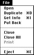
 Taking a look at the File Menu, you will notice that there is no New Folder command. System 1 uses the Macintosh File System (MFS). Under MFS you duplicate the folder “Empty Folder” and then name the new copy whatever you like.
Here’s an interesting trick. There is no keyboard shortcut next to “Open” in the File Menu, but pressing Command-O will open and launch a selected file.
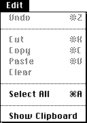
The Edit Menu has remained unchanged through System 6, but the View Menu doesn’t include the Small Icons command. Finder 1 could only show large icons.

 One of the most glaring omissions from the Special Menu is that it does not contain a shutdown command. The Shutdown command was not added until System 2. When you were done with your computer, you just switched it off under System 1. This could sometimes result in file corruption, which prompted Apple to add the Shutdown command to System 2.
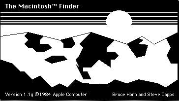
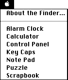 Here’s an interesting little bit of trivia. Finder 1.1g was the only version of the Finder to show the mountain background of Silicon Valley when you chose the About the Finder command from the Apple Menu. In the System 7 Finder you have to hold down the Command key when you select About the Finder to see this mountain scene.
The System 1 Apple Menu only shows the currently installed Desk Accessories or DAs. It wasn’t until System 7 that you could add Aliases to the Apple Menu.
Desk Accessories
Let’s take a look at what DAs were included with System 1.
Alarm Clock
 First is the Alarm Clock, which remained unchanged through System 6. It was finally removed in System 7, and many people sought to replace its functionality with the Menubarlet SuperClock!, which was integrated into System 7.5.
As you can see, the year digit in the date only says 5, instead of 05. I guess that the programmers had no intention of anybody using the Alarm Clock in the year 2000 and above.
The Alarm Clock also provides a quick way to change the date and time without having to go into the Control Panel. Unfortunately, the alarm feature is rather useless. The alarm only beeps once when it goes off. After it beeps, the Apple Menu flash to let you know that the alarm has already gone off. In order to make it stop flashing, you have to launch the Alarm Clock.
 Calculator
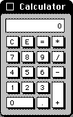
The Calculator is another useful desk accessory.
Here’s a Calculator “Easter Egg”. At the very bottom right corner is a black pixel that you can click and hold on to move the calculator around, just as if you were moving it by clicking on the Menu Bar. This is very handy if you don’t want to close the calculator but want to move part of it off screen above the Menu Bar.
Control Panel
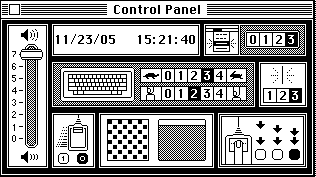
Next is the Control Panel. Unlike System 6, you can’t add snap-ins into the Control Panel.
At first, the Control Panel looks confusing due to the lack of text labels to describe its functions. On the very left is the volume control slider. At the top right is the place to adjust the date and time. Next to the date and time you can control how many times a Menu Command blinks after you select it.
In the middle are the controls for the keyboard. The top set of numbers with the turtle and rabbit is for controlling how fast a key repeats itself when pressed. Below that is another set of numbers with a picture of a key being pressed by a finger. This is where you control how long of a delay there is before a key repeats itself.
To the right of that you can adjust how fast the cursor blinks in a word processing document. At the bottom on the far left is the control for how fast the mouse cursor moves on the screen.
Next to the mouse control is the desktop pattern control. You can make your own desktop pattern by clicking in the square on the left, or you can choose a pre-made pattern by clicking on the Menu Bar in the small representation of the desktop to the right.
Next to the desktop pattern is the control for how fast the computer recognizes a double click.
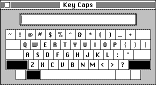 Key Caps
Key Caps is a fairly useless DA. It’s useless because when you press a modifier key (Shift, Command, or Option), Key Caps doesn’t change to show you the special characters associated with that modifier.
Other DAs
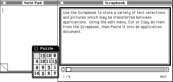
The Note Pad, Puzzle, and Scrapbook DAs remained unchanged through System 6.
Teach Text
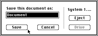 Now, let’s take a look how the Open and Save dialog boxes have evolved through the years. The Save dialog box is very simple. As you can see, the only buttons are Save, Cancel, Eject, and Drive.
The Eject button ejects the current disk, and the Drive button changes the current disk drive. This button is grayed out if you only have one disk mounted.
The strangest thing you’ll probably notice is the absence of a place to choose what folder to save your document to. This is because under MFS all documents are stored at the root level of the drive. Even though the Finder has folders that you can put files into, these folders don’t actually exist on the disk. All the files are stored in one gigantic list.
 If you attempt to save over a document that is already on your disk, you will be presented with a simple dialog asking “Replace existing ‘Document’ ?”
The Open dialog is also very different from what we are used to seeing. It also has only four buttons: Open, Cancel, Eject, and Disk.
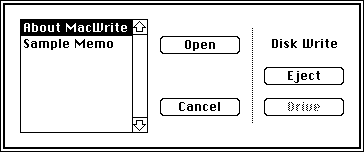 The Open dialog has a list of files that the particular program you are using can open. There are no folders in this dialog, just a huge list of files on your disk.
All in all, System 1 is a very good operating system. Even though it doesn’t have any color, it was more stable than Windows 1.0.
One of the most important features that System 1 had was the ability to overlap windows. This feature wasn’t introduced in Windows until version 2.0. System 1 provided many of the basic features that still make the Mac OS special today.
Resources
- We have been unable to find a link that will allow you to download System 1.0 for use with Mini vMac or a Mac 128K.
- System 1.0 Headquarters, Dan Vanderkam
- System 1.0/Finder 1.0, Mac512k.com
- Mac System History: Mac OS 1-5, Andy Mesa, MacKiDo
- The Early Mac OS, Apple Museum, Dr Bott
- History of the Mac OS and System 1, Wikipedia
Keywords: #system1 #macsystem1 #macintoshsystem1
Short link: http://goo.gl/4Gl11O
searchwords: system1, macsystem1, macintoshsystem1


