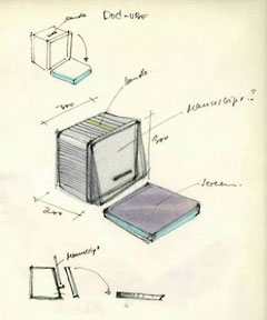
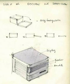
I ran across images of some Apple prototypes created during the early years of Macintosh design – things like a cube-shaped Mac, a MacBook notebook, and a table-like device among them.
The First Mac Might Have Been a Cube
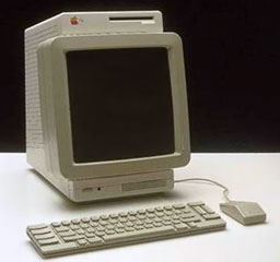
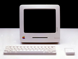
It really blew me away to see some of the early design ideas for the Macintosh. One drawing looks a lot like a Mac mini with a companion drive. Another seems to have a hinged flat panel display. Still another puts the floppy drive above what appears to be a square display. And my favorite, a 1983 design, reminds me of the 1998 iMac more than anything else.
Remember that the Macintosh project changed over time. Initially, it was going to be a 6809-based 8-bit personal computer that would sell for $500, a lot less than the Apple II.
But as the team brainstormed, they wanted to add a graphical interface, sophisticated routines in ROM, and enough memory to be productive, so Apple ended up with an 8 MHz 68000 CPU, 128 KB of RAM (the logic board could actually support 512 KB, but that was prohibitively expensive in early 1984), and a high-capacity (for 1984) 400 KB floppy drive.
This was not a $500 computer, but something far beyond what had been envisioned as the start of the project. At five times that price, it was just one-quarter as much as Apple’s Lisa, and its impact has shaped the field of personal computing ever since.
The keyboard and mouse with these prototypes looks a lot more like the ADB keyboard and mouse would introduce with the Apple IIGS in 1986, not as bulky and ungainly as the keyboard and mouse included with the first Macs. These were cleaner designs, more of an off-white color than the beige Apple used on Lisas and on Macs until 1987.
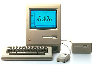
Comparing the 1982 and 1983 prototypes with what Apple actually delivered in 1984 is a bit disappointing. The 1982 design reminds me of IBM PS/2 design. The compact Mac enclosure we are all so familiar with could have been elegant, much more like the iMac that Apple would introduce 14 years later, if the 1983 concept had flown.
Looking at these images, it’s no surprise that when Steve Jobs founded NeXT, the first computer was a Cube – and that the Power Mac G4 Cube was something Jobs just had to produce. The concept had its roots in the Mac’s prototype stage, and looking at these forgotten images, I understand why Jobs has been so keen on the iMac and cube-shaped computers.
It Was Called a MacBook
Apple introduced the first battery powered Mac, the Mac Portable, in 1989, and its first notebooks computers – the PowerBook 100, 140, and 170 – in 1991. With their innovative design that put a trackball in the center of the wrist rest area, Apple established a design reflected in modern notebook and netbook computers.
PowerBook was a great brand name, and when Apple moved to Intel CPUs in 2006 and killed of the PowerBook name, many of us complained that MacBook just didn’t have the ring, the panache, the established reputation of PowerBook.
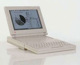
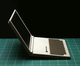
1985 MacBook concept
At the time, I don’t think any of us realized that the Macintosh design team had been working on notebook designs with the MacBook name even before the first Macintosh shipped. The 1982 design concept almost looks modern, although it probably wasn’t aluminum like modern MacBooks. It was a simple, elegant design that Apple didn’t begin to match until the 15″ Titanium PowerBook G4 shipped in 2001.
The 1985 design concept was more like the early PowerBooks with its plastic case and functional, but no longer elegant, design. This one was definitely inspired by the Apple IIc and its optional LCD screen.
Way Before Newton and iPad
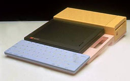
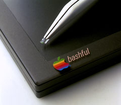
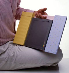
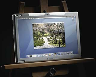
This one never got beyond the concept stage, but what a concept! The year was 1983, and frog design came up with some interesting ideas for Bashful, the code name for this tablet design concept. It appears that the tablet could be used on its own with just a stylus, or coupled to a keyboard, or on some sort of easel that also held a floppy drive.
This was almost certainly not tied to the Macintosh project, but it does show just how long Apple has been working with the tablet idea. It may have been influential in launching the Newton project, which began in 1987 and pretty much created the PDA (Personal Digital Assistant) category when it launched in 1993.
Like Bashful, Newton was designed to work with a stylus. And like Bashful, Newton has an available keyboard, although not as nicely integrated. But unlike Bashful, Newton depended on flash memory, not floppy disks.
When Apple killed off Newton in 1998, it promised that the technology would be back someday.
Someday began with the 2002 introduction of Mac OS X 10.2 Jaguar, which incorporated Newton’s Print Recognizer (under the name Inkwell), allowing text entry using a graphics tablet.
In 2007, Axiotron introduced the first Macintosh tablet, the Modbook, which rebuilds an Apple MacBook as a tablet with a touchscreen.
In June 2007, Apple introduced the iPhone, a touch-based smartphone that forever changed the smartphone market. It was a lot smaller than Newton – and not very much like Newton, with no stylus, no add-on keyboard, no expansion slot, and its small size.
In 2010, Apple introduced its first modern tablet, the iPad, a device much larger than the iPhone and Newton. (The Newton team has developed its tablet in several different sizes, but the smaller one made it to market.) The iPad has completely redefined the tablet computing market, marginalizing Tablet PCs running Windows and prompting a wide range of computer makers to try to tap into the iPad’s success.
Bashful pointed the way to what would eventually become tablet computing, but the technology and the market wasn’t ready for it in 1983. Today it’s become the hottest thing in computing.
Further Reading
- From the Archives: frog’s Early Apple Tablet, Sam Martin, Design Mind, 2010.01.22.
- Designers Unearth Apple Tablet Prototypes – From 1983, Priya Ganapati, Wired, 2010.01.22.
- Apple Tablet Concept from Yesteryear Surfaces, Jeff Porten, Macworld, 2010.01.25.
Keywords: #appledesign #macprototypes
Short link: http://goo.gl/dJUPSe
searchword: lostappledesigns

