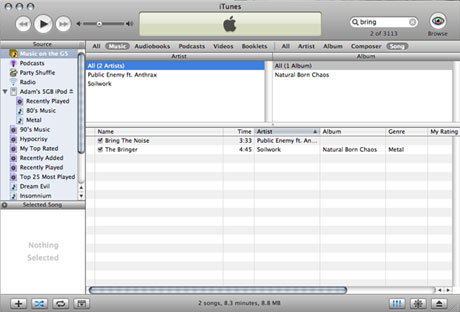
I downloaded the iTunes 5 upgrade shortly after it became available
online without reading the feature list or even looking carefully
at a screen shot.
Opening it I was impressed - I like the new look. Apple's
finally gotten rid of the glaring brushed metal look and replaced
it with a look that's much softer on the eyes and much less
intrusive than in previous versions.
There also appears to be less wasted space in this version, and
that's definitely something I appreciate, especially when using
iTunes on my 12" PowerBook.
I was actually a bit surprised that the icon for iTunes was
still green. Every major revision that Apple's done so far has had
a different icon color - pink for the first version, blue for the
second, purple for the third. Green seemed to be reserved for
iTunes 4, yet 5 seems to have exactly the same icon.
You'd expect that 5 should be a drastic change from 4, but if
you look, the new version's really not that different. Sure, there
are parental controls and the new search bar. Yes, iTunes now
displays the number of files you're adding to an iPod when you drop
them on the device icon. But other than those things - along with
the new interface - there's not a whole lot new. A makeover of
iTunes 4 is more like it.
I suppose it still warrants the 5 label - what more could you
really add to a music player that's already gone through four major
releases?
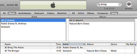
While iTunes 5 isn't exactly full of new features, the one that
helped me decide it was worth the upgrade was the search bar. I
don't have podcasts, audio books, or videos on iTunes - but I do
have a lot of music. Sometimes the name of a song will come to
mind, but I'll forget who the artist is. Sure, I could just type
the entire name of the song into the search box and it'll show up,
but if I don't have to, then why should I bother? Why sort through
20 results when I could have two to sort through?
Burning a CD also seems a bit easier, which is a welcome change.
In iTunes 4 and earlier, if I wanted to burn a CD, I'd click "burn
disc" and wait for it to ask me to insert a CD, put in the CD, and
wait for it to tell me to click "burn disc" again. Sometimes
waiting for the second click would take a while, so I'd get up to
do something else. Of course, by the time I'd return, the computer
would have canceled the action altogether, and I'd be stuck right
back at the beginning.
iTunes 5 just requires you to click "burn disc" and put in a CD.
No waiting for the computer to read the media. It just burns the
CD, finishes, and you're done.
My 40 GB iPod had a bit of trouble initially with this new
version - iTunes simply wouldn't recognize it, even though on the
iPod said that it was connected and charging. Applying the latest
iPod update seemed to fix this problem.
It also seems that Apple was aware of some problems in iTunes 5,
and it addressed them by issuing a 5.0.1 update. I've yet to
download it, as 5.0 seems to be working well for me.
I also downloaded iTunes 5 on my Windows PC. While it's
essentially the same program, I dislike how Apple's put the menu
bar and open/minimize/close buttons so close to the top of the
application. The control buttons are almost touching the "browse"
button. It works, but it doesn't really look all that nice.
That's a minor point, though, and overall iTunes 5 seems to be
up to my expectations. Like I mentioned, there wasn't much that
Apple could have done to make this version of iTunes much better
than previous ones without making it something like Windows Media
Player is on a PC (I avoid using WMP on Windows).
iTunes remains a very easy to use application, good at what it
does, without being excessive. 


