Over the past few years, one of the popular items that many
search engines have been offering up is the idea of a "personal"
homepage. Yahoo, MSN, and now even Google offer an option where you
can sign in and have the things you want to see displayed on your
homepage. This might include the latest news, the weather for your
area, stock quotes, or anything else that can be selected from a
list of things on the site's preferences page.
Personalization sounds like a great idea, but what seems to
happen with these sites is that maybe they'll offer news from CNN,
FOX, and ABC, but not from the major network you prefer, and
perhaps they won't offer things that you want to see, such as the
latest Mac news or automotive news.
Wouldn't it just be simpler if you had a page with links to all
of your favorite sites on it and could just go from there each time
you open your browser?
Enter SiteShuffle
There is such a site, and it's called SiteShuffle. It was just launched a
few days ago, and when I heard about it, I figured I'd sign up and
add links to sites that I often go to. [Editor's note: SiteShuffle
works with Safari, but it was unusable with Firefox, Camino, and
Opera when this article was first posted. SiteShuffle has since
addressed that problem.]
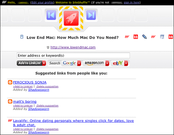
The interface consists of a back button and a forward button,
along with a red launch button in the middle. Icons for your
favorite sites are shown below this, and as you push the forward
button, SiteShuffle "shuffles" to the next icon. The name of the
site is displayed alongside the icon.

If that's the site you want to go to, you click on the red
launch button. And if there's a specific site you want to go to,
you can click on the site's icon to select it and then click the
launch button to open it.
It's really an interesting interface concept, but it doesn't
work too well. For instance, Car and Driver magazine and my
Earthlink webmail have no icon. SiteShuffle uses its default icon
(5 slanted red lines) for both of them, and I can see no way to
change it. This is a bit of an annoyance, because I have to click
on the icon to see whether it's Car and Driver or my email. Other
sites have the same problem - or they have "favicons" that make it
easy to forget which site they actually are without clicking on
them.
SiteShuffle users also suggest links for you to check out (which
makes it like del.ico.us in a way) and, if you want, add to your
own LinkList. Some of them you may not like, and you can easily
delete the suggestions.
You can also search Google, Amazon.com, and
eBay by typing
keywords into the box where you add links. This is great, but what
if I want to search Yahoo or All the Web? I can't do that unless I
actually go to their respective websites.
In general, SiteShuffle's not bad, and I'm willing to cut it
some slack since it's a brand new service - and it's free, too.
That being said, the major change I would like to see is the
ability to change a website's icon in your LinkList, or,
preferably, an improved interface that would allow me to view the
name of the site next to the icon at all times so I could know
which site I'm selecting.
The current interface is innovative, but I question its
functionality.
Another improvement I'd like to see is the ability to add search
engines. I would also like to be able to hide the suggested links
panel in favor of a cleaner homepage - to make it look more like
Google, for example, with just what you need and nothing more.
That said, I'm going to have to get into the habit of actually
using SiteShuffle on a regular basis in order to see how it works
for me. Since I use three computers on a daily basis, SiteShuffle
will simplify my Internet browsing by allowing me not to type in
all of those website names (such as webmail.earthlink.net), and
just select the site and click on the red launch button. 


