We got our first (and, so far, only) iBook at work last week. I
barely had the chance to set it up before it was whisked away for the
weekend. But I did have a little time to play with the iBook and show
it off.
Response from coworkers was very mixed regarding the blueberry and
ice color scheme. Some thought it was great; others thought it looked
like a toy.
The iBook was never intended to be a business computer. Too bad,
because it certainly has the right features, if not the right
colors.
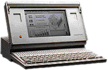
I've been using portable Macs since the Mac Portable, which came out ten
years ago. The portable had a great keyboard, a large trackball (it was
the first "laptop" with a trackball), and decent speed, but it was
large, heavy, and the screen wasn't backlit.
Still, for Mac users, it meant no longer having to buy a DOS laptop
as a field computer.
Then came the PowerBooks, with their smaller trackballs, followed by
trackpads. Each one was a big or small improvement over previous
models.
The iBook certainly continues that tradition. It has the best
keyboard of any recent portable Mac, and that included the most costly
PowerBook G3. The feel, the feedback, the typing experience is
great.
So is the texture and feel of the wrist rest, a cool plastic with an
almost soft texture that feels just right. This is also the first time
Apple (or anyone?) has used a trackpad that isn't recessed below the
work surface. Instead, it's flush with the case - and, like the
keyboard, its feels great and works very nicely.
In fact, I'd have to say the iBook provides the best tactile
experience I've ever had with a portable computer. Everything about it
feels right, from the soft curves and metal reinforced handle to the
grippy plastic casing and the trackpad button.
If it came in graphite, Apple would lose a lot of PowerBook
sales.
The screen is positively luminescent. I'd say it's at least a match
for the one in the PowerBook G3, except for the smaller size. It's
certainly great for anyone not spoiled by a 17" or larger screen. In
many respects, it is an iMac to go.
Niggling Little Complaints
The iBook isn't perfect. I'll give Apple the smaller screen as a
necessary way to keep the price down. I'll let them get away with it
being bigger than the already large PowerBook G3 because I know it's
designed to take even more abuse.
But what irritates me, as well as people using the Lombard G3, is
the F1-F12 keys - they aren't F1-F12 unless you hold down the "fn"
key.
Granted, it's nice to be able to adjust the brightness and sound
without pushing the "fn" key, but for those who use QuicKeys to program
F1-F12, it's a real nuisance to have to push the "fn" key and the
F-whatever key.
What was Apple thinking? Users are far more likely to use those keys
to program common functions (undo, cut, copy, and paste are the
tradition F1-F4 on Apple keyboards) than they are to adjust brightness
or volume. Why not have those functions require the "fn" key
instead?
- UPDATE: You can change this behavior in the Keyboard control panel.
Click on the Function Keys... button (Options on the PowerBook G3),
then check "Use F1 through F12 as Function Keys. . . ." To change
brightness or volume, you must now use the "fn" key. I think this is
preferable, especially since we use QuicKeys and have become accustomed
to programming the function keys in QuicKeys.
Conclusion
Okay, I got that out of my system. Other than the now-standard tiny
arrow keys and the USB port being on the wrong side for mice with short
cables, I'd have to rate the iBook one of the two nicest portable
computers I've ever used - and only because the PowerBook G3 "Lombard"
has an even nicer screen and the white Apple glows in the dark.
Since image is subordinate to function, I could live with the
colorful iBook.
Ten years of building portable Macs, and Apple is still making each
one better than the last.


