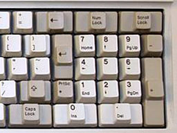
In his blog, Tim Bray states: “There’s a design flaw in Apple’s current lineup of Mac keyboards; easily fixed though.” He goes on to complain about both of Apple’s current keyboards, the USB ‘board with its full complement of keys and the Bluetooth keyboard with its significant lack of keys.
Bray says that except for layout, the current Mac keyboards are great, and he fells that he’s “typing faster than any time in the last twenty years or so.” The problem isn’t quality, but design.
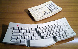
Apple Adjustable Keyboard
Bray apparently doesn’t use the numeric keypad, something Mac owners have had since Apple introduced the Macintosh Plus in January 1986. With only one exception, every ADB keyboard Apple ever made had a built-in numeric keypad (the Apple Adjustable Keyboard had a separate keypad module), and every USB Mac keyboard has as well.
And until the last update, every Bluetooth keyboard Apple ever made had the full-sized extended keyboard design we all know and love (or at least generally tolerate). But the new Bluetooth keyboard is some hideously shrunken thing that would be more at home on a notebook computer. In fact, it is essentially the same keyboard found in the MacBook and MacBook Air.
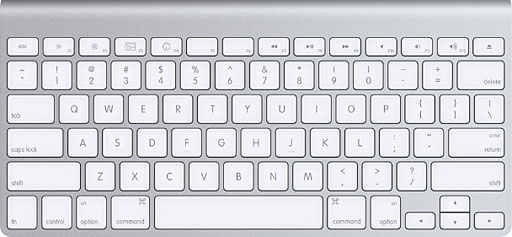
Apple Wireless Keyboard
Bray’s complaints about this compact keyboard are manifold: shrunken arrow keys; no dedicated Home, End, Page Up, Page Down, and Delete keys; and the shrunken and misplaced Control key (the Fn key is in the lower left corner of the keyboard where Ctrl has always been). His proposal: a dedicated cluster of arrow and other navigation keys to the right of the main keyboard, exactly where people who use regular keyboards expect them to be.

Apple Aluminum USB Keyboard
His only complaint about the layout of the USB extended keyboard is the real estate taken up by the numeric keypad, which he considers unnecessary.
Keyboard Design
Early Macs had good keyboards, and the early ADB keyboards were solidly built and had great key layouts. If you have a chance to compare layout of the 1987 Extended Keyboard with the latest Apple USB Keyboard, you’ll see how little has changed in two decades. Good design just works.
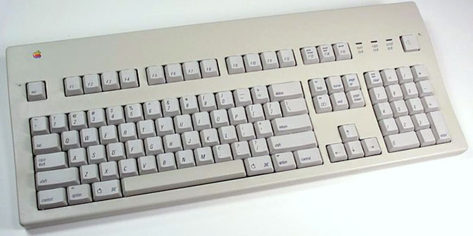
I’ve played with Apple’s aluminum keyboards in the local Apple Store, and I think I could learn to love the USB Keyboard. Well, except that it probably doesn’t have a long enough cable to reach my Power Mac G4, which is on the floor next to my desk. That requires about a 5′ cable.
And then there’s the fact that I’ve been spoiled with my Logitech Cordless Keyboard (long discontinued) for years now. It’s nice not having a cable hanging from the keyboard drawer, and I really like some of the extras, including the volume wheel and scroll wheel.
Sure, Apple has a Bluetooth Keyboard, but that would mean adding Bluetooth to my Power Mac and losing the full-sized navigation keys and the numeric keypad. Not for me.
Keyboard Design Flaws
Caps Lock
Have you ever toggled the Caps Lock key by accident? In my book, that’s the biggest design flaw in computer keyboards, and we’ve been living with it for a long, long time. The original Macintosh was the first Apple computer to put the Caps Lock key between the left Shift key and the Tab key, but the concept of a Shift Lock key goes back to the typewriter era.
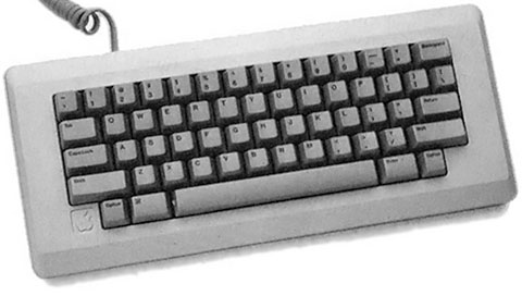
The original Mac keyboard.
Many early personal computers didn’t even include lower case characters (the Apple II among them), but many that did had a Shift Lock key, including the Commodore PET 2001-32-N (1978). The Apple III (1980) was Apple’s first computer with a Caps Lock key; it was labelled Alpha Lock to distinguish it from Shift Lock, which also modifies the number keys.
The location of the Caps Lock key was anything but standard in the early days of personal computing. What we consider the normal keyboard layout today was introduced with the IBM PC/AT Model 339 in 1986. The Enhanced 101-key Keyboard established the norm of putting the Caps Lock key between the left Shift key and the Tab key. Today’s keyboard layout became an ISO standard in 1994.
And ever since, people have been hitting it by accident.
While some dispute the usefulness of Caps Lock (Pieter Hintjens is waging a War on Caps Lock), it is not a useless key. Sometimes you need to type in ALL CAPS, and the Caps Lock key is the easiest way to do it. The problem isn’t the Caps Lock key itself, but its location. It should be moved to a location where you can’t hit it by accident, perhaps the spot currently occupied by the rarely used Escape key.
Help
The other key that bugs me is Apple’s Help key (it’s where the Insert key is on PC keyboards). Hit it by accident, and everything comes to a halt while your Mac launches a help screen. Very, very annoying! Like Caps Lock, this key should be placed where it can do the least harm, not where you may hit it by accident.
Outdated Keys
Num Lock
Once upon a time, IBM PCs and clones came with a keyboard that used the numeric keypad both for entering numbers and for navigation. To use these keys as a numeric keypad, you had to toggle the Num Lock key.
To this day, PC keyboards persist in doing this while at the same time having dedicated arrow, Insert, Delete, Home, End, Page Up, and Page Down keys. Num Lock (where the Clear button is on Mac keyboards) can go.
Pause/Break, Scroll Lock
Holdovers from the days of text-based interfaces, there’s no reason to retain these keys. Apple got rid of them a long time ago, replacing them and Prt Scr/Sys Rq with F13, F14, and F15.
Speaking of Prt Scr/Sys Rq, it’s also obsolete – but it makes a great Print button, a task Apple assigned it a long, long time ago. We can keep that!
Insert
Apple realized that nobody needs an insert key and renamed it Help. On any program I use, when you place the cursor somewhere and begin to type, it inserts your characters without any need to use an Insert key.
Return and Enter labels
On PCs, they’re both marked Enter. There’s no need to have one key marked Return and the other Enter, which Apple has been doing for 20 years now. Whatever the label, they do exactly the same thing.
Keys We Ought to Have
While we’re thinking about keyboard design, let’s list some keys that keyboards should have in the 21st century that weren’t conceived of in the 1980s:
- Volume Up and Volume Down (or a volume knob) plus Mute (Macs already have this)
- Pause, Play, and Stop for audio and video
- Buttons to bring you to back to the start of the current track (audio) or scene (video), to the previous track or scene, and to the next track or scene. Maybe also use these to go back to the previous page or forward to the next one in your browser.
- Eject for your optical drive (Macs already have this)
In Conclusion
Summing up, Caps Lock and Help should be moved somewhere that you have to deliberately choose to hit them. Num Lock, Pause/Break, Scroll Lock, and Insert are obsolete and should give way to new keys. And dedicated keys to deal with browsing and media should be standardized.
Arrow keys should always be full-sized on desktop keyboards, and most notebook PCs have full-sized arrow keys. Apple should look into that, even if it is less elegant looking. Form follows function, it shouldn’t lead.
I like Bray’s suggestion that every desktop keyboard ought to have dedicated navigation keys. Just because someone doesn’t need a numeric keypad doesn’t mean he doesn’t need full-sized arrow keys and dedicated navigation keys.
It’s over 20 years since the current keyboard design was established. It’s time we rethink that design in light of what we do on our computers today and rethink the whole thing. But while we’re doing that, we should go out of our way to accommodate learned behaviors – for instance, moving the Command, Control, Tab, or Alt/Option key would only add frustration as people migrate to a new layout without any real benefit.
You can see some of the proposed redesigns on The Million Dollar Keyboard page. The winning Colemak design kills Caps Lock, which makes Pieter Hintjens happy, but it inexplicably moves some of the modifier keys around and would require typists to retrain themselves as a few of the alpha keys have been moved.
Too many entries in the Million Dollar Keyboard contest fiddled with the QWERTY layout that we’re all used to. Regardless of ergonomic and efficiency claims for Dvorak and other layouts, the simple fact remains that people are resistant to learning a new layout.
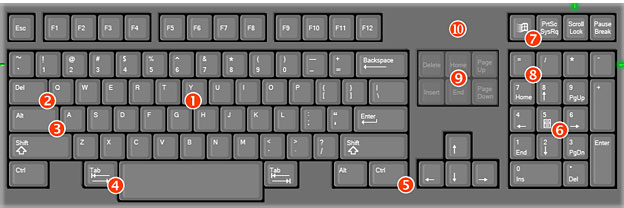
The Commonsense Qwerty keyboard design.
The Commonsense Qwerty looks like a good start. It even moves the Windows key out of the way, as we’ve suggested be done with the Caps Lock and Help keys. Caps Lock and Num Lock exist, but not as keys. Instead, the designer puts switches on the side of the keyboard, making it impossible to toggle these by accident. Bravo!
The Customizable Compact Qwerty design could be a good starting point for 15″ and larger notebooks, as it provides dedicated navigation keys. Why shouldn’t those with bigger notebooks have more keys?
Keyboard 2.0 isn’t too much different from today’s designs, but it’s specifically designed to work with multiple operating systems (Windows, Mac OS, Linux).

The MouseDREAM keyboard design has a pointer key instead of Caps Lock.
One interesting idea is the MouseDREAM keyboard, which replaces Caps Lock with a pointer “mouse” key (but no mention of a mouse button). This eliminates the problem with IBM’s famous eraserhead pointer. It also has full-sized arrow keys and navigation keys. There is no numeric keypad. This could also be the basis of a new notebook layout, and I like the way the bottom row of keys is rounded off.
Add a row of dedicated F-keys, and I think you’ve got a keyboard to make Tim Bray happy and meet Apple’s desire for a compact design.
Final Suggestions
Think different. Snuggling the arrow keys in near the QWERTY keys is clever, rounding off the bottom row has a nice organic feel, and providing a keyboard pointer that isn’t in the middle of the alpha keys are all good ideas. So is putting Caps Lock and Num Lock switches (not keys) on the side of the keyboard.
And think familiar. Removing or relocating Caps Lock, adding a scroll wheel (one feature I love on my Logitech ‘board) and/or Pointer key, and moving the arrow keys a bit are easy to get used to. Changing the QWERTY layout isn’t. Neither is moving the modifier keys (Shift, Command, Control, and Alt/Option), as they’ve become second nature to us.
Most of all, think usability for today’s users. Where is the best place to add media keys? What functions should a keyboard gain that today’s standard design didn’t anticipate?
And don’t forget to make it a pleasure to use with solid construction and good tactile feedback.
Apple, how about some real innovation in this area?
Keywords: #keyboardlayout #keyboarddesign
Short link: http://goo.gl/GWLyvx
searchword: betterkeyboard

