Got a touch of upgrade fever but can't afford the cure? Or maybe
you're just feeling restive, a tad dissatisfied. Old Mac goes
everywhere I want to go, but oh, I don't know....
Low-end Medicine
If you're using a Power Mac or other modular machine, the low-end
answer might be a new monitor. You don't have to reach for an Apple or
Sony. There are a number of feature laden monitors out there - KDS,
Panasonic, and Mitsubishi among them - capable of significantly
improving your sensory experience for around Can$400 (significantly
less in the US).
Case History
The key term here is "sensory experience."
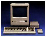
Remember the first Mac you laid eyes on? For me it was a little all
in one Plus my neighbor, a
science writer, had just carried  in from his car and set up on
the kitchen table. It was different, but it wasn't until he fired it up
that I realized what a huge improvement it was over everything I had
seen up to that point. The small screen was dazzling white. On it were
amazingly crisp black letter characters and lines. (The competition at
the time was offering colors on black. Each character seemed to have
four or five lines through it.)
From that day, Macintosh meant an easy reading high quality image.
It was the standard by which all others would be judged.
Looking at the Options
There are at least 75 computers in the school where I work. In some
ways, it's like one of those endurance testing facilities, and believe
me, the techies are there a lot. When it came time to buy a monitor for
my recently acquired Power Mac
7600/132, I took a good look around. What I saw was pretty
shocking: lab benches lined with domed and fuzzy, eye-torturing
screens.
It wasn't until I got down to the office and saw the 17-inch monitor
on the secretary's desk that I stopped for a close look. It was a
Korean Data Systems unit from a couple of years ago. The shape of the
glass, slightly curved from side to side, straight vertically, reminded
me of my Sony Trinitron television set. The monitor's box was still in
the storeroom, and, sure enough, the KDS was made with "Trinitron
technology" (three separate electron guns, one for each of the base
colors, as opposed to the standard design where a single gun serves up
the three colors in rotation). My previous Mac, an LC 520, had a Trinitron screen which I had
always admired for its rich colour and relatively fine resolution.
The KDS was on the short list.
A quick check of Web sources and a hasty confab with the school
board technicians led me to include the Mitsubishi Diamondtron and the
Panasonic PanaSync in the comparison. My local Mac source, Mark
Gilchrist of Phoenix Network Systems, filled in the picture with some
realistic Canadian prices. All three units would be classed as mid
priced with the Panasonic costing a few dollars more, and the
Mitsubishi a few dollars less than the $400 (Canadian) KDS. All three
monitors had the full range of onscreen controls and were within .01 mm
of the KDS's .24 mm aperture grille center pitch.
In other words, each would provide a very fine lined texture when
set to resolution limits (1024 x 768 with a 75 MHz refresh rate for my
7600).
Definitely Different
I settled on the 17-inch KDS AV-7TF primarily on the basis of my
previous experience with Trinitron monitors. It was at that point Mark
informed me that the "TF" in the model designation stood for, "true
flat." Even so I wasn't prepared for what came out of the box. It was
the usual tapered off-white plastic case, but this one had a dark gray
rectangle on the front that was flat from top to bottom and side to
side.
Definitely different.
Hooked up to my 7600 running OS 8.6, this monitor provides a
uniquely pleasant visual experience. There are no discernible
resolution lines. It's as if my chosen dark Bondi desktop with its
colorful icons is painted on the backside of the glass - rich and
satisfying. And because of the flat surface, there are few annoying
reflections.
Making the Change
The larger 17-inch screen took a little getting used to. The
ClarisWorks word processing page size, as displayed on my 15-inch LC
520 screen, was significantly smaller on 17-inch monitor set for it's
maximum resolution. Drop back to the 800 x 600 resolution, as used by
the LC 520, and everything was big again. Scan lines, however, were
discernible.
Operating the 17-inch monitor at the maximum resolution (1024 x 768)
has more to offer than dense black typefaces and creamy smooth colors.
The larger desktop provides more room to arrange icons, the control
strip, and Finder buttons as well as greater convenience when working
from multiple windows. Bumping up the font size from 10 point to 12
made the adjustment in word processing easy. Within three days I was
completely at home in my new and spacious hi-res environment.
And remember, that new monitor will still be there next time you
succumb to a serious case of upgrade fever.
Share your perspective on the Mac by emailing with "My Turn" as your subject.

 in from his car and set up on
the kitchen table. It was different, but it wasn't until he fired it up
that I realized what a huge improvement it was over everything I had
seen up to that point. The small screen was dazzling white. On it were
amazingly crisp black letter characters and lines. (The competition at
the time was offering colors on black. Each character seemed to have
four or five lines through it.)
