Apple released Mac OS X in March 2001. Having used computers for
almost twenty years, I can say that this new operating system is the
best ever - certainly better than my first Commodore
VIC-20. Yet, there is an undercurrent of disappointment; there is
something wrong with this OS.
It's not the Mach microkernel, the Unix core, or the fluid motions
of the Aqua GUI....
Well, actually it is the GUI. Before you stop reading, I'd like to
point out that this isn't another one of those articles bemoaning the
dock. No, this is a lot more serious. The Mac OS X interface isn't
bad - it's probably the best yet - but isn't is about time we stopped
pointing and clicking?
The Graphical User Interface emanates, famously, from the Xerox PARC
and was copied by Apple, then by Microsoft, then by Digital Research,
then.... It's now 2002, and the GUI hasn't seen many changes since
then. It's had facelifts and the odd major improvement, such as
on-the-fly previewing and drag-and-drop, but the fact remains that the
concept remains unchanged.
GUIs expanded the user base for computers because they allowed
ordinary people to use them. Command lines lend themselves only to
those with an understanding of software architecture. Few users today
realise that by clicking on "Macintosh HD" they are programming the
computer. Linux users may be slightly more aware, but this is
emblematic of the failure of the Linux GUIs to hide the underlying
complexity.
In Mac OS X, we've been give a new finder view - one which allows a
hierarchical view of the drive. This illustrates exactly what's wrong
with the GUI as a concept: Try finding a file that's buried thirteen
subfolders down without a GUI, and you could be there for hours. The
command line, the GUI, the mouse - they allowed us to perform tasks
using the best technology of the times.
Those times are gone, but the technology is still with us.
Steve Jobs and Co. have been regaling us with tales of the digital
hub for several months now. The older term for this concept was
pervasive computing. The basic idea is to put processors into
nearly every device in out home and offices, even our clothes, and
allow them to communicate with one another. When you run out of milk,
your fridge orders more. We've all heard this stuff before.
The problem is that point-and-click is the wrong interface for all
of this, as Sony's disastrous BeOS-based eVilla shows. Of
course, information appliances are a half-baked idea anyway, a strange
halfway point between the final marriage of your PC and television set.
Computer owners don't want half of a computer, nor do technophobes want
the other half. Information appliances fall between two stools, and the
interface has a lot to do with it - they're too computer-like but not
powerful enough.
Jobs has pointed out that he sees a long future for the PC, perhaps
in recognition of the failure of information appliances to gain any
serious ground in the marketplace. Thus, when it came to creating the
center of the digital hub, the Apple team were to start from first
principles. They didn't.
Certainly, there's been a radical review of the Mac's interface, but
it's based on the same concepts. We can be thankful that Apple decided
against going the whole Unix-hog and giving us MIT's X-Window system,
which is not only extremely ugly, but is also probably the best way to
slow an expensive SGI or Sun workstation to a crawl.
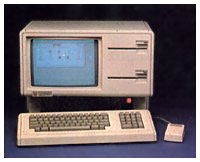
When Apple introduced the
Lisa in 1983, people said that the GUI was tacky, it wouldn't wash,
it wasn't  serious, it was a toy. Nowadays you can
barely buy a computer without some "Mac-a-like" windowing system. For
the most part, the command line is a thing of the past - there if you
want it, but not necessary.
Isn't it about time we decided to do the same to the GUI?
Why aren't we communicating with our computers in a more sensory
rich fashion? Never mind virtual reality: Why can't your computer see
you? What about speaking? At a much more basic level, why doesn't your
mouse know when your pushing it?
None of these things require artificial intelligence. They simply
require a willingness to, as Steve used to say, think different.
Read part 2.
Share your perspective on the Mac by emailing with "My Turn" as your subject.

 serious, it was a toy. Nowadays you can
barely buy a computer without some "Mac-a-like" windowing system. For
the most part, the command line is a thing of the past - there if you
want it, but not necessary.
