Overall, I'm pretty happy with the way Mac OS X has evolved.
But whenever I get a new Mac - or reinstall OS X on an old one - there
are a few pieces of software that I add ASAP.
I'm not talking about major applications - not Microsoft Office or
Adobe Photoshop or anything. I mean the little stuff that makes the
day-to-day operations smoother.
You probably have your own favourites. Here is one of mine. Nicely,
it's free.
Windows vs. Mac
15 or so years ago, polling data suggested that a big difference
between Mac users and DOS/Windows users was that the PC folks tended to
use a relative handful of applications; Mac users on average had - and
used - more different pieces of software. I haven't seen any data on
this since then.
But in the interim, starting with Windows 95, Microsoft added
something to its operating systems to make it easier for users to work
with lots of applications - the Windows Start Menu. For the Windows 95
launch, the company licensed the Rolling Stones' Start Me Up,
suggesting this was that version's key usability feature.
The Start Menu isn't perfect by any means - installing a bunch of
software on a Windows computer results in both a desktop and Start Menu
cluttered with disorganized icons pointing to ReadMe files,
uninstallers, help files, and more things that no one ever clicks on.
Most users don't have any idea how to clean up and organize the mess,
but it does give users a relatively straightforward way to start
applications.
When Windows-switchers move to the Mac, it's one of the first things
they look for - some programs are on the Dock . . . but for
others? How do you access them? How do you even know what you've got
installed?
No Room on the Dock
In the Classic Mac OS, many users (and I was one of them) got in the
habit of putting aliases to frequently used applications in the Apple
menu. But starting with OS X, Apple made that undoable. (Yes, I
know about Unsanity's Fruit Menu and used it for a
long time. But it broke when Leopard was released, and although a new
version was eventually released, I got out of the habit.)
So what's a new Mac user to do to find applications not in the Dock?
Well, you can click on the Finder icon. Then click on the Applications
folder (or its icon on the left of the Finder window). Then scroll
until you find the program you want. That may be second nature to you,
gentle reader, but many new Mac users never get in the habit.
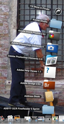 Or you can put the Applications folder in the Dock. Personally,
though, I find folders in the Dock an awkward way to work, at least if
there's more than a handful of things in the folder. Fan View (right)
is cute, but displays a tiny portion of the applications - a very
awkward way to access 116 more!
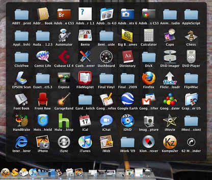
Setting the docked folder options to display in Grid View (below) is
better - now, instead of a single curved row, folder contents are
displayed in a rectangle - now there are only 62 more items to view in
my Applications folder. But even without displaying all the contents,
the grid is too dense - I find it hard to scan to find something
here.
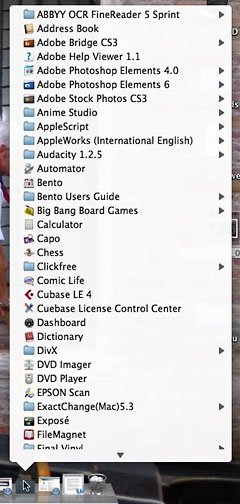 New in Mac OS X 10.5 "Leopard" is List View (right). Actually,
this is more like how docked folders worked prior to OS X 10.4
with a scrollable list in alphabetical order. This is actually, in my
opinion, relatively usable. But I don't find the location on the right
side of the Dock a particularly user-friendly place to put this sort of
feature.
XMenu to the Rescue
The first thing I add to my Macs is XMenu from
DEVONtechnologies. Noted PC Magazine columnist and gadfly
John
Dvorak recently called their DEVONthink program "about as close to
a killer Apple app as anything I've seen since VisiCalc in the late
'70s." (In the same column, the longtime PC user said, "if I was going
to buy a new laptop this minute, a MacBook Pro is probably what I'd
get, too." )
While DEVONthink costs $149, the good people at DEVONtechnologies
have made a number of small utilities available for free download,
including XMenu.
By default, XMenu pops a little icon up near the right-hand side of
the menu bar, near Spotlight's magnifying glass. It's easy to overlook
- the new version's icon is a tiny version of the stylized A on Apple's
Applications folder. Clicking on the icon drops down a scrollable,
alphabetized list of the contents of the Applications folder, complete
with small images of each application's icon. (There may be a slight
delay the first time, as the icons are cached. Subsequently, the menu
will pop up much more quickly).
Make it a Self Starter
All it takes to install XMenu is to copy it to your Applications
folder, but you probably want it to load automatically whenever you log
on to your Mac. Making that happen is not one of Mac OS X's most
intuitive operations.
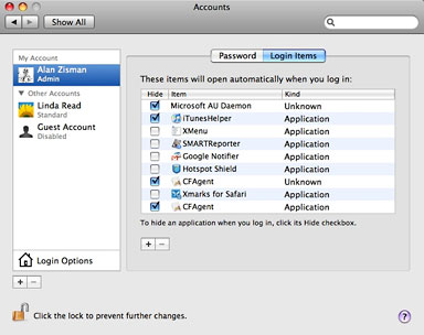 Open System Preferences and click the Accounts
item. Go to the Login Items tab. To make changes, you may need to click
on the picture of a padlock and enter your password to "unlock" these
preferences. Then you can either drag the XMenu icon from the
Application menu into the list of login items or click the [+] to
locate it in a dialogue box. Don't click the Hide checkbox.
Always Check the Preferences
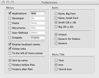 I'm a big fan of always checking an
application's preferences - you may not want the defaults set by the
programmers. To get to XMenu's preferences, right-click or
command+click on the icon.
You can use it to add multiple menus - each gets its own little icon
on the menu bar. Perhaps you want to add one for your Documents folder
or Home folder, for example. You can change the size of icons in the
menu or remove them entirely for perkier performance.
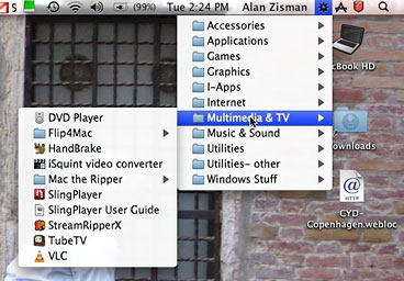 For ultimate control, you can choose the
User-Defined menu, either in place of the standard Applications and
other menus or all by itself. When that's selected, folders and aliases
in your ~/Library/Application Support/XMenu/ folder appear in the menu.
I created a set of folders, categorizing my applications - Accessories,
Applications, Games, Graphics, Internet, Multimedia, etc. - and placed
aliases to the appropriate applications in each. The result is a quick
and organized way to get to all my applications, filed in a way that
makes sense to me. I even includes some often-accessed documents.
At some point, though, I gave up on this sort of organization; I
download and try out too many applications. Some are keepers, others
not. It just got too much for me to keep the aliases up to date; if I
failed to put an aliases in the XMenu folder, I would tend to forget
that I had the application.
Back to Basics
Even though I think we all should get in the habit of checking
program preferences, in the end, I've gone back to XMenu's default
settings.
It's a tradeoff: XMenu's default Applications menu is long and
uncategorized, but it always accurately reflects the contents of the
Applications folder. (I could create subfolders in the actual
Applications folder with those same category names, dragging the
various programs into the appropriate location, but that would again be
more work - and need continual fussing to keep it accurate as I tried
out new software.)
It's not perfect, but it's pretty good - making it unnecessary to
keep a bunch of icons in the Dock for less-often-used programs but
still making it easy to find them when I need them. XMenu is one of my
must-have utilities to fill OS X's holes.
Thanks, DEVONtechnologies.
(What are your must-have utilities - especially free ones? Let me
know!) 

 Or you can put the Applications folder in the Dock. Personally,
though, I find folders in the Dock an awkward way to work, at least if
there's more than a handful of things in the folder. Fan View (right)
is cute, but displays a tiny portion of the applications - a very
awkward way to access 116 more!
 New in Mac OS X 10.5 "Leopard" is List View (right). Actually,
this is more like how docked folders worked prior to OS X 10.4
with a scrollable list in alphabetical order. This is actually, in my
opinion, relatively usable. But I don't find the location on the right
side of the Dock a particularly user-friendly place to put this sort of
feature.
 Open System Preferences and click the Accounts
item. Go to the Login Items tab. To make changes, you may need to click
on the picture of a padlock and enter your password to "unlock" these
preferences. Then you can either drag the XMenu icon from the
Application menu into the list of login items or click the [+] to
locate it in a dialogue box. Don't click the Hide checkbox.
 I'm a big fan of always checking an
application's preferences - you may not want the defaults set by the
programmers. To get to XMenu's preferences, right-click or
command+click on the icon.
 For ultimate control, you can choose the
User-Defined menu, either in place of the standard Applications and
other menus or all by itself. When that's selected, folders and aliases
in your ~/Library/Application Support/XMenu/ folder appear in the menu.
I created a set of folders, categorizing my applications - Accessories,
Applications, Games, Graphics, Internet, Multimedia, etc. - and placed
aliases to the appropriate applications in each. The result is a quick
and organized way to get to all my applications, filed in a way that
makes sense to me. I even includes some often-accessed documents.
