Unlike some Mac users, I decided to install Leopard on the day of
its release. I've generally had good luck with Apple operating systems
being "reasonable stable" upon release and figured that 10.5 would
probably be no exception.
For the most part I was right: It's stable, pretty fast and
generally does what Tiger did before it in the same ways. It's not
without it's issues, and that's what I aim to explore in this
article.
I first installed it on my Power Mac G5 Dual
1.8 GHz with 1.25 GB of RAM. It installed in roughly 30 minutes and
rebooted to the "Aurora" screen. Boot time is comparable to Tiger,
though they removed the screen that showed "Welcome to Macintosh,
loading...", and now it boots directly to the login screen or desktop,
depending on how you have your preferences set up.
Next I installed it on my 2.2 GHz MacBook Pro with 2 GB of
RAM, and the installation took about the same amount of time - and
again went flawlessly.
The upgrades put me back to a desktop that looked just like the
Tiger ones I had left behind. There were a few significant differences,
however.
The Dock
The Dock has been reworked and restyled to resemble a floating glass
shelf, along which applications are neatly arranged, showing a
reflection underneath. A single beam of "light" tells you whether the
application is open.
I have a few issues with this arrangement. Firstly, it feels like it
takes up more space than the previous Dock, and it certainly isn't as
"unified" as it was when it was a "box". The "light" beams are hard to
see when compared to certain applications reflections. The best
instance of this would be with iTunes: Open iTunes, and you'll find
it's harder to see the "light" beam than it is on Photoshop CS3, for
example.
The other new feature of the Dock is choice of the "fan" and "grid"
view for folders that have been dragged to the Dock. While very pretty,
it's not too useful unless you only have a few things in the folder.
Personally, I liked to keep my Documents folder in the Dock and browse
through it and it's containing folders using the nesting menus. There's
no option to revert to the old menus, and I find myself frustrated at
having to open the folder and look through it in the Finder.
A new Downloads folder has been placed in the Dock, and it has
become the default download location of Safari. Sorry, but I want
things on my desktop when I download them - personal preference - but
this could help people who find it hard to keep their desktop free of
clutter.
The Finder
 The folders! Someone has changed the folders! Apparently to
whoever designed these atrocities, "understated" equals "boring".
Without the colorful pictures on the Applications, Library, System, and
Users folder, I find myself doing a double take to see which folders
they are. The folders also look like boxes to me, which is more of a
frustration than anything else.
The sidebar in the Finder has been reworked, because apparently the
old one was just too simple. Now everything is smaller, for those who
felt the fonts in Tiger were too big. They've also organized it by
Devices, Places, and Search For. "Search For"? Why is that there? Why
can't I just use the box at the top of the Finder window to search and
edit my search preferences from there? What about the icon in the upper
right menu bar corner for search? I don't search for things that often
on my computer! I do, however like how they integrated search into the
"Save as..." dialogues in applications.
The biggest and most appreciated advance in the Finder is the
CoverFlow organization like in iTunes. It nicely integrates iTunes with
the rest of the OS and gives a nice preview of what the document looks
like before you open it. This is amazing when it comes to viewing
photos (it finally puts the Mac OS above Windows in this respect) and
works nicely for viewing applications if you rely on the icon to
recognize a program. I just wish that while the CoverFlow option were
chosen, you could still view the objects below it as icons, instead of
as a list.
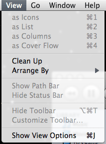
Menus
 This is my
biggest complaint next to the Dock. The menus are now more translucent,
and while in most applications this is fine, it can be distracting if
certain windows (especially iTunes or the Finder) are behind the menu.
The translucent menu bar is an interesting - and completely unnecessary
- effect.
Printing
After I reinstalled my printer driver (why should I have to do this
when I upgrade my OS and already had it installed under Tiger?),
printing was smooth, with a newly-styled print monitor application with
much more clearly labeled "add to queue", "start queue" and "stop"
icons.
New Features
Perhaps one of the best things about Leopard is Spaces, where I can
have more than one workspace at the same time. This means I can keep
certain applications or certain windows of an application on their own
screen. It's like having a virtual second, third, or fourth monitor.
While it's nothing new, it's very nice to have it integrated with the
OS.
Front Row is new to non-iMacs/MacBooks, and it's . . .
relatively unnecessary. Why do I need this on my G5 when I've never
even used it on my MacBook Pro? I don't even remember where I put that
remote control....
Time Machine is the other big new feature, and one I realistically
won't use. I'll admit I haven't even opened it yet.
Bugs
Unfortunately any new OS is not without it's bugs. The most
noticeable and most curious of the ones I've noticed is that on my G5 I
have a solid menu bar at the top of the screen, not the translucent one
that appears on my MacBook Pro. Conventional explanation would be that
my video card is not CoreImage or CoreAnimation supported - but it
is!
There is a set of
discussions on the Apple Forums that seems to have narrowed it down
to a bug on certain video cards. Not major, but somewhat annoying -
you'd think since the GeForce 5200 was so widely used on Macs, they
would have tested it.
I've also found that my MacBook Pro likes to randomly wake up and go
to sleep again while the lid is closed. Usually it doesn't happen, but
last night it did it repeatedly until I woke it up and restarted it.
Very strange behavior.
I've also read reports that there are holes in the built-in firewall
(which is disabled by default), which I am hoping Apple is working on.
While there are no exploits right now, it's best not to leave such a
thing as an open invitation.
Summing Up
Leopard is definitely an improvement on Tiger; there is no doubt
about that. Performance on my G5 is about the same as Tiger, and memory
management is vastly improved. On my MacBook Pro, it flies.
It's also still better in many ways than Windows Vista (though Vista
has a few nice features that 10.5 lacks). However, unlike Vista, it
doesn't "scale down" to meet slower computers, and you need a
relatively recent Mac to run it (technically an 866 MHz Mac, though the
closest thing actually shipped was an 867 MHz). I was surprised at the
requirements: Since Tiger ran on such a wide range of machines, I was
expecting a G4 processor at any speed as a cutoff.
Regardless of that, Leopard is a must-have if you have an Intel Mac,
and a "seriously consider" if you have a PowerPC, especially if you'd
like to breathe some new life into an older Power Mac that's starting
to become stale.

 The folders! Someone has changed the folders! Apparently to
whoever designed these atrocities, "understated" equals "boring".
Without the colorful pictures on the Applications, Library, System, and
Users folder, I find myself doing a double take to see which folders
they are. The folders also look like boxes to me, which is more of a
frustration than anything else.
 This is my
biggest complaint next to the Dock. The menus are now more translucent,
and while in most applications this is fine, it can be distracting if
certain windows (especially iTunes or the Finder) are behind the menu.
The translucent menu bar is an interesting - and completely unnecessary
- effect.
