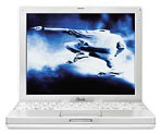
On Tuesday, Steve Jobs replaced the curvaceous, large, heavy iBook
with with a svelte iBook that beats it in almost every respect:
- lighter: 4.9 lbs. vs. 6.7 lbs.
- smaller: 11.2 x 9.1 x 1.35" vs. 11.6 x 13.5 x 2.1"
- faster: 500 MHz vs. 366 or 466 MHz
- less expensive: $1,299 vs. $1,499
- more RAM: you can add 512 MB to the stock 64 or 128 MB
- more media drives: CD-ROM, DVD-ROM, CD-RW, or CD-RW/DVD-ROM vs.
CD-ROM or DVD in old model
- more display: 1024 x 768 pixels vs. 800 x 600
- more ports: one more USB port plus VGA
- video: same
- battery: rated at 5 hours vs. 6 hours on the old model
- color: white with gray accents vs. indigo, graphite, and key
lime
When it comes right down to it, this is the smaller, lighter, less
costly iBook a lot of us were hoping for two years ago.  The old iBook had its place as an "iMac to go," but the
bulkiness was a definite drawback.
The value equation is unquestionable - except for battery life and
color options, the new iBook meets or exceeds the old one in every
respect. And the new look is anything but "girlie." I suspect a lot of
people in the business world who balked at the old iBook styling will
find the new model very acceptable.
It's also helpful to compare the next generation iBook with the 21st century PowerBook.
The iBook is 2.3" narrower, 0.4" shallower front-to-back, and 0.35"
thicker. It's also 0.4 pounds lighter. The new iBook has the smallest
footprint since the PowerBook
2400.
What's really impressive is the range of options available on this
500 MHz portable: 64 or 128 MB RAM on the motherboard, a 10 or 20 GB
hard drive, four media drive options ( CD, DVD, CD-RW, CD-RW/DVD).

Another very nice touch is the convenient layout of the ports
(above). Yes, they're all on the left side, which will be inconvenient
for right-handed users with short-tailed mice, but having all the ports
in a row like this will also make it easy for someone to design a
snap-on dock for use at home or in the office.
The only potential problem is the small 12.1" active matrix color
display. A lot of people find the 91 dots per inch of recent PowerBooks
and the TiBook comfortable, but say that going much beyond that leads
to eye strain. By putting the same 1024 x 768 pixels that normally fit
in a 14.1" display into less space, the new iBook squeezes 106 dots per
inch. That may be less of a problem under OS X with the scalable
Aqua interface, but it could cause excess eyestrain under OS 9.1.
That's the only fly in the ointment. Just as the TiBook redefined
high end "thin and light" laptops in January, the iBook redefines
economy portables.

 The old iBook had its place as an "iMac to go," but the
bulkiness was a definite drawback.

