- 2006.01.11
Recently a friend had some difficulty trying to place an order on
the iTunes Music Store, and it reminded me that for
some time now I've wanted to document some of the odd little interface
quirks that have popped up over the years that I've used a Mac.
My friend had her iTunes preferences set to use a shopping cart
instead of 1-click ordering. This was to prevent her children from
randomly clicking and buying things in the iTunes Store.
One evening she spent several hours searching for particular tracks
from an artist she likes, methodically adding them to her shopping
cart. When she was finished, she went to find her shopping cart to
place the order - and it wasn't there. Not on the home page of the
iTunes browser, not in any of the menus, and not visible in the
"source" listing.
 I could see my
shopping cart using her iTunes on her computer (I tried it when she
asked), but only when I activated the shopping cart option instead of
1-click.
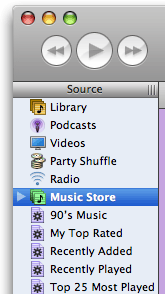
It turns out that it was hidden in the Store icon in the source
listing on the left side of the iTunes window. Her "triangle" button
(see image to right) hadn't been pressed, so the cart option was hidden
inside the Store item in her list.
How is someone supposed to figure this out? I couldn't find it in
the help files. It was so basic and simple an idea that Apple didn't
even document it. And we all know how they like to document obvious
things!
The only thing is, I don't think this was all that obvious. It's
easy once you know it, but it's not obvious.
The Chooser
This reminds me how the Chooser operates in OS 9 and below. The
first time I was confronted with the Chooser, I was mystified. What was
it for? How do you know when you need it? How do you put things in it
so you can use them?
Just like the iTunes thing above - easy to use, harder for me, at
least, to intuit.
Other Mac Oddities
Other odd things I and my students have had problems with are:
Ejecting Disks
Okay, I get (and agree) that you should always ask the
operating system to give you a disk back so it knows where each mounted
disk is at all times. This is why Apple has consistently tried to have
a software-driven eject function since 1984.
But would it hurt to put an eject button near the drive, sort of
like a lone keyboard key?
And when you invoke the eject button, why can't the OS - even today
- ask you if you want to quit all applications using the disk instead
of making you stop, clear the dialog, go do it manually, and then eject
the disk?
It's like wrestling an octopus. Quit squirming and just give me the
freakin' disk!
iPod Controls
Imagine giving an iPod to someone who had never used one and not
giving them a manual. You have to explain everything, like a secret
handshake and password to a mysterious society.
How do you turn it on? Why doesn't it have a volume knob like a
radio? When it's asleep, why doesn't it respond in any way while the
hard drive spins up - or at least explain "please wait, vacuum tubes
warming up" or something?
Once you get used to it, it's easy; but before you know how to use
the iPod, it's mysterious.
Open and Save Files
Why is the interface for opening and saving files - on Macs and PCs
- so different than the Finder interface you use for organizing
them?
In OS X, we have something approaching this, but sudden and
unexpected changes from icon view to list view to directory view can
confuse even experienced users. Why not generate an icon floating above
the desktop (moving all the crap out of the way like in Exposé)
and then ask, "Where do you want to put this?"
Where Is It?
The biggest problem new users have (IMHO) is that they can't find
things they've saved. And don't give me any Spotlight crap - I don't
trust Spotlight to find anything that wasn't created right under its
nose (see A Big Oversight in Spotlight's
Searches).
iMovie Clips
When I first used iMovie, it was a challenge to figure out that you
had to first put clips in the workspace and then drag them down to the
track area to make them do anything.
Yes, it's all in the tutorials and manuals, but aren't we talking
about Apple here? Isn't the interface supposed to be so obvious that
you don't need a manual?
Can't we have a label somewhere on the workspace that says, "Put
stuff here" and "Drag things here to make a movie," and have a
preference setting to turn these off once you get past Mystifying and
move on to Obvious and Easy for Those In The Know.
Newbies
As a teacher, I have to constantly remind myself what it was like
when I didn't know everything I do now so I can think like my students
and tell them what they need to hear. Sometimes, engineers - even at
Apple - would do well to drag someone in off the street who has barely
used a computer and watch them try how to figure out how to do things
without a manual.
Legend has it these kind of usability studies led to the one-button
mouse.
Even with all of its improvements, OS X still feels a little
inconsistent. I still think, despite its flaws, the classic Mac OS was
in many ways more mature as an interface than OS X is today -
despite the Chooser and the control panels serving somewhat redundant
functions and having Desktop Printing circumvent both.
is a longtime Mac user. He was using digital sensors on Apple II computers in the 1980's and has networked computers in his classroom since before the internet existed. In 2006 he was selected at the California Computer Using Educator's teacher of the year. His students have used NASA space probes and regularly participate in piloting new materials for NASA. He is the author of two books and numerous articles and scientific papers. He currently teaches astronomy and physics in California, where he lives with his twin sons, Jony and Ben.< And there's still a Mac G3 in his classroom which finds occasional use.

 I could see my
shopping cart using her iTunes on her computer (I tried it when she
asked), but only when I activated the shopping cart option instead of
1-click.
