While I'm sure many of my readers despise the Windows operating
system, I would like to point out some of the things I like about
it that may or may not be present in the Mac OS. I would also like
to point out some of the things that I prefer in the Mac OS. In
addition, I will mention some of the faults of both operating
systems.
I really like the Start menu. While it is technically possible
to create something like it using the Apple Menu, you have to
manually add the applications that you want to appear in the Apple
Menu. In Windows, the application's installer will almost always do
it for you. The Start menu is just as customisable as the Apple
menu in OS 7-9, as you can add application links, folders, and even
a link that lets you browse your entire hard drive.
I also appreciate how fast the solid/active window dragging and
resising is under Windows 95-XP (95 only had it if you installed
the "Plus" package or had the "c" version), unlike Mac OS X, where
it is still, in my opinion, way too slow. I don't think it's the
hardware - if a 120 MHz Pentium tower has no problems with it, I
don't see why a 400 MHz Power Macintosh G4 should.
It could be due to the interface, which is far more elegant on
the Mac, and almost always has been (except for maybe Windows 3.0
vs. System 6, but I think I'm probably the only one that liked
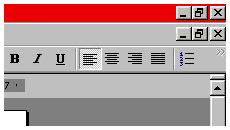
Windows 3.x). The colored bar at the top of a window in Windows is
somewhat  annoying unless the window
or application is in full screen mode. The x and other
symbols don't blend in nicely with the window (the red, green, and
yellow buttons not blending in with the titlebar is one of the few
complaints I have about OS X).
The other thing I just don't get about the Windows interface is
how the x and other symbols can somehow appear over
the toolbar when a window in a fullscreen is maximised, but if the
window is in normal mode, it appears below the toolbar. It
just doesn't make sense to me.
Then there are things that don't make sense on the Mac. Why
should I drag a disk or network folder to the Trash? I'm not trying
to throw it away! I'm just done using it for now. Yes, I do know
the reason behind it - but it needs to be changed, because it is
extremely confusing for new users, which seems to be who Apple is
trying to attract these days. OS X has improved this a bit by
showing a small eject logo when you drag the disk or folder to the
Trash, but you still have to know to drag it there first.
I like some of the other options in Windows, and how nicely
things can be integrated into the OS. For example, the drivers for
my video card work flawlessly in Windows 2000 Pro, installing a
systray icon, a control panel, and even adding an additional button
to the three at the top right of a window. But in the Mac OS, Apple
ships drivers even better integrated, and third party manufacturers
don't do too badly when trying to integrate their drivers into the
OS.
The only OS to position my icons the way I want them by default
is BeOS - I prefer to see my icons horizontally across the top or
bottom of the screen. Windows puts them on the left, the Mac OS
puts them on the right, and the only way to change that is to move
them myself.
The other thing I really like about Windows is the Internet
Explorer type interface for browsing your files, which first came
out in an OEM version of Windows 95 for Compaq (and possibly other
companies). I really like having those convenient buttons in the
toolbar that let me instantly delete, move, cut, copy, and paste
files. I appreciate even more both the forward and back buttons and
the fact that new directories open within one window.
Mac OS X does this, and it does it pretty well. However, it
is missing the back button, which I have gone up to click on in
many occasions, only to find that it's not there. It would be nice
if Apple included it.
So does this mean that I suddenly love Windows and hate the Mac?
No. I like both operating systems to an extent, but I have learned
not to take things too seriously.
Yes, I hate Windows XP. Not because of features, interface, or
anything else like that. I hate it because of the registration
scheme, the way Microsoft can obtain a list of DVDs, CDs, and MP3s
that you listen to, and the way they can automatically update your
software without your permission (well, technically you gave them
your permission to update the software when you clicked "agree" the
first time).
If I don't like something, I don't use it. Windows 2000, Mac
OS 9, and Mac OS X all work fine and do most of what I
want. When you use a computer, you want to get work done, not just
spend time working on making the computer work.

 annoying unless the window
or application is in full screen mode. The x and other
symbols don't blend in nicely with the window (the red, green, and
yellow buttons not blending in with the titlebar is one of the few
complaints I have about OS X).
