When the Macintosh was new, it
was a welcome relief from the world of DOS, CP/M, and the Apple II,
where you had to know quite a bit about the computer in order to
get it to work the way you wanted. It was simple to open
applications, navigate through directories, and controls and menus
were mostly self-explanatory.
You didn't need to spend hours memorizing commands - and even
more hours trying to input the correct command to ensure that the
document you printed out showed bold and italic text where you
wanted it.
Working with files was easy, too. An icon with a paintbrush on
it would open in MacPaint. An icon with a "W" on it would open in
Word. It was simple.
Early versions of Windows were even fairly easy to use.
Applications had simple menus, and it was easy to close a window
simply by double clicking in the upper left hand corner.
With Windows 95, Microsoft tried to introduce too many features
at once while at the same time trying to keep the simplicity of the
old system. It didn't work very well - things suddenly got
complicated and required a much more extensive help system.
The Mac didn't really get an extensive help system until System
7.5, and in Mac OS 8 it was much more prominently placed (new
computers with OS 8 installed featured icons for Help on the
desktop). However, Apple kept the same basic interface design for
years - from System 6 to Mac OS 9.2, windows, menus, icons, and
system behavior (i.e., when you select one window, the entire
application comes to the front) remained the same.
It didn't require someone with extensive knowledge to use a Mac,
and if you'd used one, you could use any Mac running any OS
version. The big plus for the Mac was that things looked and acted
pretty much the same in different OS versions - until OS X
changed everything.
The problem with Windows 95 was that it aimed to make Windows
3.1 users comfortable while also hoping to get users to become
comfortable with the new style. The style I am referring to
consists of three (close, minimize, maximize) buttons in the upper
right corner of a window, as well as the start menu and
taskbar.
The issue was that while it had those three buttons, you could
still close a window by double clicking the window icon on the left
(which is how I still do it in Windows) or selecting File:
Close.
The start menu and taskbar was great - probably the best thing
Microsoft's done - however, they still left the Program Manager
intact in Windows 95 and 98. "I thought my applications were only
in the start menu,"' a user might say, while finding the same icon
in Windows Explorer, the Program Manager, and the start menu.
This was acceptable in Windows 95, as it was a "transition" OS.
However, two years later, when 98 came out, it had the same "extra"
features as 95 did, as well as a bunch more. (And don't get me
started on Millennium Edition.)
What Apple really did right with the Mac OS was give you one way
to do things. When you want to change network settings, you go
through the control panel (or system preferences), and all settings
related to the particular item are in one place, unlike Windows,
where there are often several control panels, wizards, or
properties dialogue boxes to configure one item, such as a home
network.
But to be fair to Microsoft, they have tried to "dumb down"
Windows a little bit in attempt to gain the label of "easy to use."
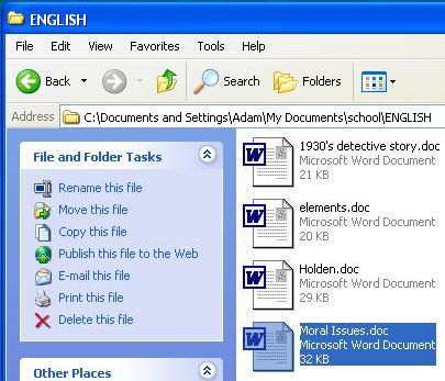
Just take a look at the "File and Folder tasks" box in Windows
Explorer in Windows XP. "Rename this folder," "move this folder,"
"copy this folder," "share this folder," and "E-mail this folder"
are a few of the options you have. It's funny; you also get most of
these by right-clicking the folder. And if you're really
smart, you can even actually drag the folder into another folder to
move it.
Am I stupid or what?
I don't need an application, an operating system, or anything
else to be intrusive to the point where it actually annoys me. Some
of these items you can turn off, but the fact is that these "extra
features" need not be here in the first place. To make a computer
and operating system user friendly, there need to be fewer
buttons, fewer options, and fewer connectors. Less is
more.
Apple is partially on the right track. They have the "fewer
buttons" and "fewer options" thing down, as well as the "fewer
connectors" (on their computers). The mistake both Apple and
Microsoft are making now is the assumption that if they make the OS
pretty, people will buy it and enjoy using it. Right now, with
Windows XP's multiple colors, it feels like I'm playing the latest
Bob the
Builder kids game, even though all I'm doing is typing in
Word, listening to the Spoons in Winamp, and chatting with a few
friends in AIM.

The Prettification of Windows
I think part of the whole "bright colors, awesome effects" thing
is to get people to say, "Wow, Windows/Mac OS is back and
completely new." It's the "fresh start" idea, and I do understand
that it can be a great idea in terms of marketing.
But now it is time for both companies to get back to business.
Simplify the interface. Don't concentrate on the effects and "ease
of use" features. Make it work, and make it work well.
The fading menus and cool colors are great, but they doesn't
mean a thing when you've got a report due and the computer keeps
crashing when you try to spell check the document.


