Dan Knight
- 2007.05.07
Most of today's emails are in response to Less than Intelligent Design in Electronics
and Computing. - Tip Jar
Mac Volume Control, Mighty Mouse Kudos,
and Mac mini Thoughts
John Muir writes:
Dan,
Just read your article on Less
than Intelligent Design, and these thoughts come to mind...
"I'm sure that Apple would never make those kind
of mistakes. The closest they come is giving you no control over
the startup volume of your Mac."
You can't control the volume right there and then, but it is
adjustable elsewhere. From my experience with my 12" PowerBook G4 and Intel Macs, there are
basically two separately controllable system volumes: one when
using the internal speakers and another for anything plugged into
line-out / the earphone jack.
For instance, my Intel recently had a firmware upgrade come via
Software Update, and after that was done I noticed its start chime
was much louder than before. Once I was up in OS X, I saw that
my volume setting was the same as usual. That's because I use it
with a hi-fi connected to the line out jack and this volume setting
is the active one once it's up and running. However the chime is
being played through its internal speaker, so I pulled my line out
jack out the back and pressed the volume down button a few times to
bring that "hidden" setting back under control. No surprise at all:
it had been up at the top. No problems now.
Incidentally, the PowerBook helped me discover this less than
instantly intuitive arrangement. As I used to listen to iTunes with
headphones directly from it before I got an iPod, and quickly
learned there were different behaviours with and without a cord
plugged in.
As for the Mighty Mouse, I must admit to being one of its rare
fans! (Indeed, I've even used them for competitive first person
shooter gaming on occasion, with some necessary cunning in button
choice.) I can see precisely where its hybrid design comes from. I
think the answer is "Steve". The idea seems to be to promote single
button use and simplicity as the default, but to allow advanced
users to uncover the extra functionality via System Preferences.
Also, I'm sure you're mistaken on the side buttons. From what I
remember the default is for the side buttons to instigate either
Exposé or perhaps the task switcher. The scroll button also
defaults to opening the Dashboard. I could be wrong, since I've had
it setup my own way so long, but I'm pretty sure it's like this on
other machines per Apple's decision. Right click is the one they're
sneakily trying to persuade you not to use!
And finally as for the Mac mini: I expect it would be very
different indeed with a 3.5" hard drive plugged in. For anyone who
wants to visualise what difference "an inch" makes, I advise
putting a 2.5" and 3.5" hard drive in your hand at the same time.
 Their sizes are striking. Despite the name, I'd say a 2.5"
drive is 3 times shorter than a 3.5" and around half the plan area
or less . . . therefore about 6 times smaller overall.
Their weight rather gives this away too. Although there are many
positives to going 3.5", I'm glad Apple didn't with the mini. Not
least is the quiet factor where 2.5" drives easily win hands down.
Not to mention the cooling . . . which is my own
favourite thing about the Intel Mac mini - it's exceptionally quiet
and steady, compared to say the ramping fans of a Power Mac G5 -
and the reason I bought one.
Perhaps another model for the 3.5" drive; such as the ever
demanded yet still mythical midrange headless Mac.
John Muir
Hi again, John,
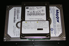
I just happen to have a 2.5" and 3.5" drive at
hand for comparison purposes. The length of the 2.5" drive is
almost identical to the width of the 3.5" drive, and you can place
two 2.5" drives side-by-side on top of a 3.5" drive with room to
spare. Also, most 3.5" drives these days are 25mm thick, while
notebook drives come in 9.5mm and 12.5mm. Assuming the latter, four
notebook drives take up as much volume as a single desktop
drive.
In terms of weight, this particular notebook drive
is just over 5 oz. while the 3.5" drive weighs a hefty 22 oz. -
about 4x the weight.
Remarkably, as small as the mini is, the "zero
footprint" Mac mini companion drives out today manage to just
barely fit a 3.5" drive into the same space.
Yes, noise and cooling are other important factors
- typed as I sit next to a not so quiet Power Mac G4 that runs a
bit on the hot side. I love the design Apple came up with for the
Power Mac G5 and continued in the Mac Pro - aluminum for looks and
ruggedness and to act as something of a Faraday cage for
electromagnetic signals, lots of holes for fresh air, and fans that
run only as fast and as often as necessary to do the job. I'd love
to see that in a midrange Mac some day.
Dan
John Muir replied:
Agreed. That would be the monster!
CRT Danger Explains Difficulty Getting
into eMac, G3 iMacs
Drew Page says:
Hi Dan,
I enjoyed your latest article. It was really spot on, especially
the part about VCRs. What the heck were they thinking?
Anyways, I did think of a reason Apple made it hard to get into
iMacs and eMacs of the CRT era: electrical shock. You see, CRTs
actually retain a fair amount of charge even after you shut them
off. Of course, they discharge after about an hour, but I bet most
people don't know that. If a person opened up their iMac or eMac
and touched the back of the CRT in the wrong place, ZAP! I bet
Apple knows this and didn't want the liability.
Of course, they really should have made the Mac mini user
accessible. No excuse for this. That could have been incorporated
into the existing design. As far as the iPod? Probably a corporate
decision in order to sell more iPods, like you say.
Drew Page
Drew,
Thanks for your thoughts. I never would have
thought of that as a reason for making the eMacs and G3 iMacs so
hard to open up.
Dan
B&W G3 Did Have an Eject
Button

 Dan Palka writes:
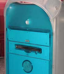
The Blue & White G3, and all
the earlier G4 towers up until the Quicksilver, had a physical
eject button on the tower.
Dan Palka
System 7 Today
Right you are, Dan, as I verified by pulling my
b&w G3 out of the basement. That's what comes of trusting my
memory instead of looking. Early G4 Power Macs had the same design,
and the Quicksilver was the first not to have a visible eject
button.
I'll correct the article.
Dan
VCRs with No Backup Battery
Lonnie Buchanon adds his 2¢:
Amen Dan!
Don't forget the VCR's with no backup battery. If the power goes
out while you're gone, it doesn't record your show. You have to
reset your time, date, and tuner settings after every power
outage.
Lonnie Buchanon
proud Pismo user
Right you are, Lonnie.
Worse yet, my first DVD recorder, an inexpensive
Lite-On model, had a clock that gained at least a minute a day.
Very poor design for a product where having the correct time is
essential to its function.
Dan
Lonnie replies:
Oh, that is worse.
Thanks for such great articles. This one made me giggle but your
point is quite correct. It's amazing to me how many products
continue to be made difficult because "that's the way it's always
been done."
Lonnie Buchanon
Don't Forget the Clamshell iMac
Tedrick Mealy writes:
Hey Dan,
I found your Less than
Intelligent Design in Electronics and Computing article very
interesting and oh-so-true. But I think you should add an aspect of
the clamshell iBook to your
list.
I love how easy it is to add a wireless card or upgrade the RAM,
but the hard drive is a whole different story. I was considering
upgrading the hard drive on my clamshell; 10 GB is a little tight.
So I decided to do a little research on how difficult it would be,
since I had already heard it was a bit tough. The first thing I
found (http://caslis.com/mac/ibook/ibdrive.html)
showed my just how crazy an idea it was. Among all the things you
have to remove (i.e., keyboard, wireless card, case, optical drive,
the whole screen assembly, modem, heat sink, metal cage thing, hard
drive cage thing) I counted a full 48 screws and bolts to be taken
out! That is absolutely insane!
I guess the advantage is that it is built like a tank and can
take a hit with no worries.
Tedrick
Thanks for writing, Tedrick.
I have a clamshell iMac that had a failed optical
drive when I swapped it for an old iMac. Finding a replacement
optical drive wasn't difficult, but putting it in certainly was.
And it's not simply a matter of all those screws - lining up the
pieces of the case is a real bear as well.
As you said, it is built like a tank....
Dan
Resizing Windows on Macs Is Frustrating
Ashley writes:
Just read your article on top Mac user mistakes.
I'm a person who uses Windows machines every day for work and
Macs at home, because I like their style. I'm actually not partial
to either one, as each has its pros and cons. (Although, if you ask
me, Apple wasn't the first company with stylish computers. SGI was
making boxes that looked gorgeous back when Apple still made beige
square boxes.)
Anyway, I must admit that the single most frustrating thing that
I've found with the Mac OS is the item you list as #12 ["Trying to
resize windows from the edge rather than the drag area on the
corner"]. And, while you are correct in that I've learned the
behavior of the Mac OS and adapted to it, every time I wish to
resize a window, I'm constantly frustrated by it.
For a company that swears by its usability, it's sometimes
galling how Apple - and many Apple fans - refuse to acknowledge
that on occasion Windows does do things better.
Being able to grab a window from any side or corner and stretch
it in the corresponding direction is a major time saver, and its
absence is a major frustration. Not only does this interaction
allow you to resize windows easier, but you can also effectively
resize and reposition the window in one step by dragging by the
upper-left or upper-right corner. The Mac instead forces you to do
this in two steps, and if you forget to position the window first,
even more than two.
It only took Apple about 3 centuries to finally figure out that
two mouse buttons are actually really handy. Hopefully it won't
take them so long to figure out that the single resize corner is
similarly restrictive and needs to be retired to the dustbin of
technology history....
Respectively yours,
Ashley
Thanks for writing, Ashley.
I agree that it would be far more convenient for
both Mac users and switchers if you could resize windows from any
side or corner instead of only in the lower right corner, as Apple
has done since the first Mac OS.
Dan
Why I Want a 12" MacBook Pro
Adam Rosen says:
I've been an occasional visitor to LEM for many years,
congratulations on 10 years of good work! The site is a great
resource for the Mac community, with relevant info on new and old
Macs alike.
I currently use 12" PowerBook G4
as my main portable and hope along with many other readers that
Apple eventually releases a MacBook Pro in this form factor. In
addition to all the issues raised, I find two other major benefits
that the 12" PB has over MBPros or MacBooks:
- all cables attach to a single side of the computer (left),
making this notebook even easier to setup in tight spaces
- it has a full size high quality keyboard, like desktops and
other high end laptops
I want these two features on a new Intel laptop. And (are you
listening, Apple) please don't make the optical drive an optional,
external feature. 12" size is fine, as is a slot on the front!
BTW, I have a rather sizable Macintosh collection myself, posted
online as The Vintage
Mac Museum. I've used info found on LEM to put some of this
stuff together. I have a link to Low End Mac on the VMM homepage,
would love a mention and link on LEM back if possible.
Regards,
Adam Rosen
Nice website, Adam.
I somehow can't imagine Apple not coming up with a
12" MacBook (regular or pro) somewhere down the line.
Dan
Adam responds:
After too many dashed hopes, I've given up imagining what Apple
will/will not do, I just buy what exists now and enjoy it to the
fullest. Maybe Uncle Stevie doesn't like the 12" size? I'll bet a
12" MacBook (non-Pro) would only be offered in white - sigh. Think
how cool a 12" black MacBook would be!
BTW, I forgot to mention in my last email, there's a monthly
tech flea market at MIT in Cambridge, MA which is a great place to
buy old Macs very cheaply. Last month I got two iMacs for $20 each.
It's held the 3rd Sunday of the month from April to October, may be
of interest to your readers in the Boston area:
http://web.mit.edu/w1mx/www/swapfest.html
Adam
Adam,
It's a lot of guessing as to what Apple will do
next. I'd love something along the lines of a convertible
laptop/tablet MacBook in the 10-12" range, but those who know are
not talking.
Dan
Dan Knight has been publishing Low
End Mac since April 1997. Mailbag columns come from email responses to his Mac Musings, Mac Daniel, Online Tech Journal, and other columns on the site.

 Their sizes are striking. Despite the name, I'd say a 2.5"
drive is 3 times shorter than a 3.5" and around half the plan area
or less . . . therefore about 6 times smaller overall.
Their weight rather gives this away too. Although there are many
positives to going 3.5", I'm glad Apple didn't with the mini. Not
least is the quiet factor where 2.5" drives easily win hands down.
Not to mention the cooling . . . which is my own
favourite thing about the Intel Mac mini - it's exceptionally quiet
and steady, compared to say the ramping fans of a Power Mac G5 -
and the reason I bought one.
 Dan Palka writes:
