I test
an awful lot of utilities, applications, and add-ons for my columns
and features, but I only end up using a few of them on a regular
basis. I'm actually very happy with pretty much the same basic
suite of software tools I've been using for years - many since the
OS 9 days where OS X native versions are available.
I'm not big on having a lot of system add-ons running, although
there are a few key ones (like TypeIt4Me and WindowShade X) that I
would find it very hard to live without.
However, once in a while a piece of software comes along that
clicks with me. Such is XRG (X Resource Graph), an open source
system monitor by Mike Piatek-Jimenez for Mac OS X that allows
you to monitor CPU activity, memory usage, battery status, machine
temperature, network activity, disk I/O, current weather, and stock
market data.

XRG in horizontal configuration - click image for full sized
view
 You
can configure the monitor window to display only the information
categories you want, as in the reduced horizontal example above and
the full sized vertical example to the right. (Editor's note: I've
had XRG on my Macs for ages. These screen shots are from my eMac.
Others may be from different computers.)
The stated mission of XRG is to provide a functional system
monitor with a clean and flexible interface, one that doesn't
intrude on the rest of your Mac experience.
XRG is also designed to take as little CPU time as possible
while still showing detailed graphs on system usage. For example,
XRG is claimed to use 3-5% of the CPU on a 667 MHz G4, and 1-5% of
the CPU on a dual 1.25 GHz G4. Personally, I haven't noticed that
it degrades performance noticeably even when running on my
relatively puny 700 MHz G3 iBook.
XRG includes a machine temperature module that will graph the
temperature of different locations in your computer - provided that
your CPU has temperature sensors. Unfortunately, the IBM 750FX chip
in my iBook doesn't. (Editor's note: Ditto for my PowerBook G4/400
and 1.25 GHz eMacs.) Supported models include Power Mac G5s,
aluminum PowerBook G4s, and iBook G4s.
Other features include the addition of uptime statistics to the
CPU graph, the ability to drag XTF theme files to the graph to set
graph colors, and the option to hide XRG's Dock icon through a new
contextual menu for the graph title bar.
XRG's window collapses to its title bar, which is small enough
to be unobtrusive. It expands and contracts on mouseover. If you
disable that function in the Preferences, it expands and collapses
with a double click.
The temperature graph supports newer Power Mac and PowerBook
models with supported temperature and/or fan sensors, including the
Power Mac G5, iMac G5, aluminum PowerBook G4, and iBook G4. Later
machines may or may not be supported in current versions of
XRG.
Some older Macs (such as the Mirrored Drive Doors G4s) have sensors
on their CPU(s), but these will not be displayed in the Temperature
graph. Instead, these temperature values will only be displayed in
the CPU graph.
XRG will display n/a where the CPU temperature should be
if it fails to find any temperature sensors that it can monitor.
Many older Macs do not have any temperature sensors at all, in
which case there are not any sensors for the XRG graph to find.
XRG also has the ability to hide the application icon in the
Dock. Unfortunately, this also hides the main application menu, so
the option to disable the dock icon is only in the contextual
menus, which can still be accessed when the Dock icon and
application menu are hidden. To toggle whether or not the Dock icon
is shown, either right-click or control-click on the XRG window
title bar and select Hide/Show XRG Dock Icon (after restart). Then
quit XRG, and the next time the application is opened, the Dock
icon will be hidden (or shown).
The XRG graph can be resized by clicking on the border at any
location and dragging it appropriately. If you click and drag on a
corner, it will resize the window's width and height. If you only
want to resize the window in one direction, drag on an edge instead
of a corner. Also, the graph's orientation can be changed from the
default vertical orientation to a horizontal orientation. Select
which window orientation you would like to use in the General
Preferences.
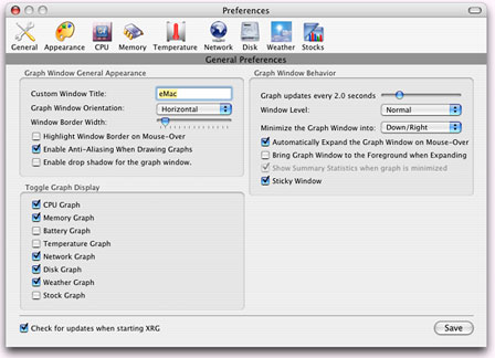
XRG Preferences - click image for full sized view
Editor's note: One nice feature of XRG is that you can customize
the colors. The default colors are a bit on the dark/garish side,
in my opinion, so I've set my copies of XRG to use lighter shades
of these colors.
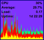 The load average
is the average number of processes that are currently waiting for
the CPU at any given time. Usually, a load average of 1 on a single
processor machine means that the CPU is always busy, because one
process is always waiting for the CPU. A dual CPU machine should
theoretically be completely busy when the load average is 2 (one
process for each processor).
When the Battery graph displays a 95% charge but claims the
battery is fully charged, the apparent discrepancy originates in
Apple's Power Management implementation. It's not good for a
lithium battery to be charged just a very little bit at one time.
Since batteries will lose a small amount of charge over a period of
time, it would shorten the life of the battery if it was charged
every time it dropped below 100%. For this reason, Apple's Power
Management implementation will assume that the battery is charged
when the battery percentage is above 95% and will only recharge it
to a full 100% charge when the percentage drops below 95%.
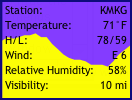 The Weather
Module can be configured in the preferences to read out weather
information from weather stations around the world. The nearest one
to me is about 40 miles away as the crow flies, and it works
great.
As I mentioned, I cottoned to XRG and keep it running a lot of
the time. The two references I use most are the local weather and
uptime since the last restart, although machine temperature would
be of interest if my machine supported it.
The main annoyance I've had is that the program is sometimes
unresponsive to double clicking to collapse the window back to its
title bar, requiring several attempts before it cooperates. The
mouseover expand and collapse function works fine, however.
For a freeware application, XRG has a very decent and
comprehensive online Help manual (see some excerpts in the Appendix
below).
XRG 1.1 contains bug fixes and some new features. The primary
new features include enhanced support for temperature sensors in
the iMac G5 and fan sensor monitoring on multiple types of
machines. Other new features include compatibility with OS X
10.4 (Tiger) and "Update Now" menu options for the Weather and
Stock graphs. Bugs have been fixed in the Temperature, Weather, and
Battery graphs.
Version 1.1 changes, enhancements and fixes:
- Fixed bug with font not getting selected when opening the font
panel. (Code from Nils Hjelte)
- Fixed bug in weather contextual menu where temperature would
show up as 1F while temperature units set to Celsius. (Code from
Tor Sigurdsson)
- Fixed bug with changing window orientation from horizontal to
vertical when the window is very large.
- Condensed the minimum graph width for the Disk, Network, and
Weather graphs.
- Added Update Weather Graph Now option in the weather contextual
menu.
- Added Update Stock Graph Now option in the stock contextual
menu.
- Buffered the change in the fast CPU graph so it's less
jumpy.
- Fixed a bug in the temperature graph where the last sensor
wouldn't be displayed if selected as a graph.
- Fixed a bug in the temperature preferences to cover the case if
the number of sensors changes and a setting was out of range.
- Made the temperature graph labels a little better at
resizing.
- Added fan sensor support to the temperature graph.
- New Icon. (Created by Laurent Baumann)
- Cut the amount of drawing time for the temperature graph in
half.
- Added support for PowerBook G4 exhaust fans.
- Added support for iMac G5 temperature/fan sensors.
- Added support for PWM G5 sensors.
- Added warning dialog before enabling fan sensors.
- Fixed a font bug. Set the font height based on the entire
alphabet of a font and not just a single letter.
- Made version checking more robust.
- Fixed a bug in the temperature module where sensors wouldn't be
disabled properly if they went away (as the exhaust fans in
PowerBooks do).
- Added compatibility for Tiger.
- Fixed bug in battery graph caused by the amperage being
retrieved changing in later versions of Panther. Amperage bar graph
now works again.
- Made temperature graph text drawing more robust.
- Possibly fixed a bug in network graph where PPP connections
could add quite a bit of "virtual" traffic that didn't really occur
to the total bandwidth used since boot time.
System requirements: All versions of XRG have been fully tested
and work on Mac OS X 10.2.x (Jaguar). XRG 0.4.0 and later work
under Mac OS X 10.3.x (Panther) as well as Jaguar.
Appendix: The XRG Modules
The CPU Graph
 The CPU Graph
readout will vary depending on your preferences and the type of
machine you are on. The image shown is on a single processor
machine. For dual processor Macs, the graph will be split in half,
with one CPU's activity shown on the top, and the other's activity
on the bottom.
On the top line of the graph, XRG displays the current
percentage of the CPU that is being used. If you have a dual
processor machine, there will be a percentage displayed for each
CPU.
If you have "Separate Coloring for User/System/Nice CPU time"
turned on, then the graph will be split into three colors.
Graph Foreground Color 1 designates the System CPU Load, or the
amount of CPU time spent in the core system code.
Graph Foreground Color 2 designates the User CPU Load, or the
amount of CPU time spent by applications started by users who are
logged in.
Graph Foreground Color 3 designates the Nice CPU Load, or the
amount of CPU time spent by applications that are set to be nicer
than others. XRG is set as a nice application, which means it will
give up it's CPU time when the computer is extremely loaded.
With "Show Average % Usage" turned on, XRG will display the
average % of the CPU used for the time frame currently shown on the
graph.
If you have "Show Load Average" turned on, then XRG will show
the machine's load average on a line labeled as "Load." The load
average is the average number of processes that are currently
waiting for the CPU.
If you enable "Show CPU Temperature" in the preferences and your
processor supports it, XRG will display the current CPU
temperature. This is highly inaccurate on slightly older machines,
and could be off by as much as 12 degrees. Newer machines have
sensors for different locations of the computer. See the
temperature graph help section for more details and for system
support.
Finally, there is an option to display a more immediate "Fast
CPU Graph." This graph is updated 5 times a second and is shown in
the rightmost ~10 pixels of the graph.
The Memory Graph
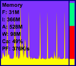 The Memory Graph
is divided into 3 main sections. The first is the informational
text. The text shows (F)ree memory, (I)nactive memory, (A)ctive
memory, (W)ired memory, (Ca)che hit rate, and Page Faults.
Free Memory is self-explanatory, it's the amount of RAM that
isn't allocated by any applications. Inactive memory is memory that
is either left over from previous applications, or is in use by
current applications but not readily available in the system memory
map.
Active memory is memory used by current applications and is in
the system memory map.
Wired memory is allocated by the kernel and cannot be swapped
out to disk; it's locked, or wired into main memory.
Cache hit rate is the percentage of the time that the operating
system looks for a memory page in cache and finds it. The higher
your cache hit rate, the more efficient your machine is
running.
Finally, the page fault value is the number of times that a page
fault occurs multiplied by the size of a memory page (4k), to give
a rough estimate of the bandwidth being used by page faults.
The second main section is a graphical representation of the
memory allocated along the right size of the graph.
Graph Foreground Color 1 shows the amount of wired memory, Graph
Foreground Color 2 shows the amount of active memory, Graph
Foreground Color 3 shows the amount of inactive memory,
Graph Background Color shows the amount of memory that is
free.
The third main section of the memory graph is a paging graph
that is displayed directly under the text on the left side of the
graph. This graph shows the page fault, page in, and page out
activity on the system.
A page fault (Graph Foreground 1) occurs when the system fails
to find a memory address in the system memory map. When a page
fault occurs, the system loads the needed page either from inactive
memory or from the disk.
A page-in (Graph Foreground 2) occurs when a page is currently
swapped out to virtual memory and needs to be loaded back into
active memory.
A page-out (Graph Foreground 3) occurs when more memory is
needed and a page is swapped from RAM out to virtual memory.
The Battery Graph
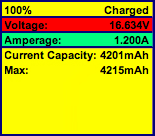 The battery graph
shows many more statistics than the standard MacOS X battery
monitor. This graph will only work with PowerBooks and iBooks, as
desktop machines don't have any batteries with the capability of
being monitored.
The first bar graph displays the current charge percentage along
with an estimated time of how much longer the battery will last.
The graph shows the percentage in Graph Foreground Color 1. When
the battery is charging, the time estimation is for how long it
will take the battery to fully charge. Also, to designate that the
battery is charging, there will be a small animation in the
remaining battery capacity section of the graph.
The second bar graph displays the current voltage that the
battery is providing. The scale of this graph can be somewhat
random, and XRG uses the max of the scale as the highest voltage
reading it has gathered since it was launched. The third bar graph
displays how much current the battery is providing while running on
battery, or how much current the battery is drawing while the
PowerBook is plugged in. If you take both the current voltage and
the current amperage, and multiply them, you will get the wattage
that your PowerBook is currently using.
The rest of the battery graph is used to display the battery
charge over a length of time. The graph is updated every 30
seconds, which is how much time one pixel width of the graph
represents. On this graph, there will be two lines of text (if
there is room to display them). The first line has the current
capacity of the battery in mAh (milli-ampere hours), and the second
is the maximum capacity of the battery, also in mAh. The maximum
capacity determines how long the battery will last in your
PowerBook. Over time, you will notice that this number goes down.
This is caused by wear and tear on the battery and is the reason
your PowerBook doesn't last the 3-5 hours that it used to when it
was new.
The Temperature Graph
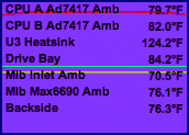 The
temperature graph displays the temperature of different sensors
mounted in some new PowerMac and PowerBook/iBook computers. If XRG
doesn't recognize any valid sensors in your computer to monitor, it
will display No Sensors Found. Currently, machines that are known
to work with the XRG temperature graph include the PowerMac G5,
Aluminum PowerBooks 12"/15"/17" models, and the G4 iBooks.
The image shown is from a dual processor PowerMac G5. The CPU
A/B Amb values are ambient temperatures of the air surrounding the
G5s. This isn't the temperature of the chips themselves; as there
are no known sensors that give that information. The U3 Heatsink
shows the temperature of the of the System Controller. This is the
chip that manages traffic between the processors and the rest of
the system. The Drive Bay is an ambient temperature of that zone.
Both of the Mib temperatures are for the zones that enclose the PCI
cards. Finally, the backside temperature is just as it says, the
ambient temperature of the back side of the computer.
PowerBooks and iBooks are slightly different. Newer generations
contain more sensors than older ones, and depending on the display,
sensors could be located in different locations as well. The
sensors that are known include Hdd Bottomside, CPU
Topside/Bottomside, CPU Core, CPU/Intrepid Bottomside, GPU On Die,
Pwr Supply Bottomside, Pwr/Memory Bottomside, Battery, Rear Main
Enclosure, and Rear Left/Right Exhaust. The Hdd sensor is for the
internal hard drive, the CPU temperatures are for various locations
with respect to the CPU (Intrepid may be a daughtercard or a
controller chip), GPU On Die is the temperature of the graphics
processor (which is usually an ATI Radeon chip), and the rest are
fairly self-explanatory.
In the preferences, you have an option to display up to three
sensors as their own separate line graphs. Over time, these values
don't change much, but you could see dramatic changes when doing
anything on your computer that stresses a certain part of the
computer. For example, doing a lot of file and network copying
would increase the disk temperature, charging a battery would
increase the battery and power supply temperatures, and playing an
advanced OpenGL game would probably increase everything (most
notably, the CPU, U3, GPU, and Mib temperatures).
The Network Graph
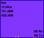 The network graph
displays how fast you are sending and receiving data on your
network connection. The send data rate is displayed in Graph
Foreground Color 1, and the received data rate is displayed in
Graph Foreground Color 2. By default, these two rates are displayed
by stacking on top of each other. There is an option in the
preferences to either invert the send data rate or the receive data
rate. The number in the upper left corner below "Net" is the scale
of the graph. In this case, the scale from top to bottom of the
graph shown is 10K/sec.
There is an option in the preferences to set a minimum scale to
show, and since there wasn't much network traffic in the image
shown the scale was set to the minimum, which in this case is
10K/sec.
Right below this, if you have "Show Total Bandwidth used since
boot time" and/or "Show Total Bandwidth used since XRG was opened"
enabled in the preferences, the graph will display these numbers as
well. There is a limitation with showing the Total Bandwidth used
since system boot time.
The method that XRG uses to gather these statistics returns 32
bit values. This means, that when XRG is first opened, it can not
detect more than 4 GB of network traffic in one direction on
one interface. For this reason, unless XRG is opened close to the
time that the system was booted, this number may be incorrect.
Total Bandwidth used since XRG was opened should always be a
correct value, as XRG keeps track of bandwidth used while it's open
with 64 bit numbers, which are much larger. On the bottom of the
graph, both the most recent transfer (Tx) data rate and the most
recent receive (Rx) data rate are displayed. If your preferences
are set to invert the send or receive graph, the corresponding data
rate text will be shown at the top of the graph as well.
The Disk Graph
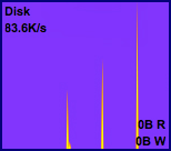 The disk graph
displays how fast you are reading and writing data to block devices
(local hard drives). The write speed is displayed as Graph
Foreground Color 1, and the read speed is displayed as Graph
Foreground Color 2. The default display here is to have the two
graph values stacked on top of each other. There is an option in
the preferences to either invert the read data rate or the write
data rate. The number in the upper left corner below "Disk" is the
scale of the graph. In this case, the scale from the top to the
bottom of the graph shown is 83.6K/sec. On the bottom of the graph,
both the most recent (R)ead speed and (W)rite speed is shown. If
your preferences are set to invert the read or write graph, the
corresponding read or write speed will be shown at the top of the
graph as well.
The Weather Graph
 The weather graph
shows a variety of current weather statistics along with a graph of
the temperature (and optionally a secondary value) over the past 24
hours. The first line of text is the current ICAO code that is
being referenced for the weather data. You can find a list of ICAO
codes for different locations here.
The lines below that show the current (T)emperature, last 24
hour (H)igh and (L)ow temperatures, (W)ind direction/speed in knots
and (G)ust speeds if applicable, (R)elative (H)umidity calculated
from the temperature and dew-point, (V)isibility, (D)ew-point, and
(Pr)essure. Distances are displayed with units in miles or
kilometers. Pressure is displayed with units of inches or
hectopascals.
Temperature is shown in either Fahrenheit or Celsius. Units can
be configured in the preferences. The primary graph (temperature)
is displayed as a region filled in with Graph Foreground Color 1.
Users can choose to show one of the other values to graph as a
secondary graph which is drawn as a line in Graph Foreground Color
2.
The Stock Graph
 The stock graph can
display pricing information for one or more stock symbols. The
stock symbols to monitor are configured in the preferences, and the
text on the graph will show the last closing price of the stock. If
"Show last day change" is enabled, then the line below each stock
symbol shows the change in stock value from the previous day. If
"Show DJIA as a secondary graph" is enabled, then the last DJIA
closing price will be shown in the lower left corner of the
graph.
Also, the DJIA closing price will be graphed in Graph Foreground
Color 2 as a line. The number in the lower right corner of the
graph shows the horizontal graph scale (designating if 1 month, 3
months, 6 months, or 1 year of data is shown in the graph). The
stock graph only graphs the closing price of one stock symbol at a
time.
The text of the stock symbol currently shown on the graph will
be highlighted as Graph Foreground Color 3 and displayed on the top
line of the graph. If there are too many stock symbols to display
with the current graph size, a down arrow will be displayed on the
last line designating that there are other symbols which could not
be displayed because of size constraints.


 You
can configure the monitor window to display only the information
categories you want, as in the reduced horizontal example above and
the full sized vertical example to the right. (Editor's note: I've
had XRG on my Macs for ages. These screen shots are from my eMac.
Others may be from different computers.)
 The load average
is the average number of processes that are currently waiting for
the CPU at any given time. Usually, a load average of 1 on a single
processor machine means that the CPU is always busy, because one
process is always waiting for the CPU. A dual CPU machine should
theoretically be completely busy when the load average is 2 (one
process for each processor).
 The Weather
Module can be configured in the preferences to read out weather
information from weather stations around the world. The nearest one
to me is about 40 miles away as the crow flies, and it works
great.
 The Memory Graph
is divided into 3 main sections. The first is the informational
text. The text shows (F)ree memory, (I)nactive memory, (A)ctive
memory, (W)ired memory, (Ca)che hit rate, and Page Faults.
 The battery graph
shows many more statistics than the standard MacOS X battery
monitor. This graph will only work with PowerBooks and iBooks, as
desktop machines don't have any batteries with the capability of
being monitored.
 The
temperature graph displays the temperature of different sensors
mounted in some new PowerMac and PowerBook/iBook computers. If XRG
doesn't recognize any valid sensors in your computer to monitor, it
will display No Sensors Found. Currently, machines that are known
to work with the XRG temperature graph include the PowerMac G5,
Aluminum PowerBooks 12"/15"/17" models, and the G4 iBooks.
 The network graph
displays how fast you are sending and receiving data on your
network connection. The send data rate is displayed in Graph
Foreground Color 1, and the received data rate is displayed in
Graph Foreground Color 2. By default, these two rates are displayed
by stacking on top of each other. There is an option in the
preferences to either invert the send data rate or the receive data
rate. The number in the upper left corner below "Net" is the scale
of the graph. In this case, the scale from top to bottom of the
graph shown is 10K/sec.
 The disk graph
displays how fast you are reading and writing data to block devices
(local hard drives). The write speed is displayed as Graph
Foreground Color 1, and the read speed is displayed as Graph
Foreground Color 2. The default display here is to have the two
graph values stacked on top of each other. There is an option in
the preferences to either invert the read data rate or the write
data rate. The number in the upper left corner below "Disk" is the
scale of the graph. In this case, the scale from the top to the
bottom of the graph shown is 83.6K/sec. On the bottom of the graph,
both the most recent (R)ead speed and (W)rite speed is shown. If
your preferences are set to invert the read or write graph, the
corresponding read or write speed will be shown at the top of the
graph as well.
 The stock graph can
display pricing information for one or more stock symbols. The
stock symbols to monitor are configured in the preferences, and the
text on the graph will show the last closing price of the stock. If
"Show last day change" is enabled, then the line below each stock
symbol shows the change in stock value from the previous day. If
"Show DJIA as a secondary graph" is enabled, then the last DJIA
closing price will be shown in the lower left corner of the
graph.
