At midpoint 2009, my current fleet of Web browsers is solidly
anchored by Opera Turbo 10
Beta by virtue of the fact that if one doesn't care much about good
image quality, it's so much faster than any other browser over my
dialup connection (wireless broadband is promised here in rural Nova
Scotia before the end of the year, but no joy so far, and I'm not
holding my breath) that every other browser is simply eclipsed.
The secret to Opera 10 Turbo's speed is server-side optimization and
compression technology that speeds up throughput over slow connections
by reducing the amount of data needed to display Web pages by up to
80%, which is a blessing when stuck with rural dial-up that gives me
26,400 bps throughput on good days.
For about a year I subscribed to an optional compression feature
called Dial-Up Accelerator from my ISP - a product of Slipstream Data Inc., a Canadian
software development subsidiary of BlackBerry smartphone maker Research
In Motion (RIM), but it was clunky, somewhat buggy, and didn't work
appreciably faster than Opera Turbo's free built-in compression - and
it nuked the image quality more drastically. I unsubscribed as soon as
I determined how good and dependable Turbo was.
Opera claims that Turbo easily delivers 3x to 4x the speed of slower
connections and can offer "broadband-like" speeds on dial-up. The
latter is more than a bit of a stretch, at least in the context of my
really slow dialup service, but it sure is a lot faster.
As for the image quality degradation, you can turn Turbo off when
you need full image resolution.
Of course, Opera was already my favorite browser even
before Turbo debuted for a whole raft of other reasons, but the Turbo
feature clinches its top dog status.
Opera's Mac default skin gets a fresh look that seemed a bit too
gray for my taste at first, although I've warmed to it, but there are
plenty of very attractive Opera skin themes - some quite spectacular -
that can be downloaded from the Opera website.
Also new in Opera 10b1 is a resizable tab bar that displays
thumbnails of your open Web pages on mouseover and can now also be used
to show all open tabs as thumbnails. Opera's Speed Dial bookmark
thumbnail feature can also be customized to suit your taste by using
the "Configure" button to display from 4 to 25 favorite websites, and
some of the optional themes add a custom background to the Speed Dial
page, dressing it up more like Safari 4's Top Sites feature.
Opera 10b1 includes webmail integration, so if you use a webmail
service as your default mail client, you can configure Opera 10 to open
the compose page from your webmail service provider when you click on
email addresses, and the same applies to Opera's Feed Reader feature
for RSS/atom feeds. The search field is resizable for when you need
more than two words of search parameters.
Opera 10's uses the Presto 2.2 version of Opera's unique browser
engine (as opposed to Apple's WebKit or Mozilla.org's Gecko) which, not
counting the Turbo feature, is claimed to to be up to 40% faster on
resource intensive pages such as Gmail and Facebook.
Spelling errors are now red-underlined as you type in all fields
where you can input text, and a contextual menu includes spelling
suggestions and the ability to change dictionary languages or to select
additional dictionaries.
The integrated Opera Mail email client, which I don't use, now
supports rich text messages including inline images, styled text,
links, and/or custom HTML, and a new Delete after X days feature
automatically removes messages from POP servers after the specified
interval.
Will I keep using Opera when broadband finally arrives in this neck
of the woods? You bet! There are plenty of non-speed related reasons to
love this browser, such as its excellent Download Manager, which
deserves mention since it's so much better than any other browser's,
with excellent progress monitoring and full control, including
dependably resumable downloads after a pause or shutdown and no-hassle
multiple downloads.
Opera's Zoom controls are also among the best, if not the
best, with a handy pulldown menu and button in the lower right corner
to resize pages. If the page is too wide for your screen, simply hit
Fit to Width, and Opera will resize the page so you avoid
horizontal scrolling. I also like Opera's implementation of the
sidebar, which stays out of your way until bidden to appear with a
button-click - and hiding again efficiently.
And I just like the way Opera's user interface is laid out, although
I wish it had a bigger progress bar (but at least it still has one,
unlike Safari 4). Another Opera advantage is that it works nicely with
both OS X 10.5 "Leopard" and 10.4 "Tiger".
Stainless 0.6.5 Now a Usable Alternative Browser
However, I'm still using other browsers, particularly when I need
image quality and don't want to bother switching Opera over to
non-Turbo mode.
One of the fastest I've been using is Stainless, a multi-process browser
only for OS X Leopard based on Apple's WebKit Open Source browser
engine.

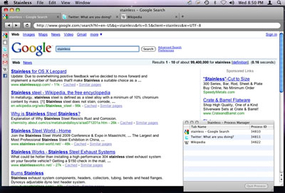
Stainless is built on WebKit and puts tabs above the address bar.
Stainless started out as as a technology demo to showcase the
developer's multiprocessing architecture in response to Google Chrome, but it's proved so
popular that they've decided to morph Stainless into a full-fledged
browser with some unique features that you won't find in Chrome or in
any other browser.
Stuff like parallel sessions, which allows you to log into a site
using different credentials in separate tabs at the same time, a
private cookie storage system, and session-aware bookmarks that
remember the session in which they were saved.
 I
tried Stainless shortly after it debuted and was underwhelmed, but the
latest beta 0.65 version is now a useful and usable tool - still pretty
bare-bones, but lean and speedy with the basic features I can't get
along without - namely tabs and a bookmarks function. Alas, there's no
progress bar - just a Safari-esque spinning wheel to inform you that
something is happening.
Consistent with its Chrome inspiration, its tabs appear above the
Address field, but not up in the title bar as was abortively tried in
the Safari 4 public preview.
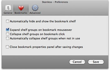
There's no conventional Bookmarks menu, but the "Bookmark Shelf"
feature where you can drag Web page icons. Bookmarks are stored as
compact icons, with text identification on mouseover, and a variety of
configuration and function options in the preferences.
This one is quickly growing on me.


 I
tried Stainless shortly after it debuted and was underwhelmed, but the
latest beta 0.65 version is now a useful and usable tool - still pretty
bare-bones, but lean and speedy with the basic features I can't get
along without - namely tabs and a bookmarks function. Alas, there's no
progress bar - just a Safari-esque spinning wheel to inform you that
something is happening.
